kage
kage
airjelly.ai
Design analysis
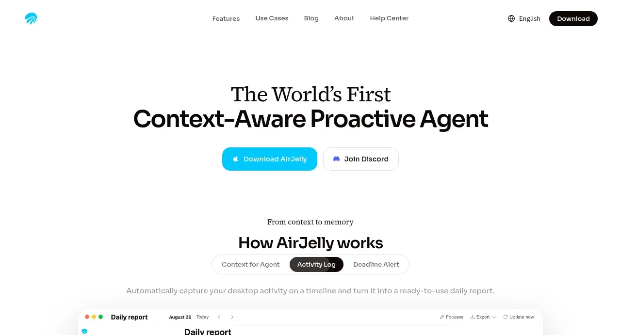
A high-contrast editorial headline is centered above two compact calls to action, with extensive white space and no competing visual. The serif eyebrow/headline pairing gives the software product a distinctive, confident voice.
Prompt preview
## Reference images

Study these alongside the description below: hierarchy, rhythm, spacing, colour. Build for the product you are asked about, using this design language.

- Component: https://kage-design-assets.t3.tigrisfiles.io/components/airjelly/990a635f-6745-4f3e-9b4f-9fb8b62b8b48-1792044309-1.webp
- Full page it was cut from: https://kage-design-assets.t3.tigrisfiles.io/screenshots/airjelly/990a635f-6745-4f3e-9b4f-9fb8b62b8b48-1792044207019-full.webp
- Component on Kage: https://kage.design/component/airjelly-hero

## Before you start
Ask what the user's product, brand voice, audience, and desired action are, then adapt this structure to that product.

Create a centered landing-page hero immediately below the navigation. Use a restrained white canvas, an oversized two-line headline with a serif first line and bold sans-serif second line, and a short supporting line if the product needs one. Place two adjacent pill buttons underneath: one vivid cyan primary action and one white outlined secondary action. Keep the content column narrow, center-align everything, and use roughly 72–96px top padding with 28–40px between headline and actions. Use near-black #111111, cyan around #16C7E8, pale gray borders around #E5E5E5, and rounded buttons around 18–22px. Make the action row wrap cleanly on mobile and add restrained hover/focus states.

Never: use logos, product names, copy, illustrations, or imagery from the reference.