kage
kage
diagramly.xyz
Design analysis
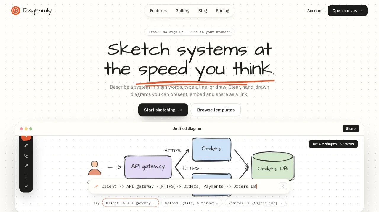
The hero uses a centered promise, short eyebrow, two clear actions, and a large browser-like canvas preview. A dotted paper grid and rough diagram marks make the product feel tactile and approachable.
Prompt preview
## Reference images

Study these alongside the description below: hierarchy, rhythm, spacing, colour. Build for the product you are asked about, using this design language.

- Component: https://kage-design-assets.t3.tigrisfiles.io/components/diagramly/9b8d5fcc-855c-4b01-a046-ef496ed19a9b-1792044171-1.webp
- Full page it was cut from: https://kage-design-assets.t3.tigrisfiles.io/screenshots/diagramly/9b8d5fcc-855c-4b01-a046-ef496ed19a9b-1792044070781-full.webp
- Component on Kage: https://kage.design/component/diagramly-hero

## Before you start
Ask the user what their product is, what action the hero should drive, and which brand colours and type styles they prefer. Apply the principles below to their product and create an original composition.

Build a spacious centered hero for a browser-based creative or productivity tool. Place a small eyebrow above a large two-line display headline, followed by concise supporting copy and two actions: one dark primary button and one quiet secondary button. Below the copy, show a wide rounded product preview that demonstrates the core workflow inside a browser-like frame.

### Design language
- Use a warm off-white paper background near `#fcfbf7` with a subtle repeated dotted grid around `#e8e5dc`.
- Use an expressive hand-drawn display typeface for the headline, near-black `#1f201e`, with a thin coral underline/accent around `#df5b3e`; use a neutral sans-serif around `#70716d` for body copy.
- Center the content in a max-width of roughly 680px; give the headline generous line-height and keep the paragraph narrower than the headline.
- Use 16–20px gaps between eyebrow, heading, paragraph, and actions; give the product preview substantial top margin and let it span most of the content width.
- Render the preview as a white rounded rectangle with a light border, soft shadow, browser controls, a compact toolbar, and an illustrative diagram made from simple rectangles, arrows, labels, and a database-like shape. The diagram must communicate the workflow, not merely decorate.
- Buttons should have a dark filled primary treatment and a light outlined or white secondary treatment, both with 8–12px radius.
- Add responsive behavior: reduce headline size and preview complexity on small screens while retaining the same hierarchy.

### Never
- Never use logos, product names, copy, illustrations, or imagery from the reference.
- Never replicate the exact diagram, headline, UI labels, or screenshot content.