kage
kage
reasonmachines.com
Design analysis
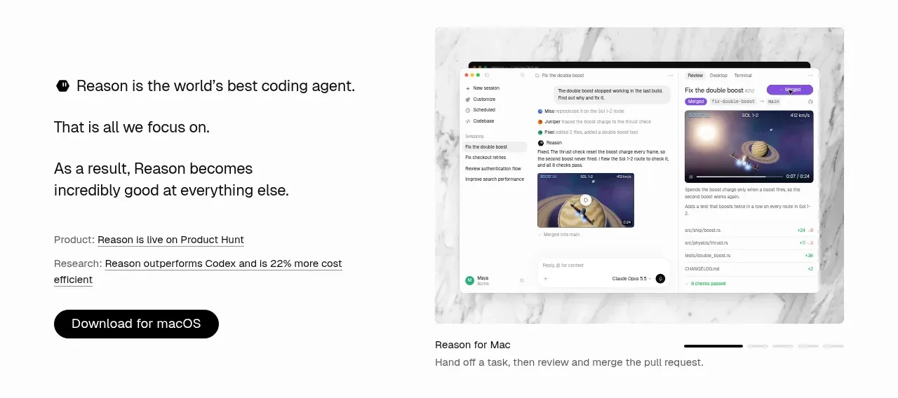
A restrained split hero pairs a concise, left-aligned product thesis and download CTA with a large product preview on the right. Small supporting claims establish credibility while the carousel treatment gives the visual side a sense of an ongoing product story.
Prompt preview
## Reference images

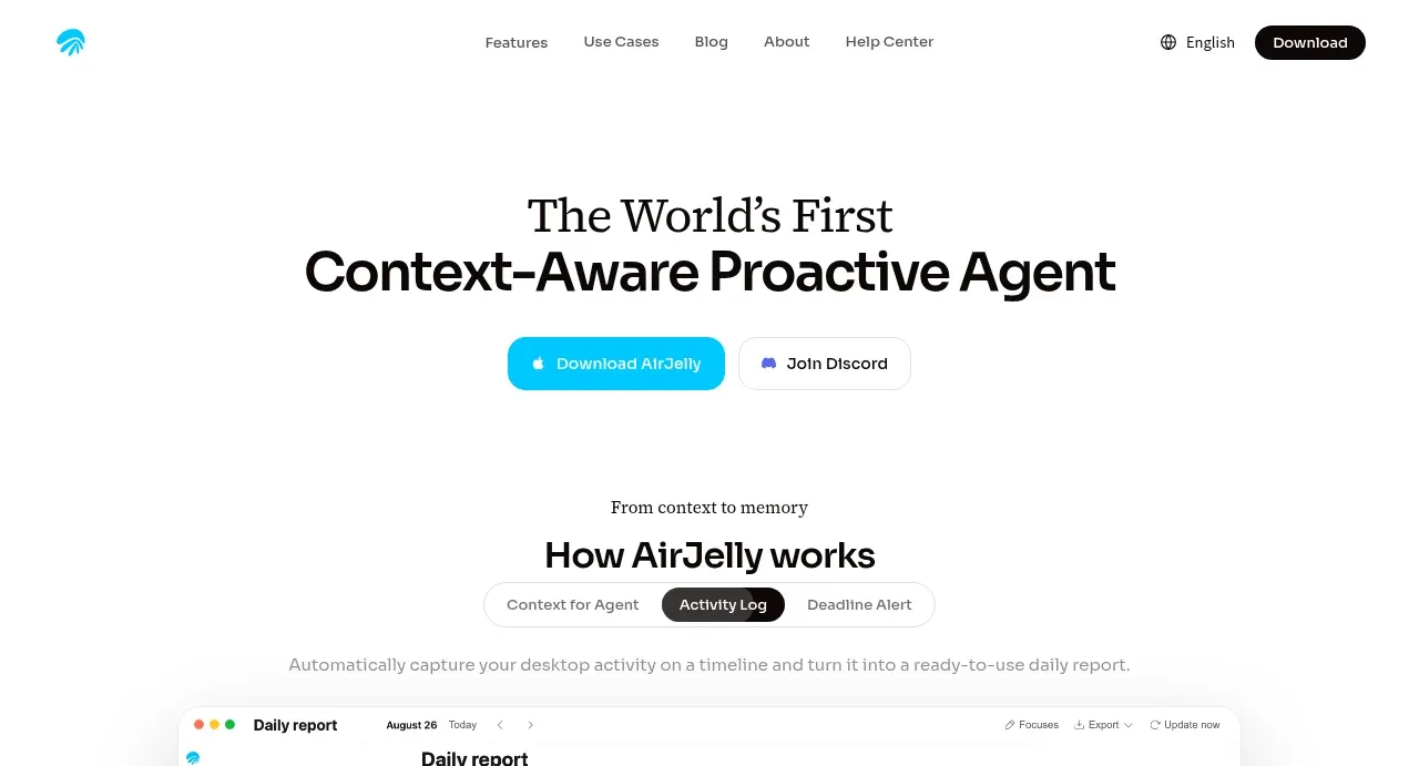
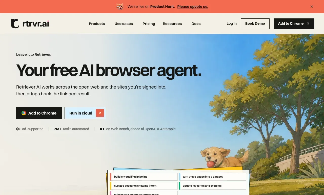
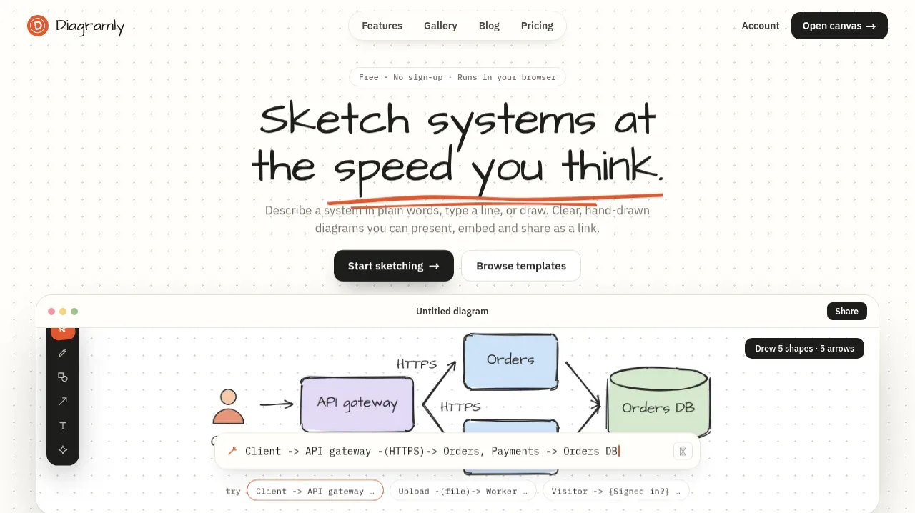
Study these alongside the description below: hierarchy, rhythm, spacing, colour. Build for the product you are asked about, using this design language.

- Component: https://kage-design-assets.t3.tigrisfiles.io/components/reason/2bab5115-4041-4830-a11d-e755b25d1e85-1792044285-0.webp
- Full page it was cut from: https://kage-design-assets.t3.tigrisfiles.io/screenshots/reason/2bab5115-4041-4830-a11d-e755b25d1e85-1792044194874-full.webp
- Component on Kage: https://kage.design/component/reason-hero

## Before you start
Ask the user what their product is, who it serves, and what brand personality and visual identity it should use. Then apply the following principles to create an original hero for that product rather than reproducing the reference.

Build a full-width desktop hero with a quiet, premium editorial feel. Use a two-column layout inside a centered max-width container: the left column should carry the product thesis, a short supporting explanation, compact proof points, and one prominent primary CTA; the right column should show an original product UI preview or product-specific visual with a subtle frame and a small caption/control row beneath it. Keep the left edge of the text and the visual aligned to the same container grid, with generous whitespace and no unnecessary navigation inside the hero.

Use a warm near-white background around `#fbfbfa`, near-black text around `#111111`, muted secondary text around `#6f6f6f`, and a dark CTA around `#050505` with white text. Use a restrained sans-serif type system: a compact bold lead statement, readable body copy, and small 12–14px evidence/caption text. Keep the hierarchy calm rather than oversized. Use approximately 32–56px vertical spacing between content groups, a 24–32px column gap, and a 1200px-or-similar max-width that collapses to one column on narrow screens. Give the product preview a soft 1px neutral border, 8–12px radius, and very subtle shadow or tonal contrast; avoid decorative gradients unless they are part of the user's brand.

If the preview is a carousel, make the active state obvious with a dark short indicator and inactive indicators in light gray. The CTA should have a pill or softly rounded shape, comfortable horizontal padding, and a clear hover/focus state. Ensure the hero remains useful without the visual by preserving the headline, proof, and CTA hierarchy on mobile.

### Never
- Never use logos, product names, copy, illustrations, screenshots, or imagery from the reference.
- Never copy the reference's exact wording, proportions, or UI contents.
- Never invent unsupported claims; ask the user for real proof points or omit them.
- Never let the product preview overpower the primary message or make the CTA ambiguous.