kage
kage
adant.ai
Design analysis
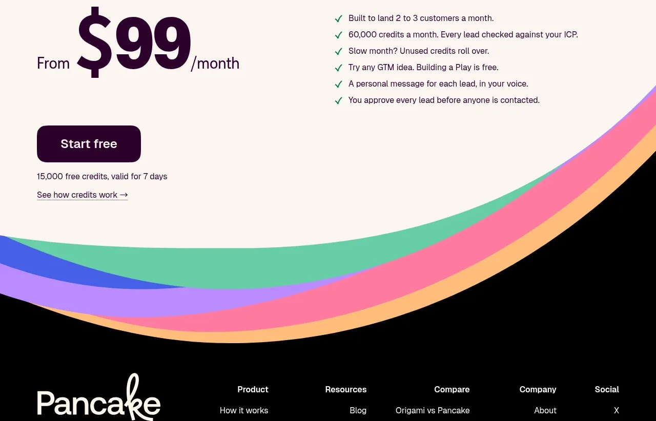
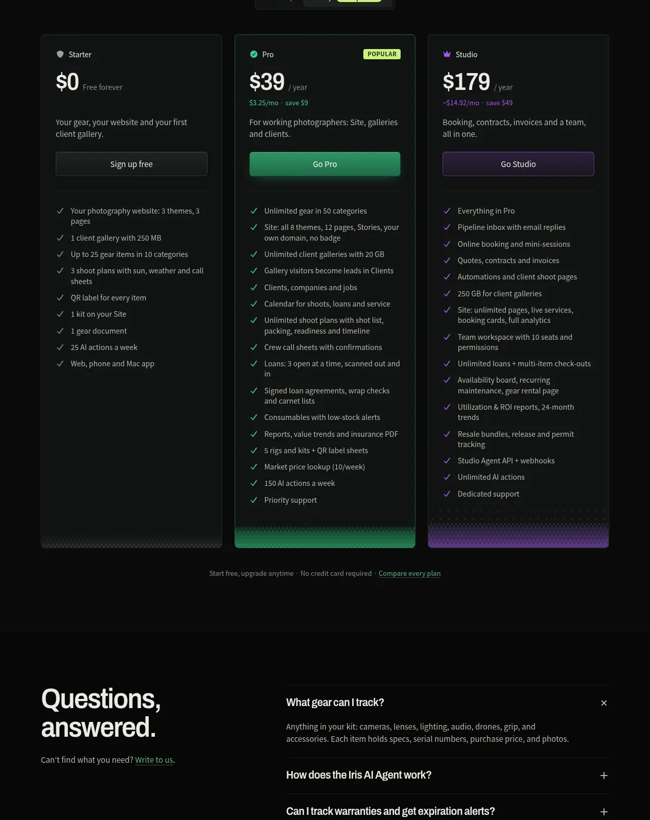
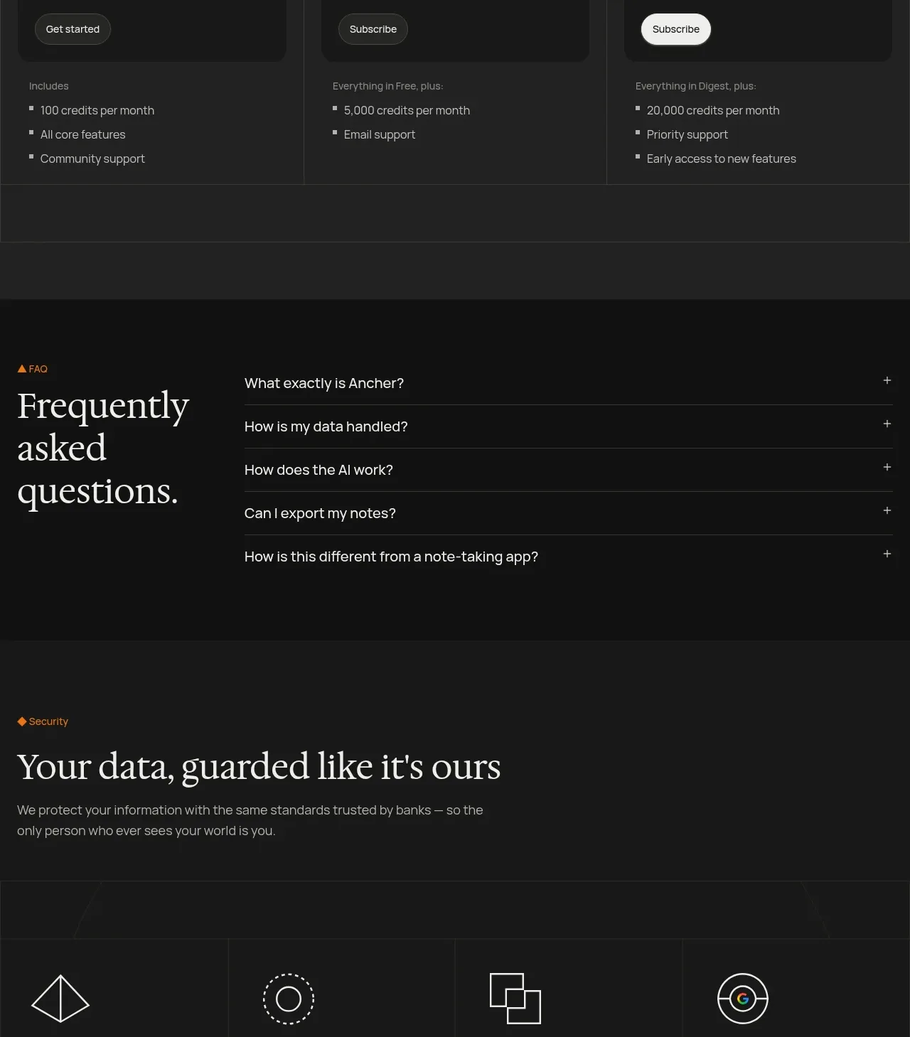
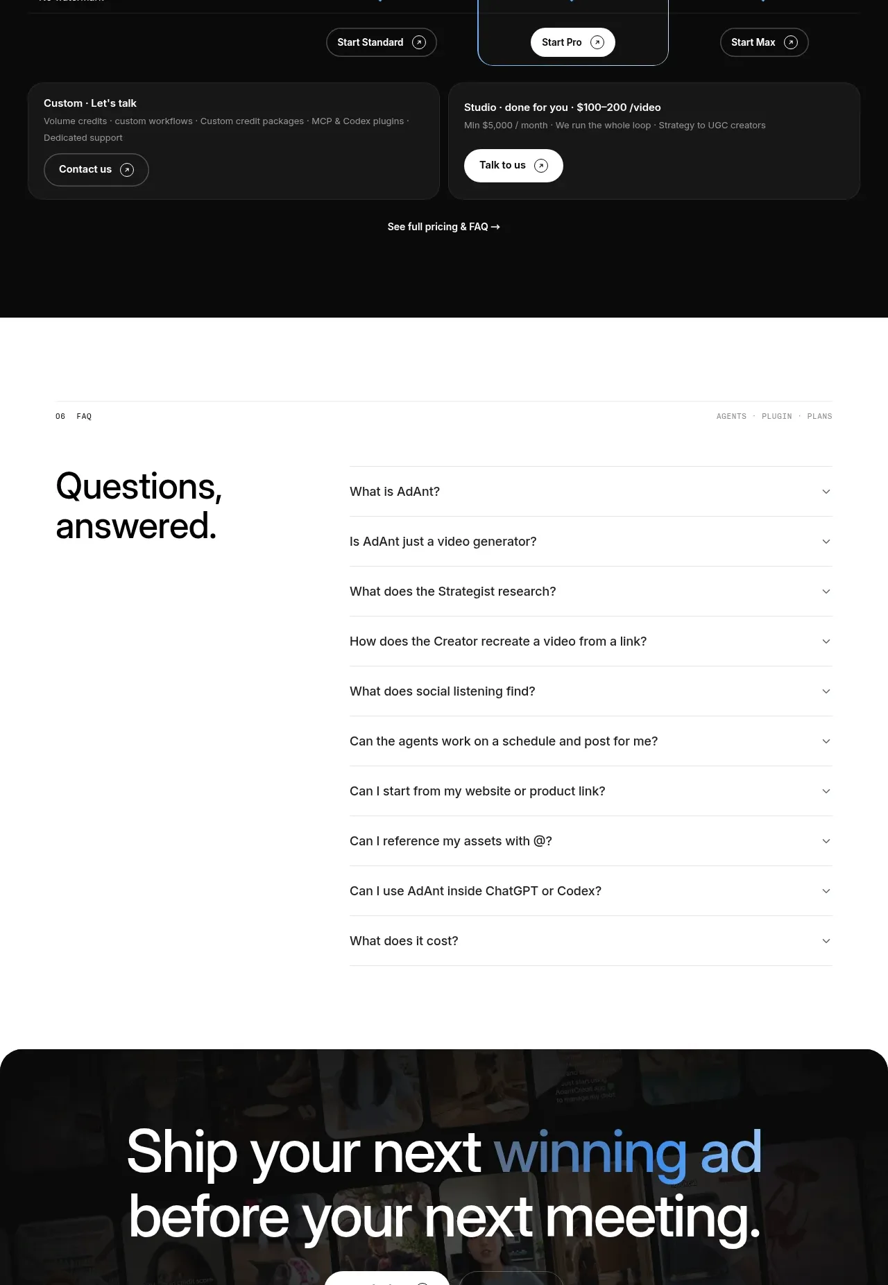
A dark pricing section offers three clear tiers, emphasizes the middle plan, and includes comparison rows plus custom-work CTAs.
Prompt preview
## Reference images

Study these alongside the description below: hierarchy, rhythm, spacing, colour. Build for the product you are asked about, using this design language.

- Component: https://kage-design-assets.t3.tigrisfiles.io/components/adant-2-0/1b13b0a2-e64e-418d-a933-0f40a66c40ee-1792044360-7.webp
- Full page it was cut from: https://kage-design-assets.t3.tigrisfiles.io/screenshots/adant-2-0/1b13b0a2-e64e-418d-a933-0f40a66c40ee-1792044250464-full.webp
- Component on Kage: https://kage.design/component/adant-2-0-pricing-table

## Before you start
Ask what the user's pricing model, billing units, target segments, and preferred conversion action are. Then build pricing that is transparent and original.

Create a dark pricing section with a small pricing overline, a concise heading, a billing toggle, and three horizontally aligned plan columns. Show plan name, large price, billing cadence, short qualification text, and a primary button. Visually emphasize the recommended middle plan with a cool blue outline, slightly lifted surface, and stronger contrast. Under the plan headers, use a compact comparison matrix of meaningful capabilities with checkmarks or short limits. Finish with two subdued custom-plan cards and a small pricing/FAQ link. Use #090A0B, #17191D, #F5F6F8, muted #969DA7, and accent #5B9AE9. Use 36–48px section headings, 28–40px prices, 12–14px labels, 16–24px padding, 16–20px radii, and clear keyboard states. Make monthly/yearly switching update every displayed price and label.

### Never
- Never use logos, product names, copy, illustrations, or imagery from the reference.
- Never copy the reference prices, tier names, feature list, or billing claims.
- Never hide essential limits behind hover-only interactions.