kage
kage
geardex.app
Design analysis
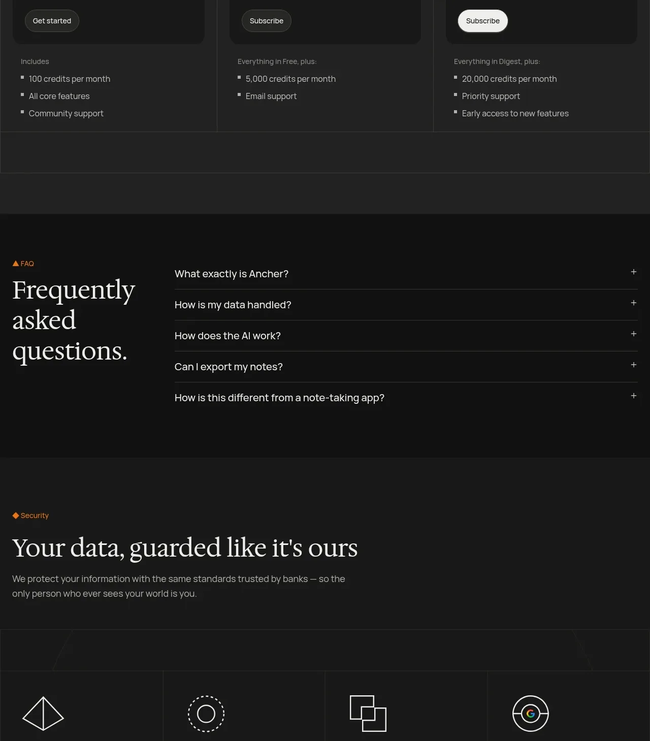
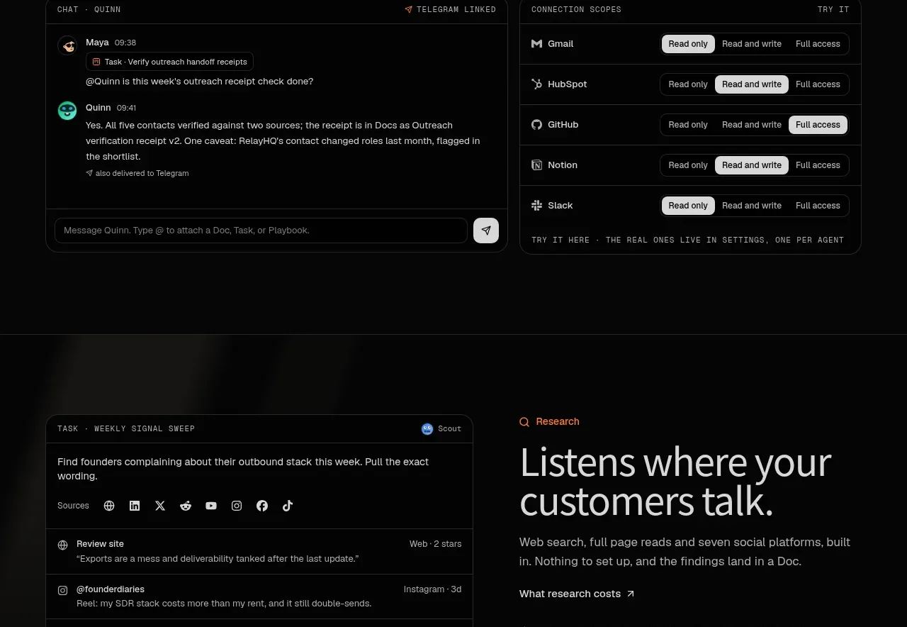
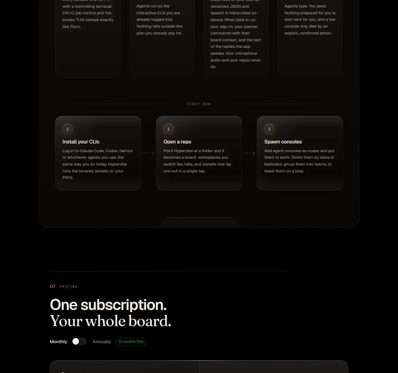
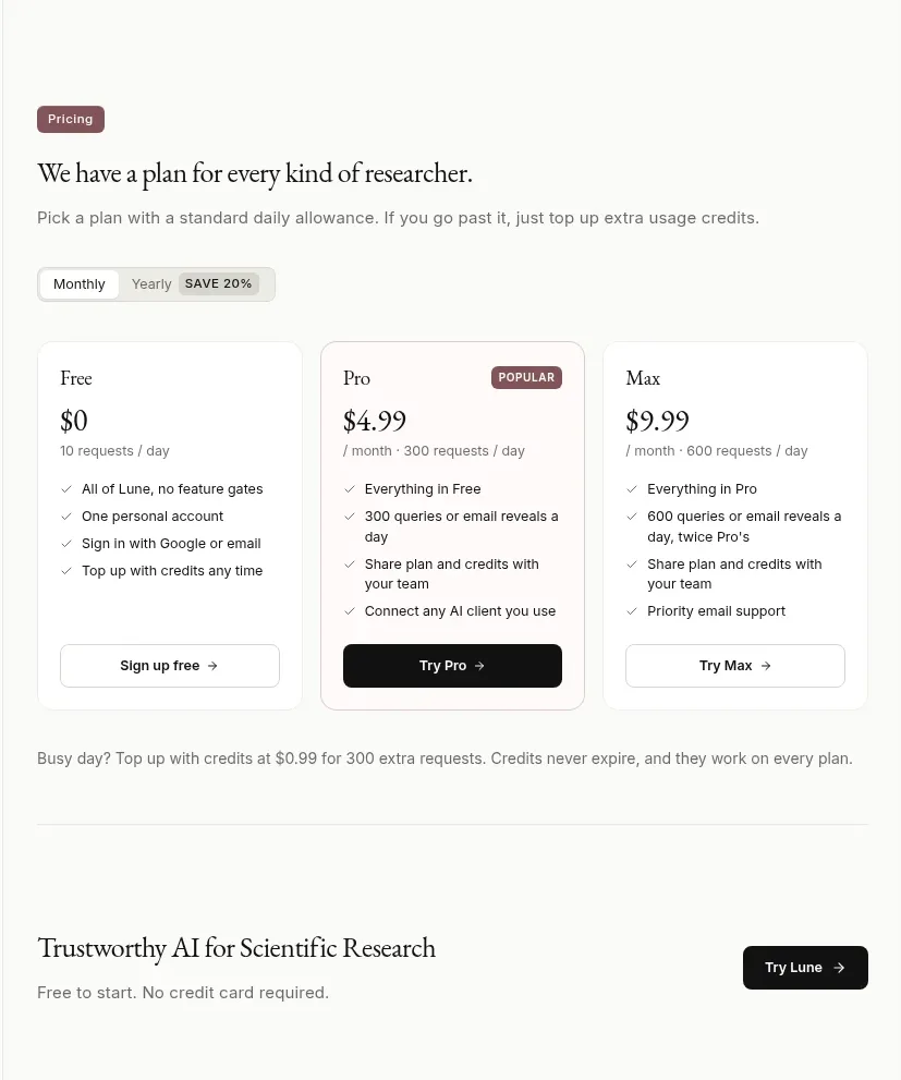
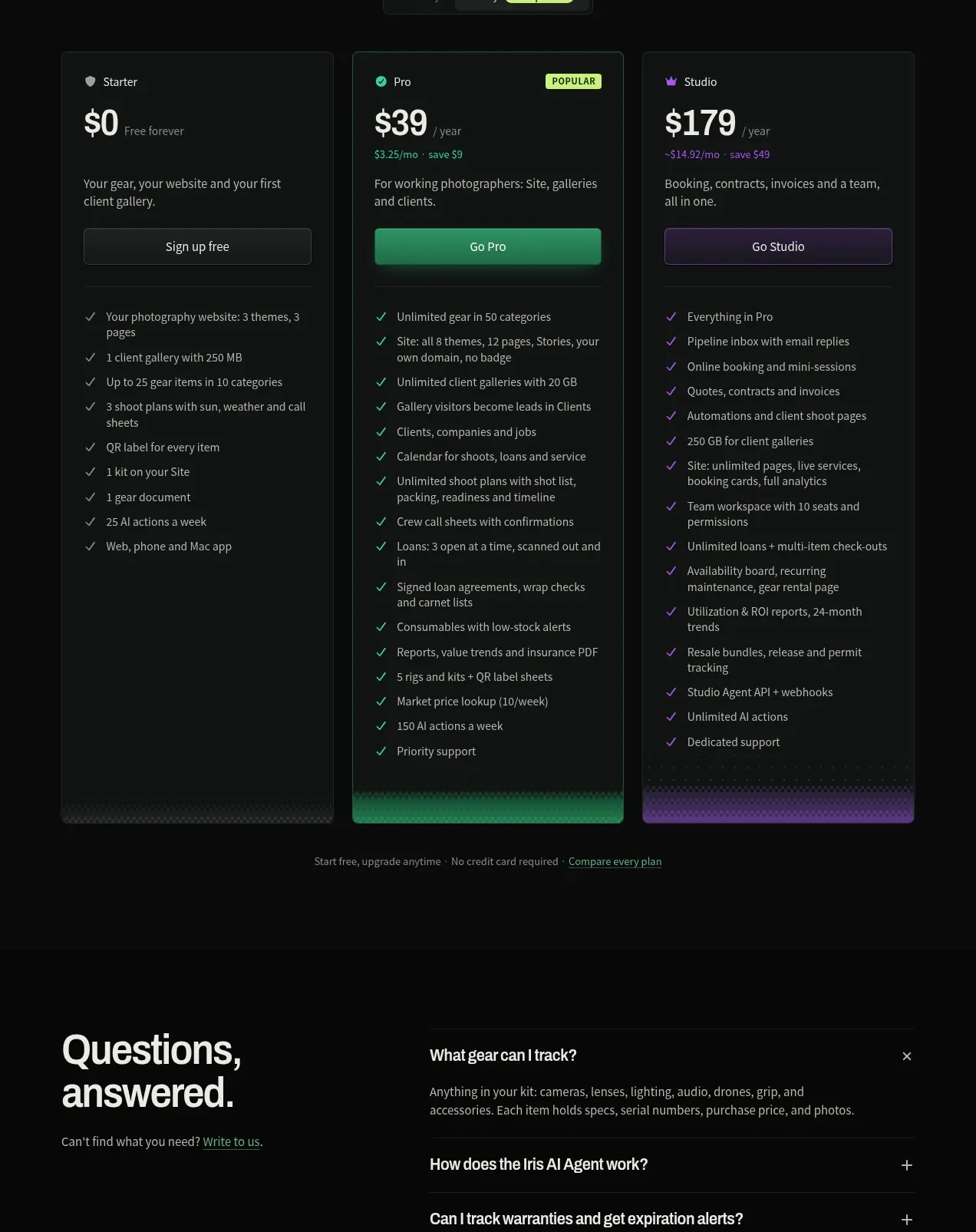
A centered pricing introduction leads into three tall plan cards with monthly/yearly switching, highlighted middle plan, feature checklists, and a reassurance note.
Prompt preview
## Reference images

Study these alongside the description below: hierarchy, rhythm, spacing, colour. Build for the product you are asked about, using this design language.

- Component: https://kage-design-assets.t3.tigrisfiles.io/components/geardex-app/fc33b7d0-970c-45a6-93bf-9b94f05b130c-1791941532-9.webp
- Full page it was cut from: https://kage-design-assets.t3.tigrisfiles.io/screenshots/geardex-app/fc33b7d0-970c-45a6-93bf-9b94f05b130c-1791941487258-full.webp
- Component on Kage: https://kage.design/component/geardex-pricing-table

## Before you start
Ask what the user's product, audience, and brand are, then apply these principles to that product rather than reproducing the reference.

Build a dark pricing section with a centered headline, supporting line, and a compact monthly/yearly segmented control with a savings badge. Below, show three equal-height pricing cards: a modest free tier, a visually emphasized recommended middle tier, and a premium tier. Each card needs plan label, price, billing suffix, short description, full-width CTA, and a vertically spaced checklist of benefits. Use #080a09 background, #121613 cards, #273129 borders, white #edf2ec, muted #929b95, emerald #2bd18b for the recommended plan, and violet or another brand accent for premium. Keep all card bottoms aligned, use 8px radius, and make the toggle interactive with visible selected state.

Never use logos, product names, copy, illustrations, or imagery from the reference.