kage
kage
hypervibe.so
Design analysis
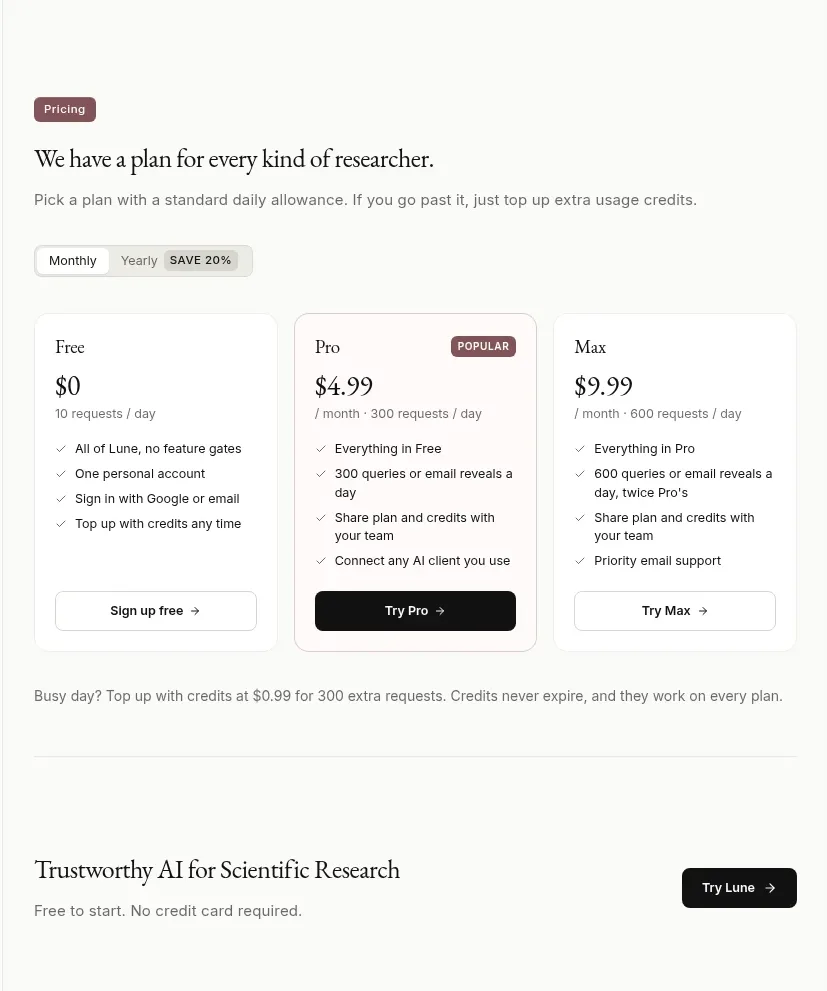
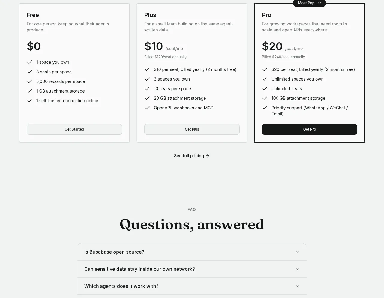
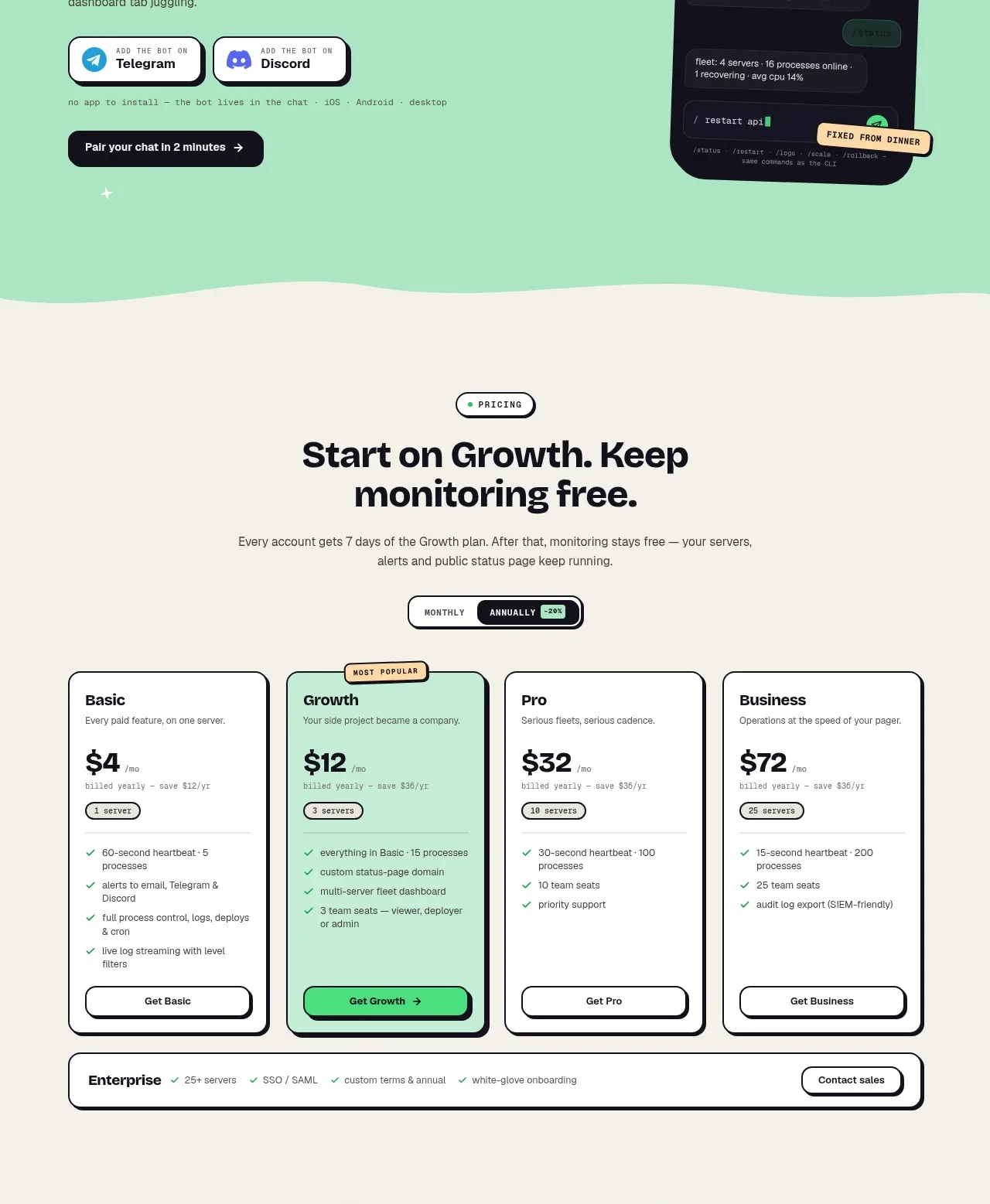
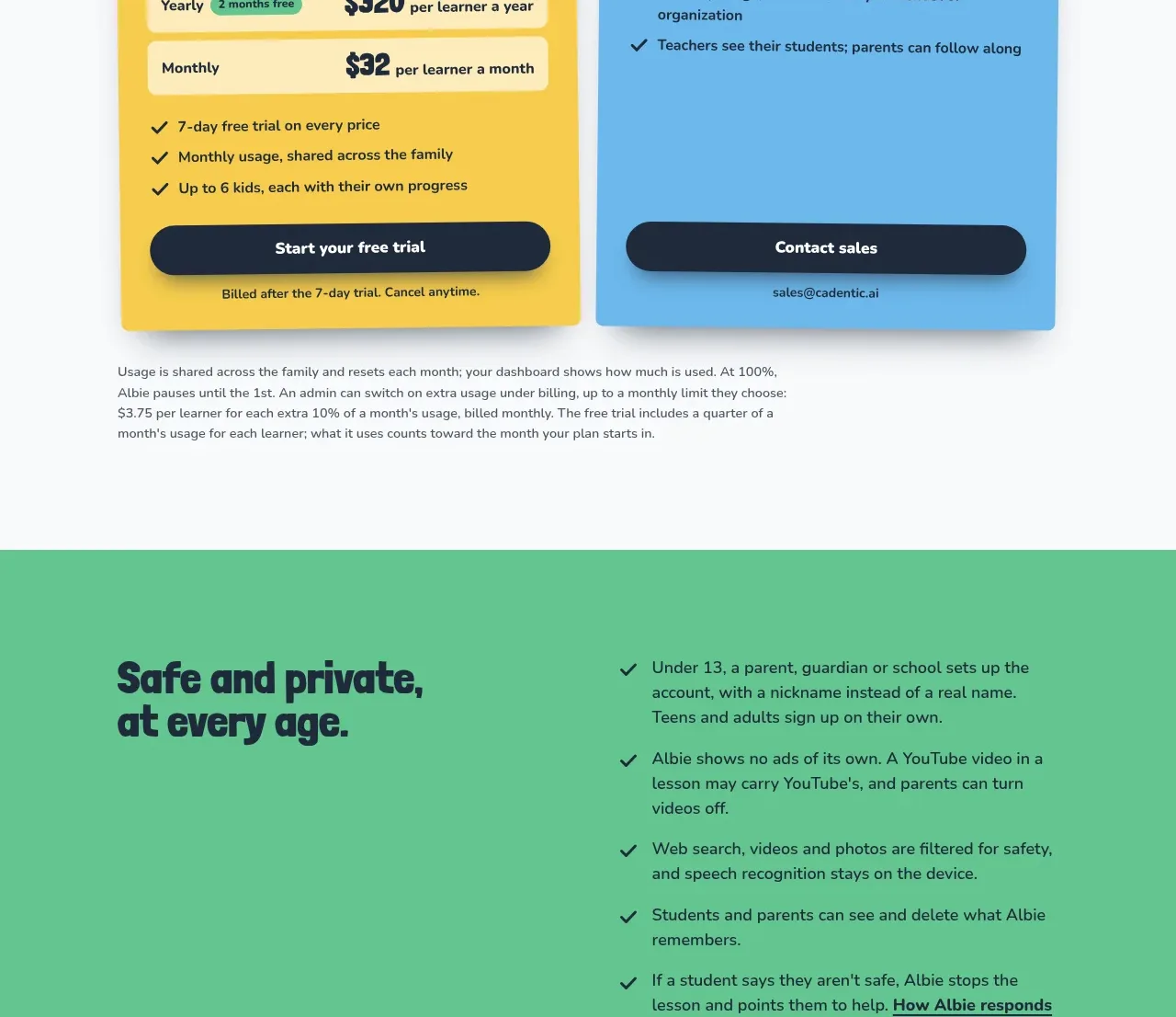
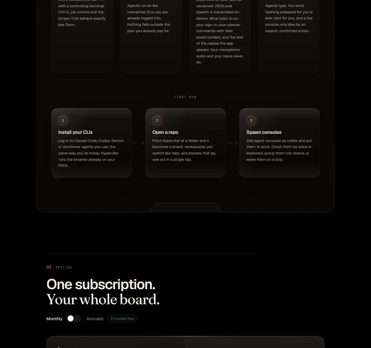
The pricing area leads with a clear subscription headline, presents one emphasized plan, and follows with compact expandable objections.
Prompt preview
## Reference images

Study these alongside the description below: hierarchy, rhythm, spacing, colour. Build for the product you are asked about, using this design language.

- Component: https://kage-design-assets.t3.tigrisfiles.io/components/hypervibe/0f025394-2dff-4c9b-be5f-8e394ec4a30f-1791699117-9.webp
- Full page it was cut from: https://kage-design-assets.t3.tigrisfiles.io/screenshots/hypervibe/0f025394-2dff-4c9b-be5f-8e394ec4a30f-1791699070438-full.webp
- Component on Kage: https://kage.design/component/hypervibe-pricing-table

## Before you start
Ask what the user's pricing model, billing cadence, included limits, refund policy, and conversion action are. Then build an honest pricing section using these rules.

Create a pricing section with a small numbered eyebrow, a large two-line heading, and a monthly/annual toggle. Feature one dominant pricing card with plan label, large price, billing qualifier, primary CTA, and a two-column or stacked list of included benefits. Use a dark #11110f card, 1px rgba(255,255,255,.14) border, 14–18px radius, off-white typography, muted supporting text, and a warm orange CTA (#ff7645). Below the card, add a compact accordion list for common pricing questions with clear plus icons and keyboard support. Make the price and included limits scannable; show taxes or cancellation details if relevant.

### Never
- Never use logos, product names, copy, illustrations, or imagery from the reference.
- Never copy the reference price, plan name, FAQ questions, or guarantees.
- Never hide material limits or make the billing toggle misleading.