kage
kage
luneresearch.com
Design analysis
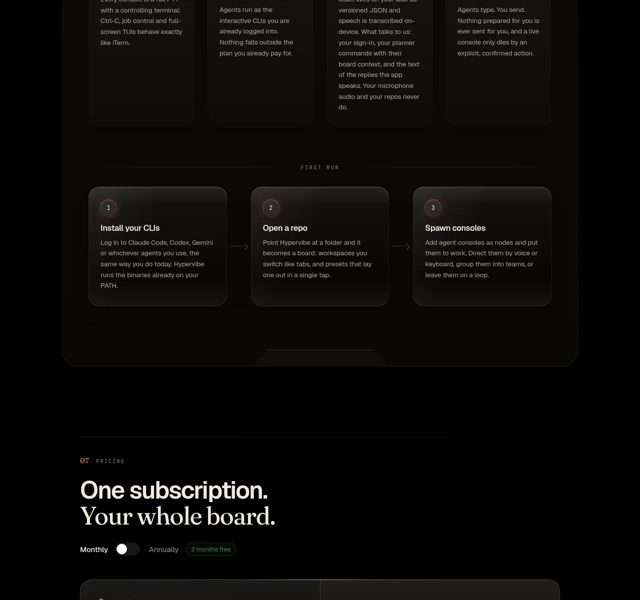
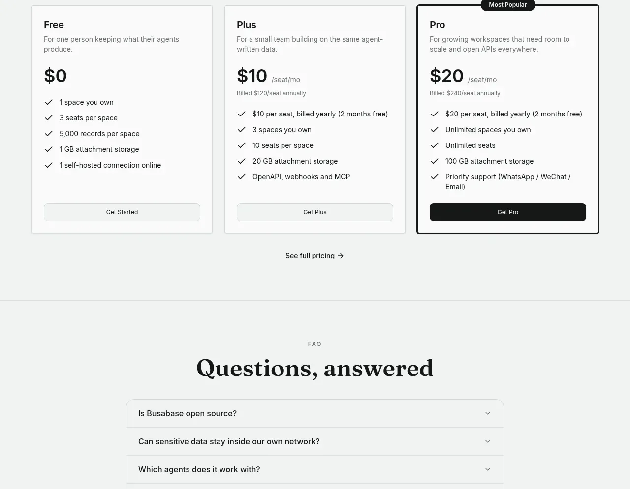
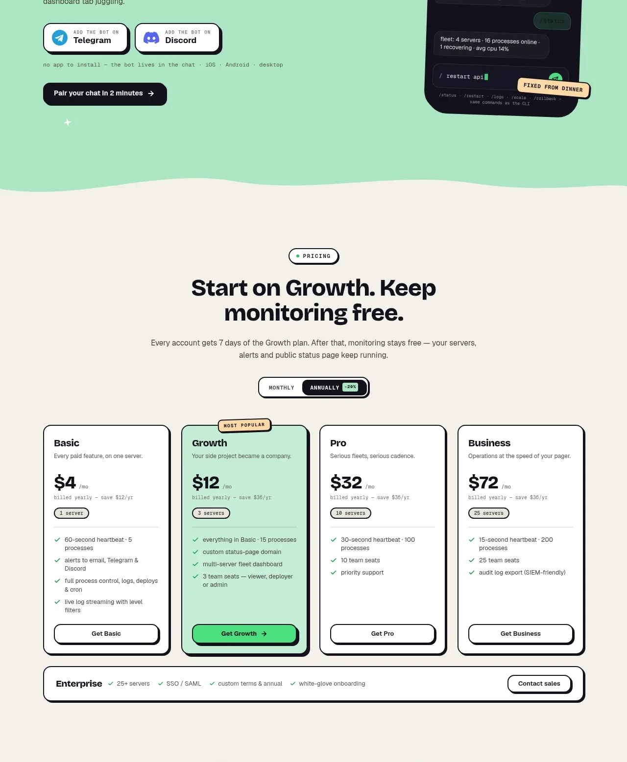
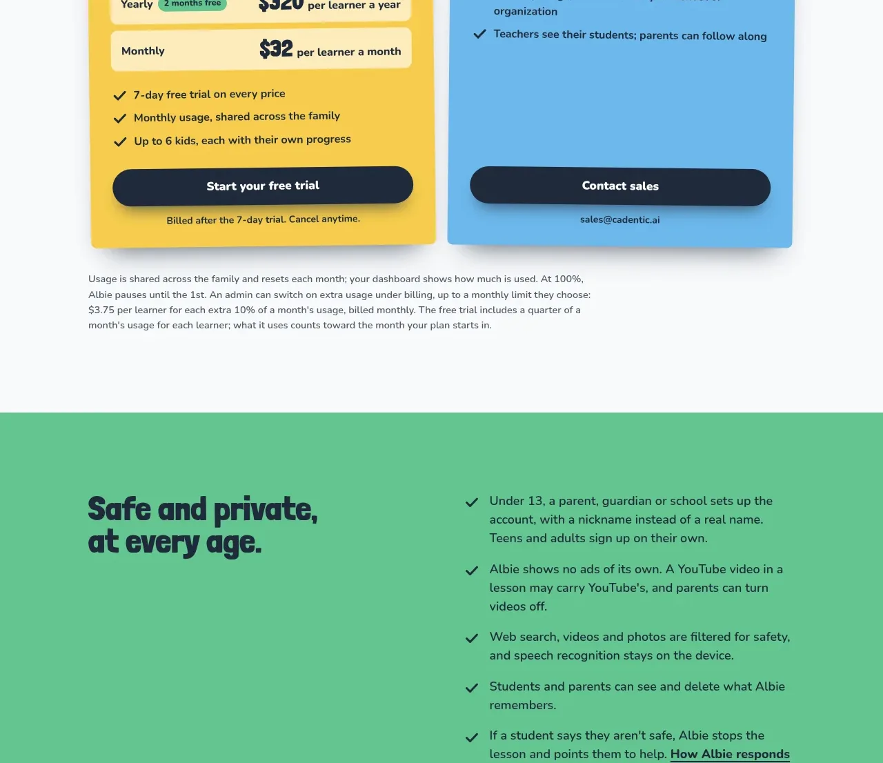
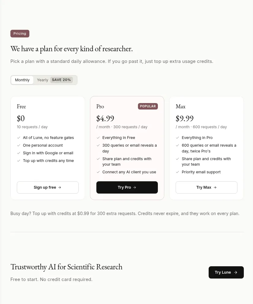
The pricing section uses a billing toggle and three vertically comparable plans, with the middle plan visually emphasized and a usage-credit note beneath.
Prompt preview
## Reference images

Study these alongside the description below: hierarchy, rhythm, spacing, colour. Build for the product you are asked about, using this design language.

- Component: https://kage-design-assets.t3.tigrisfiles.io/components/lune/4bf7ff48-f6a1-4cc9-aba1-cb69c6f24fa8-1791698510-5.webp
- Full page it was cut from: https://kage-design-assets.t3.tigrisfiles.io/screenshots/lune/4bf7ff48-f6a1-4cc9-aba1-cb69c6f24fa8-1791698434673-full.webp
- Component on Kage: https://kage.design/component/lune-pricing-table

## Before you start
Ask what plans, limits, and billing model the user's product actually has. Use those details to build a transparent, honest pricing component.

Create a three-tier pricing section with a small eyebrow, serif heading, supporting copy, and a monthly/yearly segmented toggle with a savings indicator. Use equal-height cards for entry, recommended, and highest-capacity plans. Each card needs a plan name, prominent price, billing/usage qualifier, concise checkmarked benefits, and a full-width CTA. Emphasize the recommended tier with a darker border, small badge, or filled CTA, not excessive color. Add a compact note below about overage or usage credits. Use #f8f8f5 page background, #fff cards, #171716 text, #777772 secondary text, #deded8 borders, and a muted plum accent #765665 for the recommendation. Radius 8px, card padding 18–22px, 12px body text, and 28–34px price text. Toggle values and prices must update accessibly; CTAs need loading, focus, and disabled states.

Never: use the reference's logos, product names, copy, illustrations, imagery, or exact prices.