kage
kage
squadroom.app
Design analysis
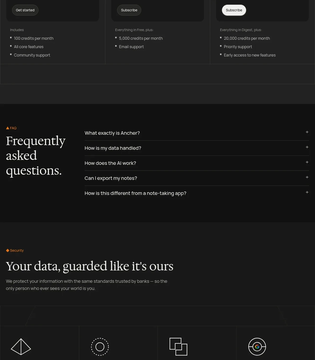
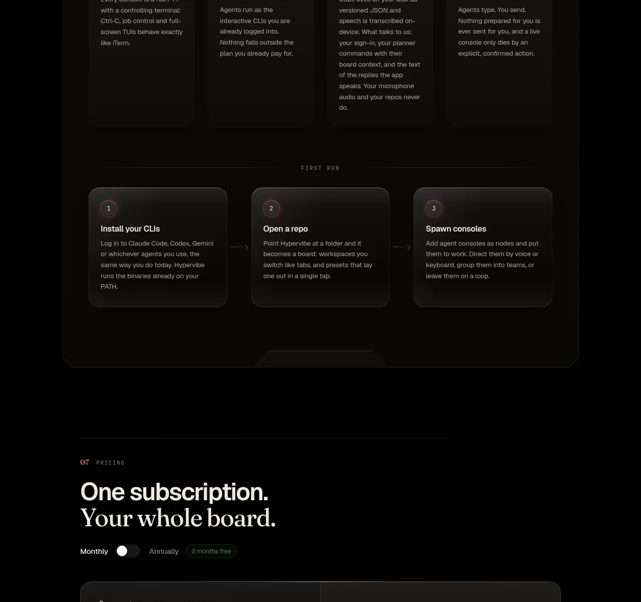
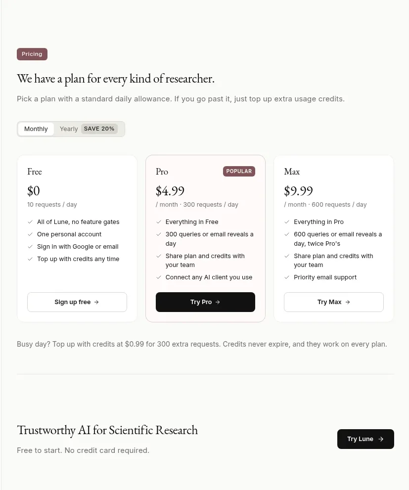
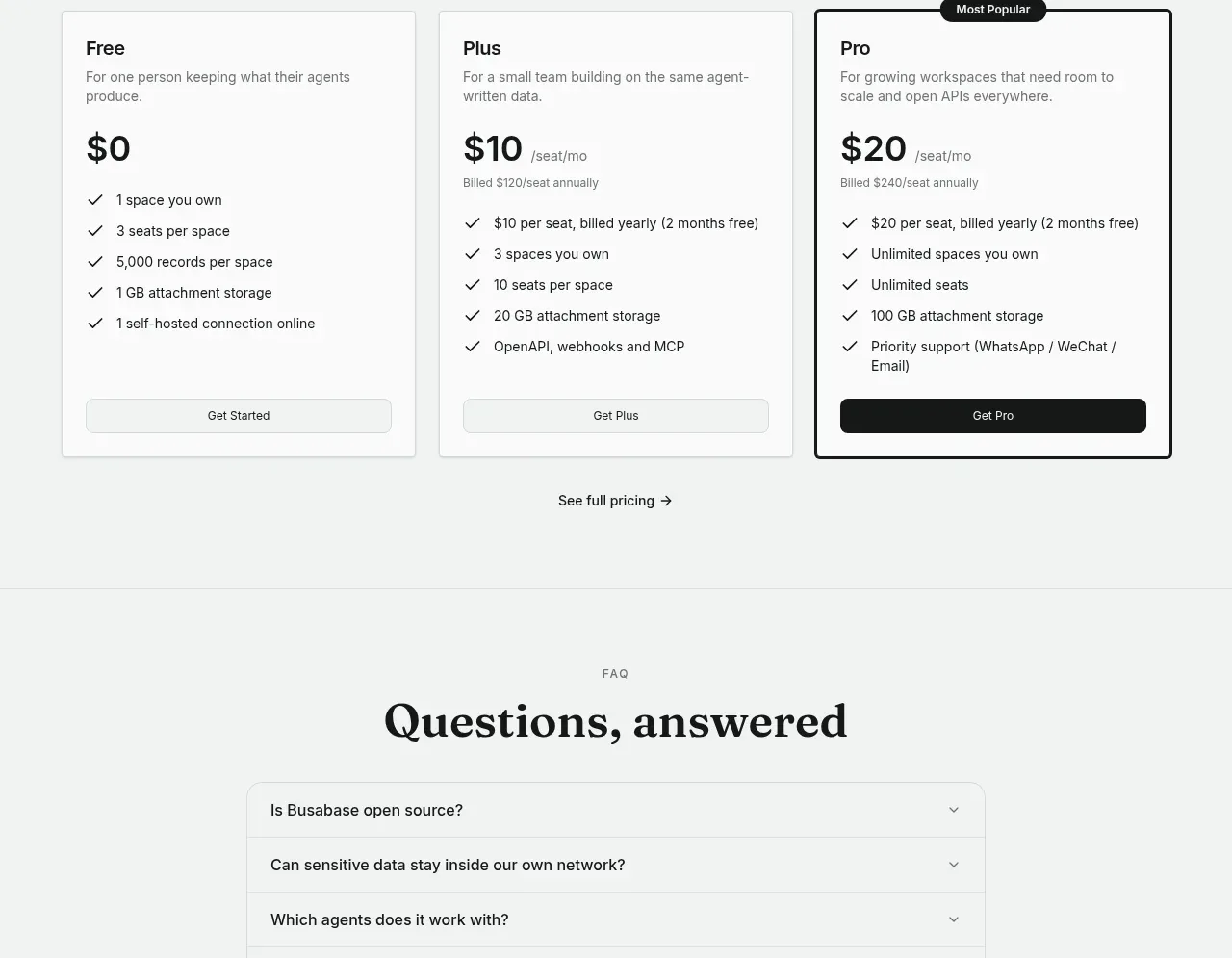
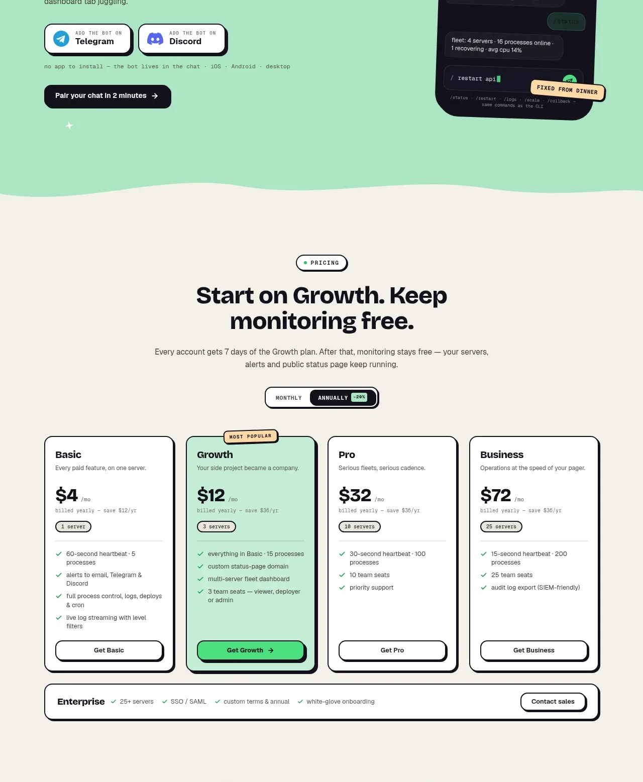
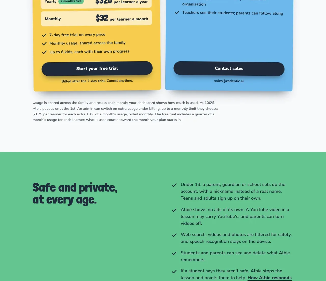
A single-plan pricing block reduces choice overload by placing the value proposition beside one prominent price card and a concise feature checklist.
Prompt preview
## Reference images

Study these alongside the description below: hierarchy, rhythm, spacing, colour. Build for the product you are asked about, using this design language.

- Component: https://kage-design-assets.t3.tigrisfiles.io/components/squadroom/d449f1a3-a1d7-46c0-a9d5-0020447fa3ed-1791871293-8.webp
- Full page it was cut from: https://kage-design-assets.t3.tigrisfiles.io/screenshots/squadroom/d449f1a3-a1d7-46c0-a9d5-0020447fa3ed-1791871247696-full.webp
- Component on Kage: https://kage.design/component/squadroom-pricing-table

## Before you start
Ask what the user's pricing model, billing unit, guarantee, and strongest purchase objection are. Design a trustworthy original pricing block around those answers.

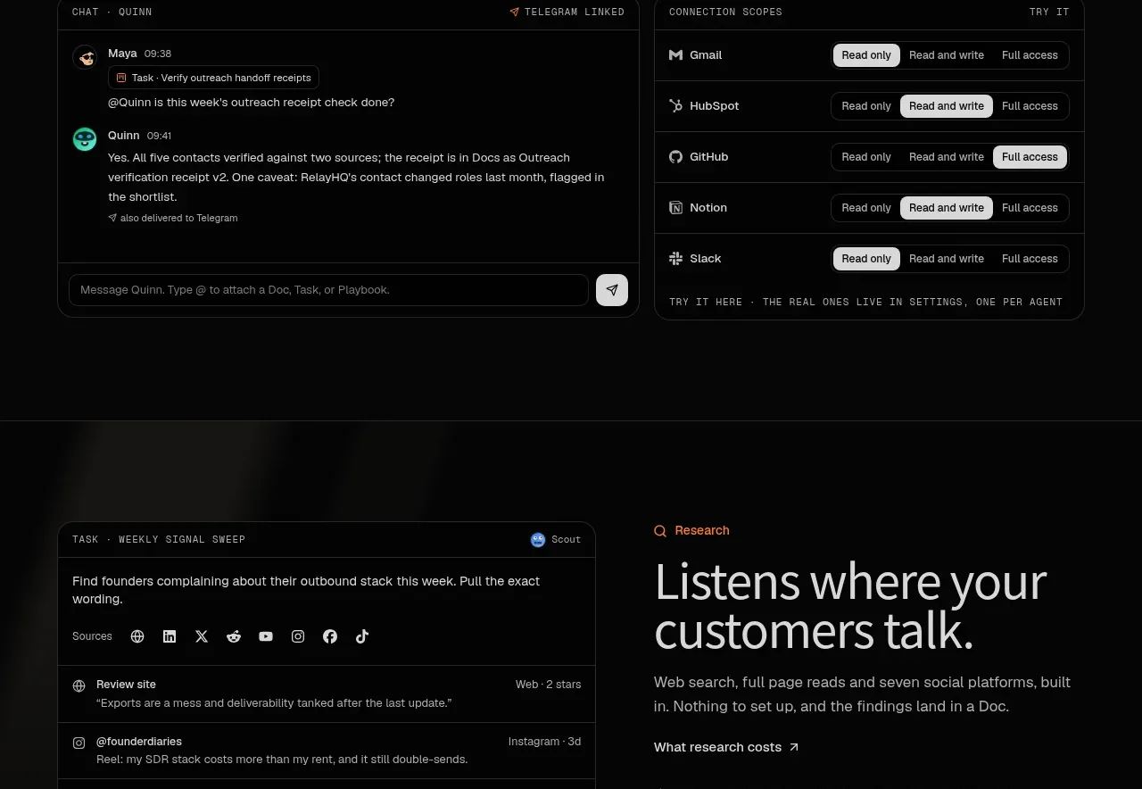
Build a dark pricing section with a two-column layout. The left side contains a small pricing eyebrow, a large concise heading, supporting copy, a pricing-details link, and a short changelog or recently shipped list. The right side is one elevated plan card with a large price, billing cadence, reassurance or guarantee line, two-column checklist, and bright purchase CTA.

Use #070707 background, #e7e7e3 text, #92928d copy, #252525 borders, and 12–16px radius. Make the price visually dominant with a 48–60px numeral, while keeping supporting metadata small. Use orange #ff7624 for checkmarks and early-access emphasis, and an off-white button with a circular orange arrow. Keep feature rows aligned and scannable. Collapse to one column on mobile.

Never: use logos, product names, copy, illustrations, or imagery from the reference.