kage
kage
ancher.ai
Design analysis
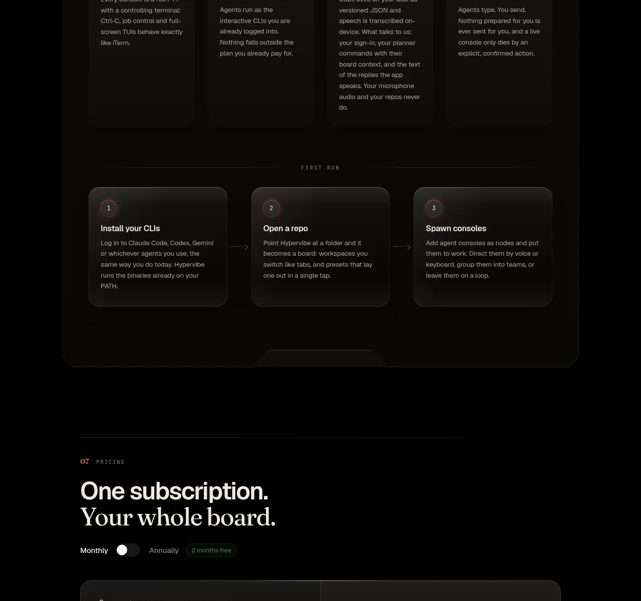
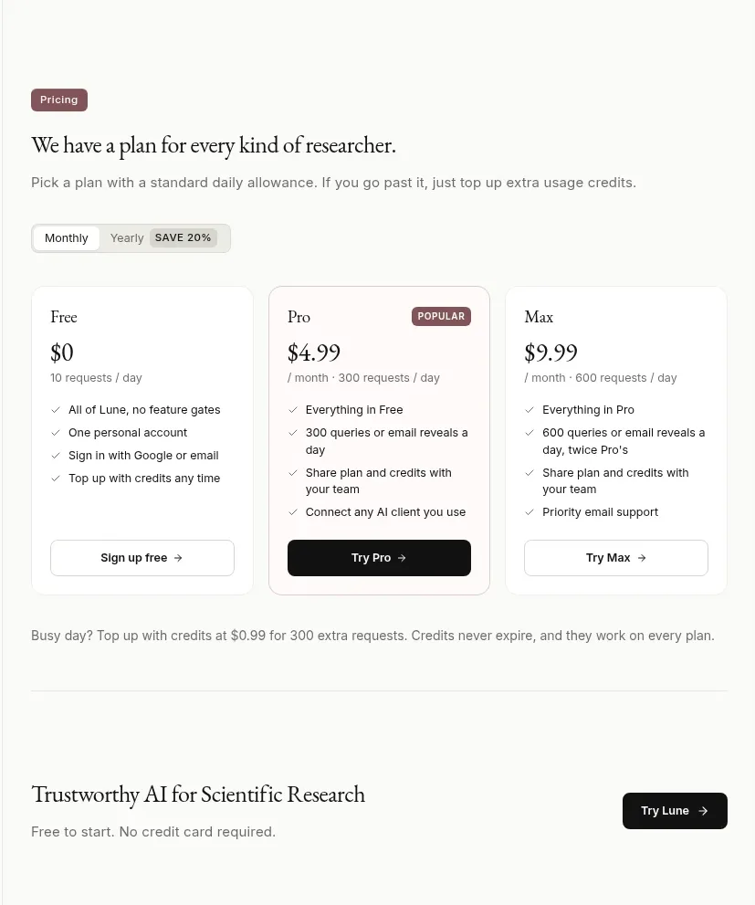
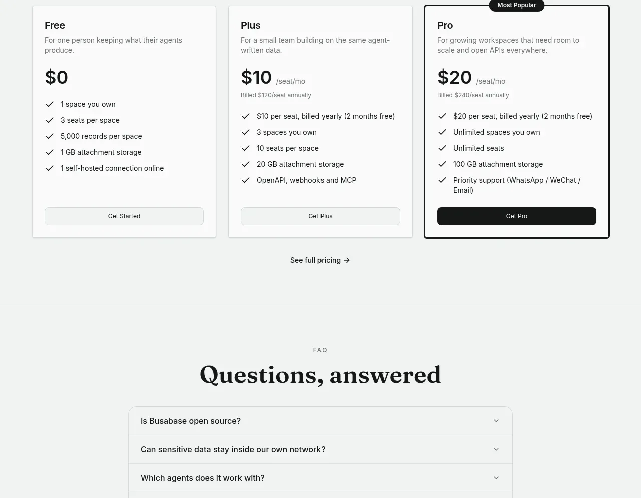
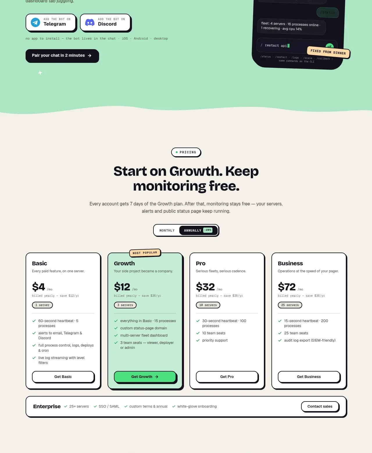
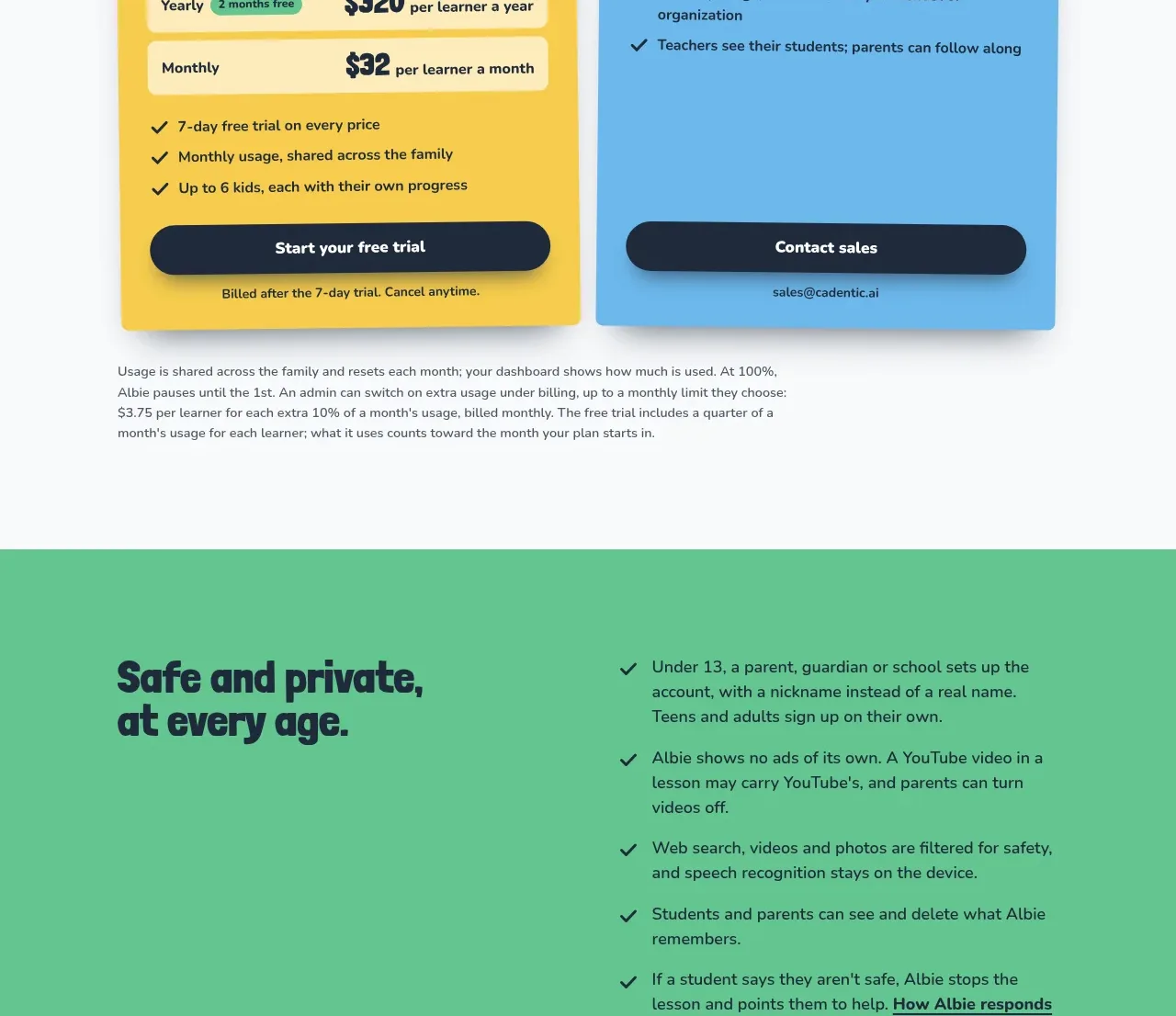
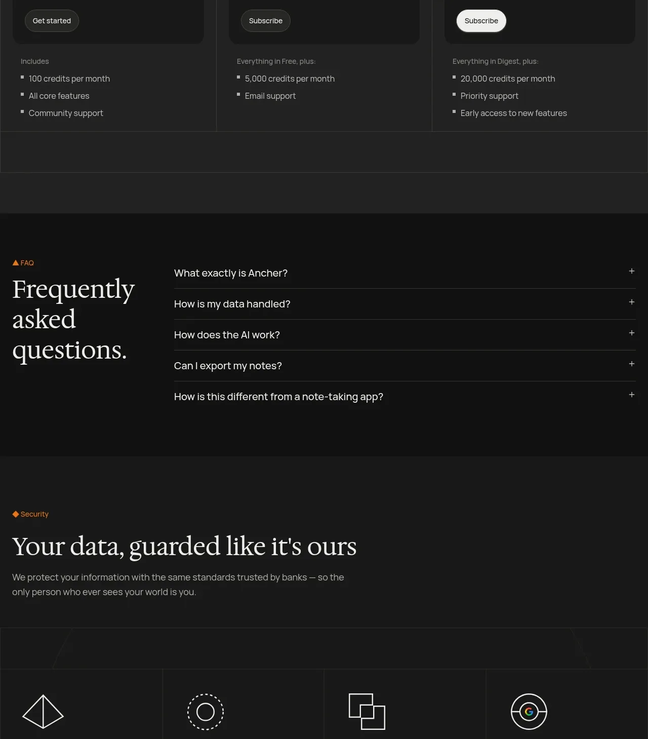
Pricing is introduced with a clear editorial heading, a monthly/yearly switch, and three comparable plans with one prominent recommended action.
Prompt preview
## Reference images

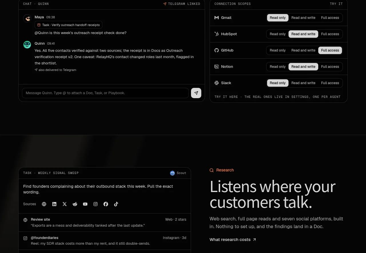
Study these alongside the description below: hierarchy, rhythm, spacing, colour. Build for the product you are asked about, using this design language.

- Component: https://kage-design-assets.t3.tigrisfiles.io/components/ancher-2-0/49a60068-1f5d-45e9-9623-df337c2895cf-1791871461-8.webp
- Full page it was cut from: https://kage-design-assets.t3.tigrisfiles.io/screenshots/ancher-2-0/49a60068-1f5d-45e9-9623-df337c2895cf-1791871353691-full.webp
- Component on Kage: https://kage.design/component/ancher-2-0-pricing-table

## Before you start
Ask about the user's pricing model, billing cadence, target segments, and which plan should be recommended. Use that information rather than copying any reference plan.

Build a dark pricing section with an eyebrow, a two-line serif heading, supporting copy, and a small monthly/yearly segmented toggle with a savings note. Below, use three equal plan columns: name, audience label, price, billing note, short value proposition, primary button, and a concise feature list. Use a slightly lighter surface for the recommended plan or recommended button, not a loud banner. Add subtle vertical rules and consistent row alignment. Use #242424 section surface, #171717 plan cards, #f0ece4 headings, #969088 copy, orange #e9821c accent, and white or pale neutral for the strongest CTA. Use 8px card radius, 16px padding, and make the toggle and buttons keyboard accessible. Stack plans on mobile.

Never: use logos, product names, copy, illustrations, or imagery from the reference.