kage
kage
agentcraft.ai
Design analysis
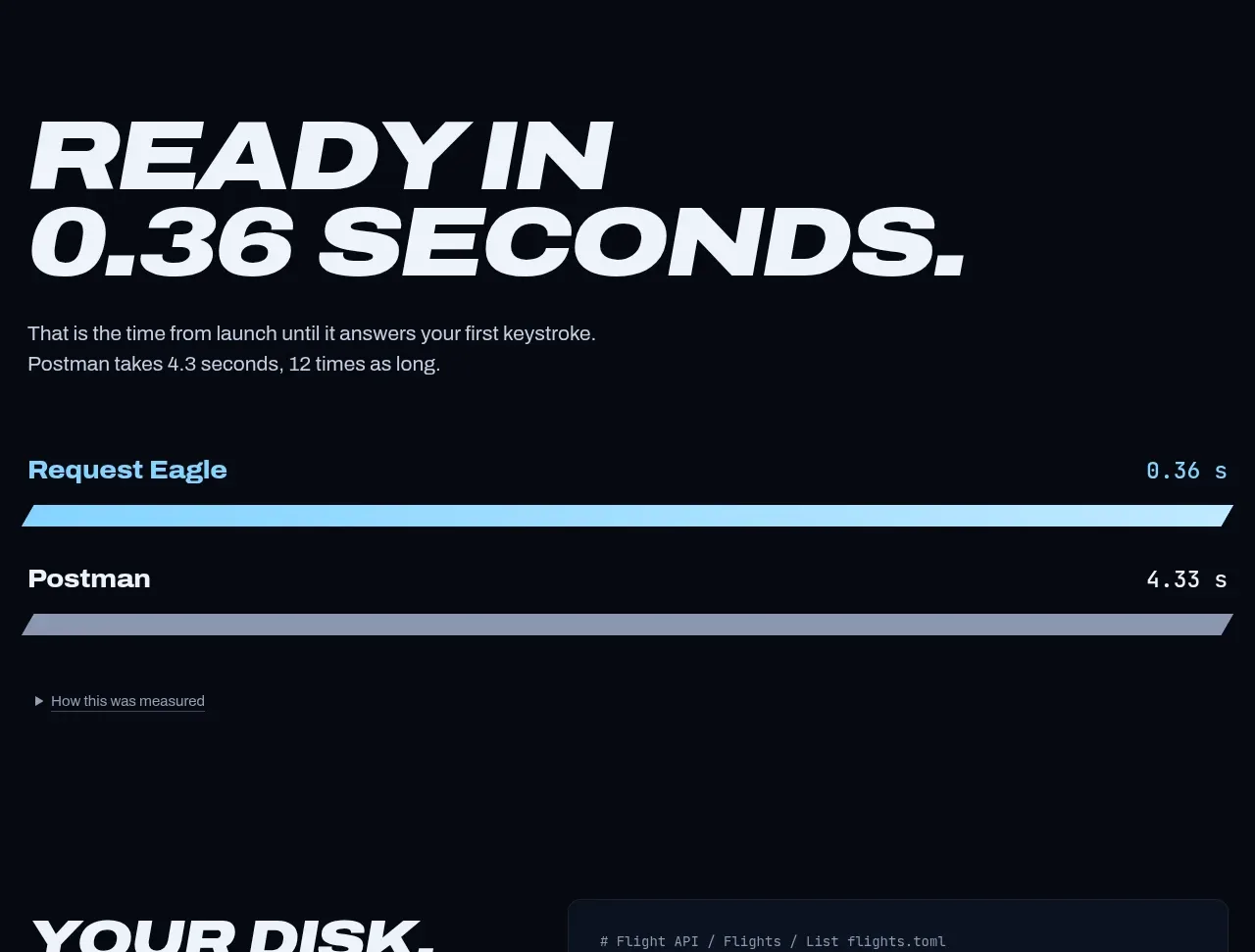
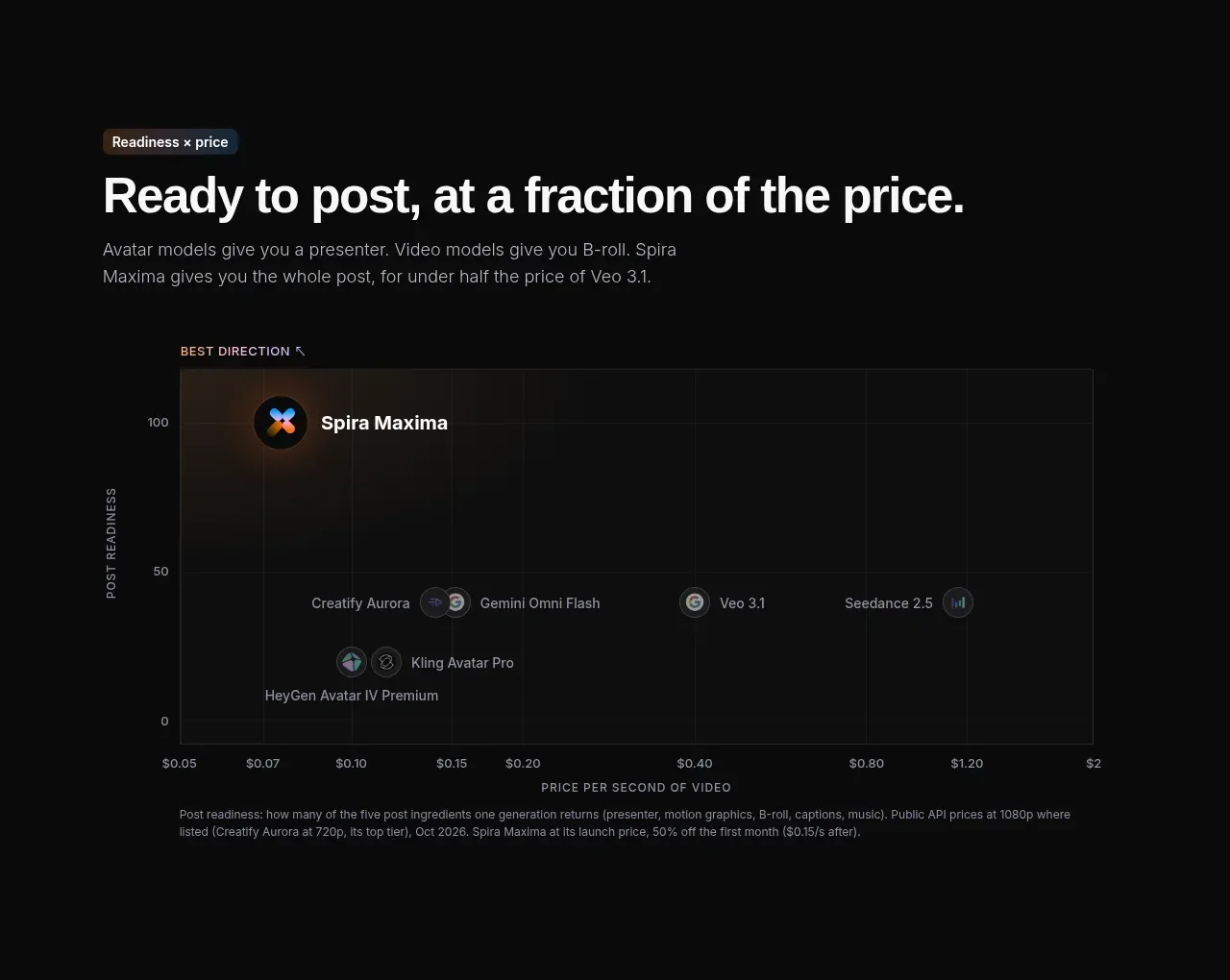
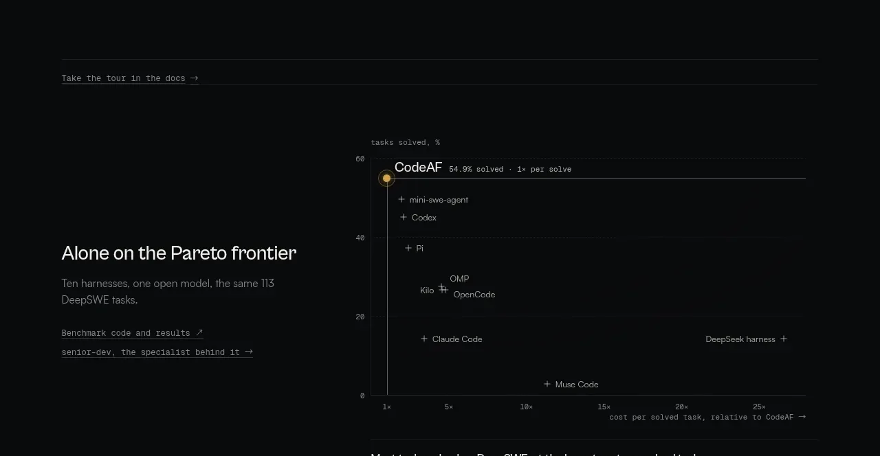
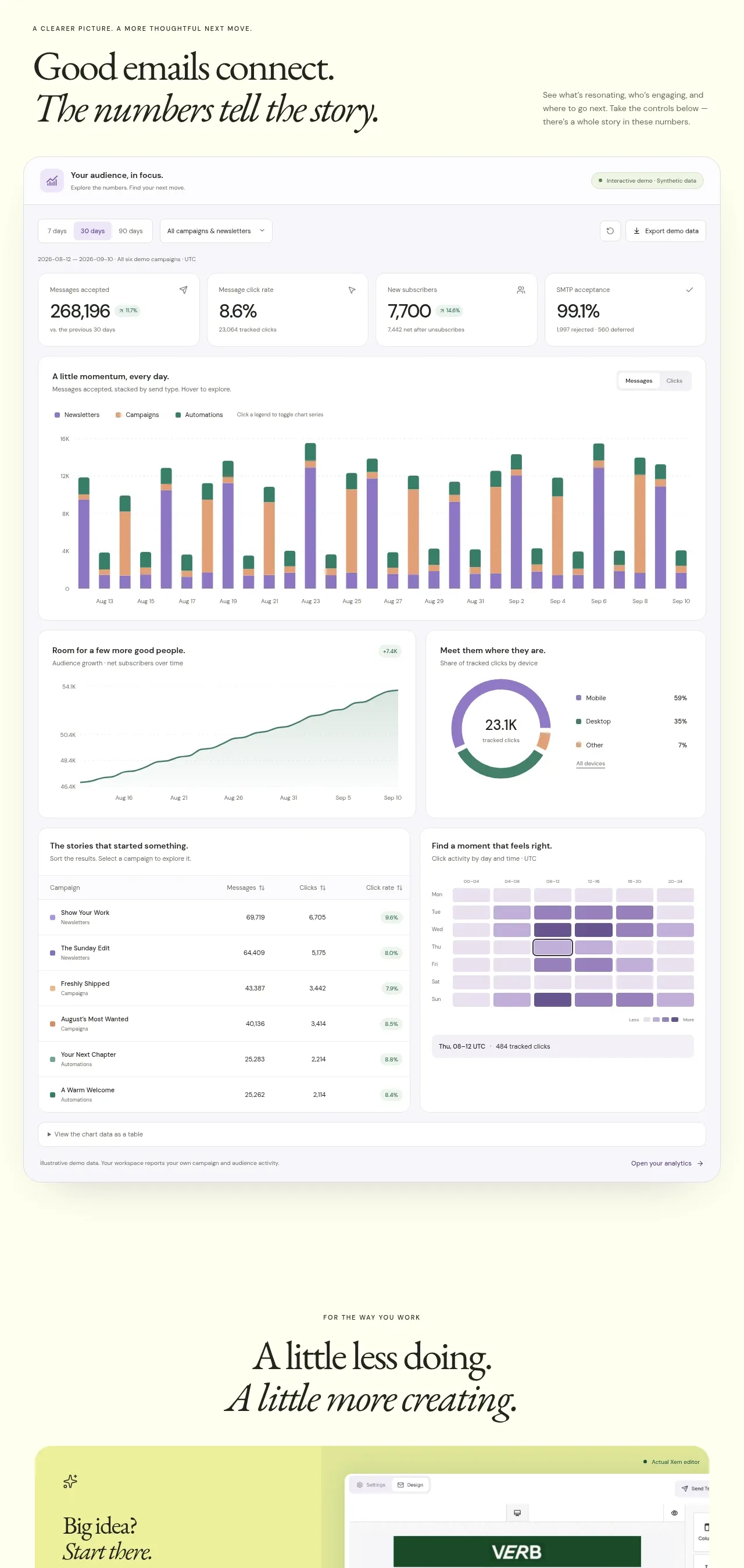
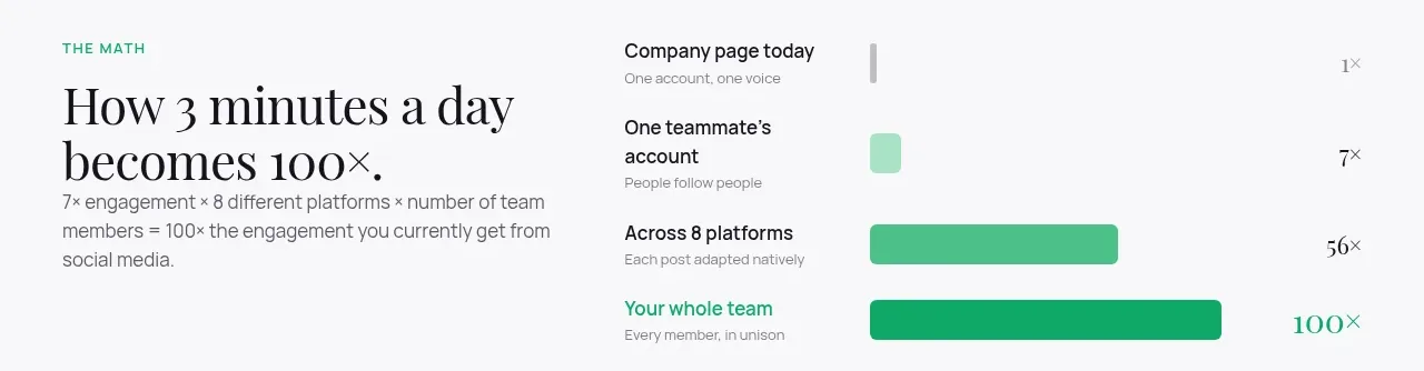
A split section pairs a concise explanatory heading with a horizontal bar comparison that dramatizes increasing team leverage.
Prompt preview
## Reference images

Study these alongside the description below: hierarchy, rhythm, spacing, colour. Build for the product you are asked about, using this design language.

- Component: https://kage-design-assets.t3.tigrisfiles.io/components/agent-craft/d8105fc6-c65e-46ba-b702-5f209216873d-1791957789-2.webp
- Full page it was cut from: https://kage-design-assets.t3.tigrisfiles.io/screenshots/agent-craft/d8105fc6-c65e-46ba-b702-5f209216873d-1791957724400-full.webp
- Component on Kage: https://kage.design/component/agent-craft-chart

## Before you start
Ask what the user's product and brand are, then apply these principles to that product rather than copying the reference.

Build a compact two-column comparison section: left side has a small uppercase eyebrow, a 34–44px editorial heading, and one explanatory sentence; right side has a labeled horizontal bar chart with 3–4 rows. Start bars with a thin baseline or small marker and increase widths clearly from muted gray to saturated green. Use a white or warm-gray background (#fafafd), serif display heading in charcoal (#17171b), sans-serif labels in #55565d, pale mint support (#dff5ea), and green bars (#29b881 to #0b9e6c). Include direct value labels aligned to the far right. Keep the chart accessible with text values and responsive stacking under 720px.

### Never
- Never reuse logos, product names, copy, illustrations, or imagery from the reference.
- Never use misleading scales or make the chart depend on color alone.