 kage
kage
partners.axiom.co
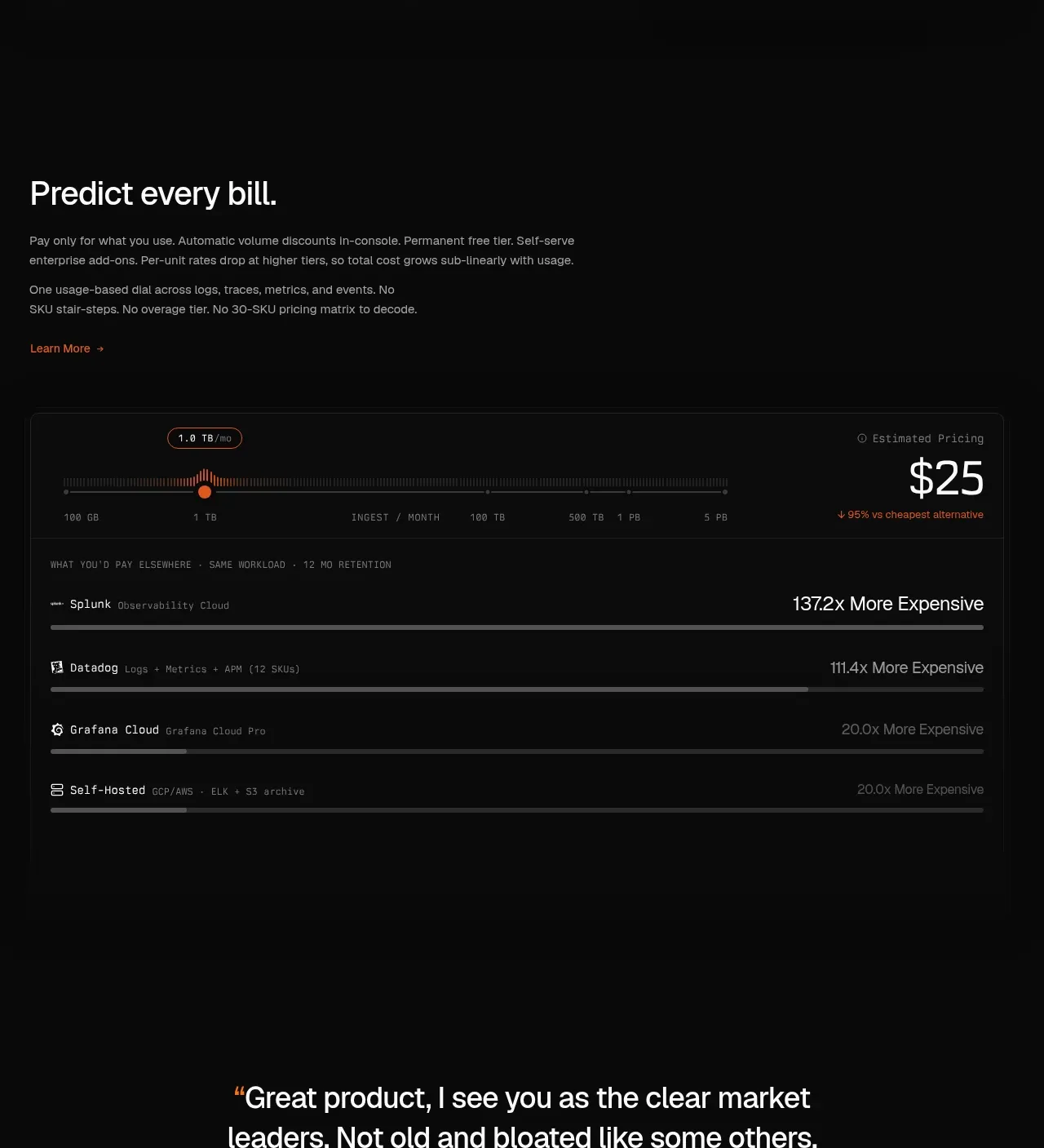
Design analysis
A pricing explanation transitions into a large horizontal usage chart that contrasts predictable usage pricing with more expensive alternatives.
Prompt preview
## Reference images

Study these alongside the description below: hierarchy, rhythm, spacing, colour. Build for the product you are asked about, using this design language.

- Component: https://kage-design-assets.t3.tigrisfiles.io/components/axiom/c8c1ccab-fdeb-4f51-a10a-de94b7cc1af3-1789711531-5.webp
- Full page it was cut from: https://kage-design-assets.t3.tigrisfiles.io/screenshots/axiom/c8c1ccab-fdeb-4f51-a10a-de94b7cc1af3-1789711409328-full.webp
- Component on Kage: https://kage.design/component/axiom-chart

## Before you start
Ask how the user's product is priced, what unit drives cost, and which alternatives users compare against. Build an original explanatory pricing visualization.

Use a dark section with a left-aligned headline, concise pricing rationale, and an accent link. Follow with a wide bordered chart panel: a subtle horizontal scale, a highlighted usage marker, a prominent current price callout, and several comparison rows rendered as horizontal bars. Use near-black surfaces (#0a0b0b), #252525 rules, muted gray labels, off-white numeric emphasis, and a warm orange marker/accent (#ec713d). Use monospace or tabular numerals for measurements, rounded 6px panel corners, and ample 24–32px padding. Make the chart responsive: let labels wrap and allow comparison rows to stack, while keeping the primary price visually dominant. If interactive, make the usage marker keyboard accessible and update the price live.

Never: copy logos, product names, copy, illustrations, or imagery from the reference.
More components
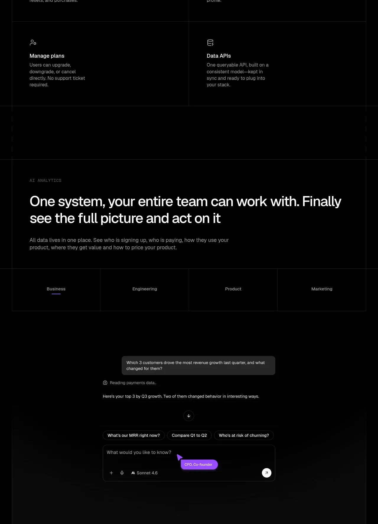
 Analytics and agent insight workspace
tiun. · Chart
Analytics and agent insight workspace
tiun. · Chart
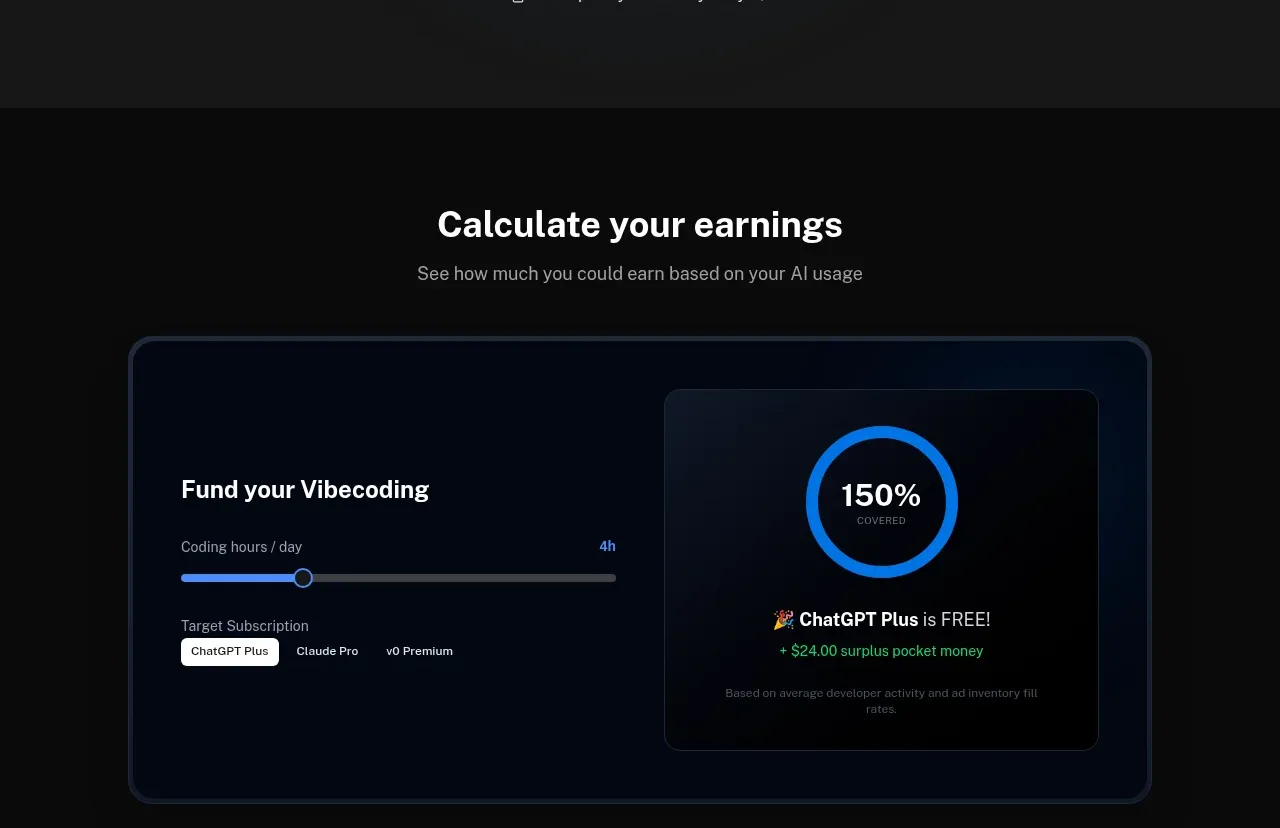
 Earnings calculator
Idlen · Chart
Earnings calculator
Idlen · Chart
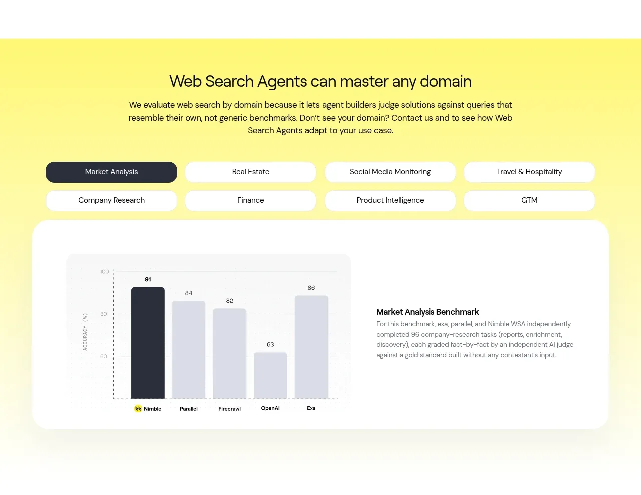
 Domain benchmark and tabs
Web Search Agents by Nimble · Chart
Domain benchmark and tabs
Web Search Agents by Nimble · Chart
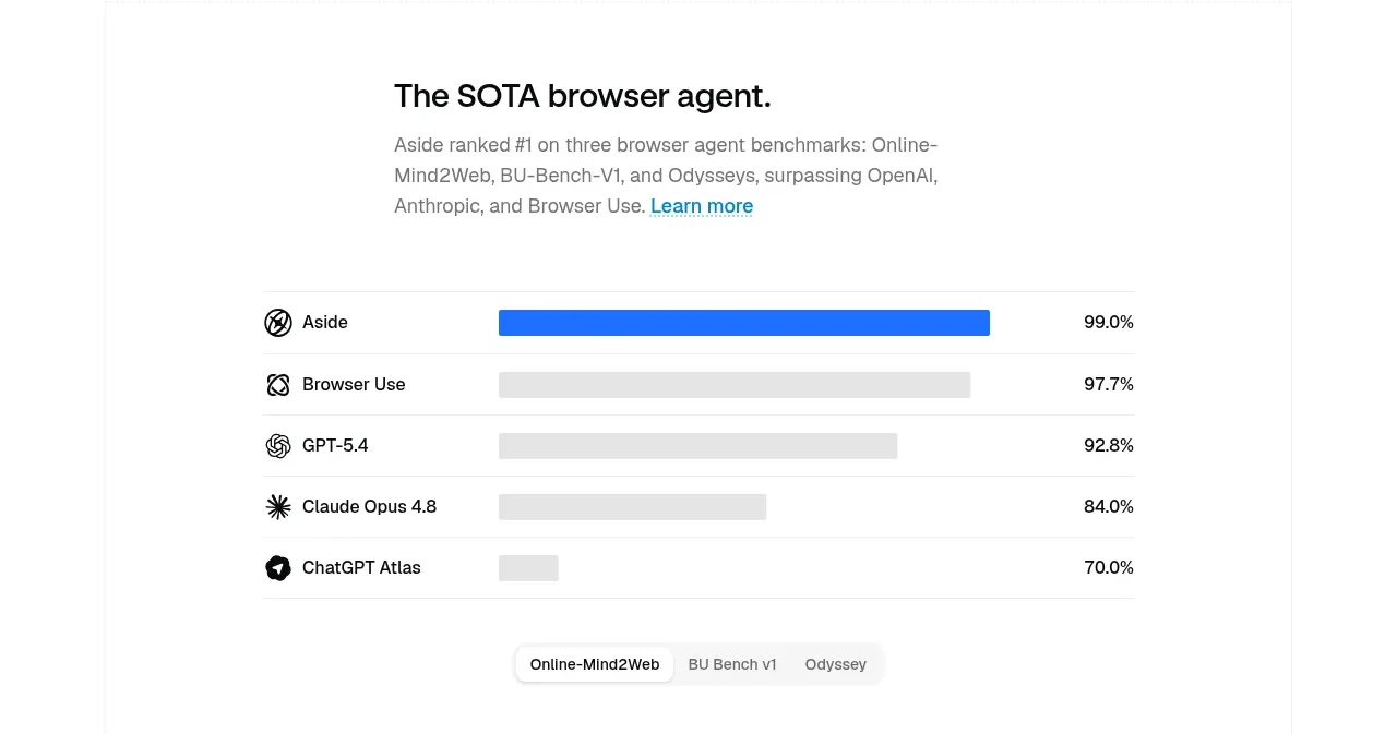
 Agent benchmark comparison
Aside · Chart
Agent benchmark comparison
Aside · Chart
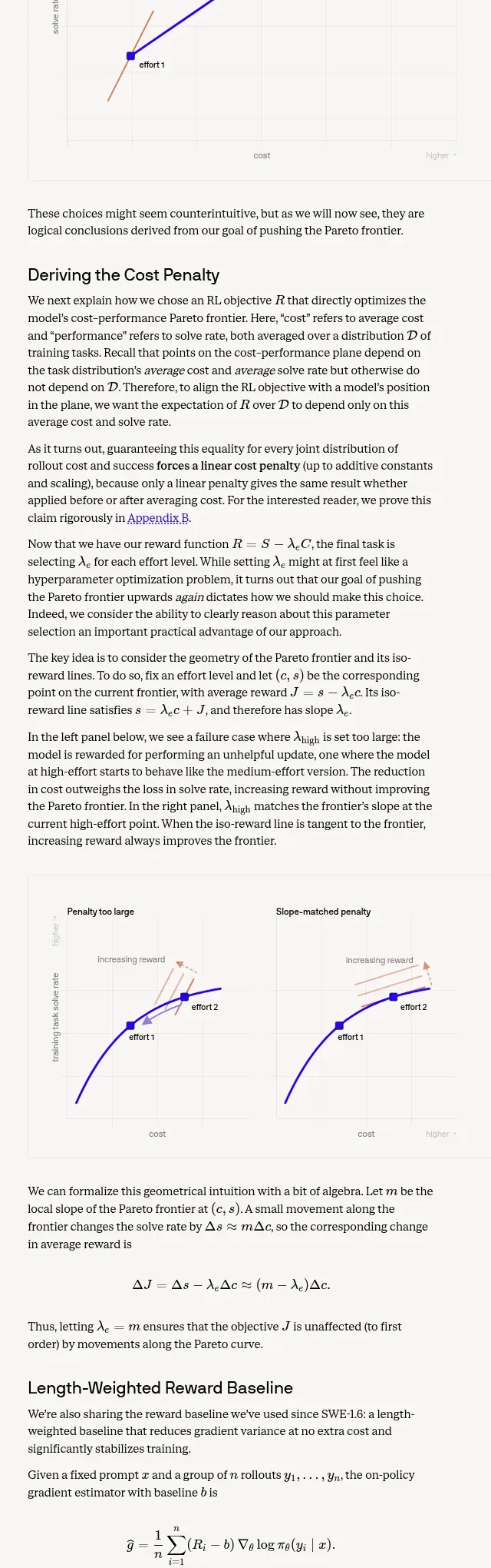
 Length-weighted reward and RL stability
Cognition's SWE-2 · Chart
Length-weighted reward and RL stability
Cognition's SWE-2 · Chart
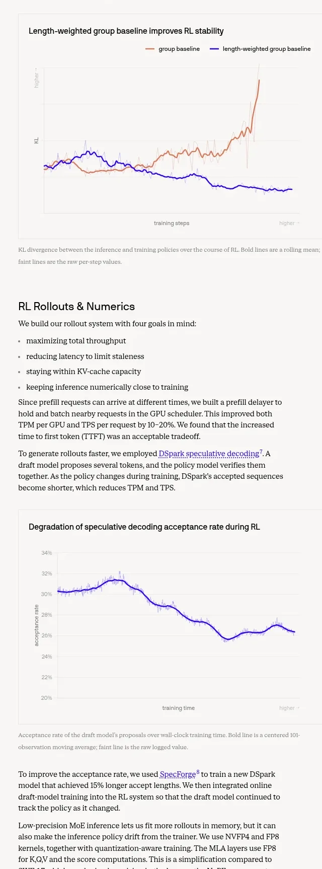 Trustworthiness evaluation charts
Cognition's SWE-2 · Chart
Trustworthiness evaluation charts
Cognition's SWE-2 · Chart