kage
kage
xem.email
Design analysis
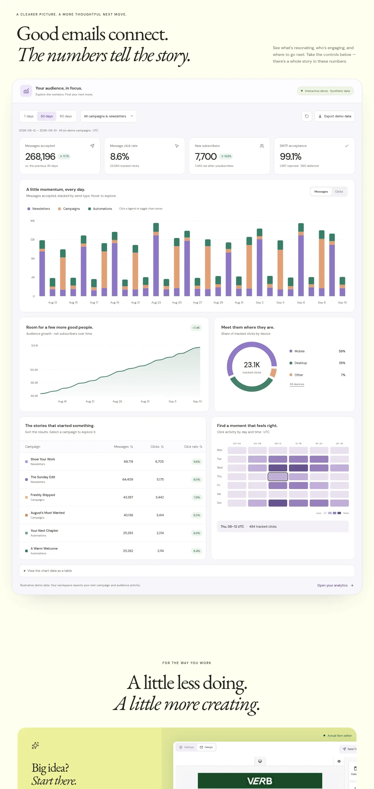
A large analytics section turns the product promise into measurable proof with summary stat cards, a prominent stacked bar chart, a trend chart, a donut chart, a heatmap, and a data table.
Prompt preview
## Reference images

Study these alongside the description below: hierarchy, rhythm, spacing, colour. Build for the product you are asked about, using this design language.

- Component: https://kage-design-assets.t3.tigrisfiles.io/components/xem/cfdda217-53f8-4a81-998a-9d07a076ba78-1790143673-7.webp
- Full page it was cut from: https://kage-design-assets.t3.tigrisfiles.io/screenshots/xem/cfdda217-53f8-4a81-998a-9d07a076ba78-1790143376275-full.webp
- Component on Kage: https://kage.design/component/xem-chart

## Before you start
Ask what metrics matter for the user's product, what decisions the dashboard should support, and which data is safe to show. Apply the structure with realistic original data.

Build an analytics proof section on a warm ivory background. Start with a left-aligned serif heading with an italic continuation and a short explanatory sentence. Place a large white dashboard card beneath it with a toolbar for date range, filters, and export. Use four compact KPI cards, then a wide stacked bar chart, followed by a two-column row containing a line/area chart and donut chart, then a table and a heatmap. Use #fffefa cards, #e7e7dc borders, 14–18px radii, subtle shadows, and a restrained palette of forest #2c7a65, purple #8064bd, apricot #d89b71, and pale green fills. Make legends, labels, tooltips, keyboard focus, and responsive overflow clear; on mobile stack charts vertically.

Never use the reference's logo, product name, copy, illustrations, or imagery.