kage
kage
agentfield.ai
Design analysis
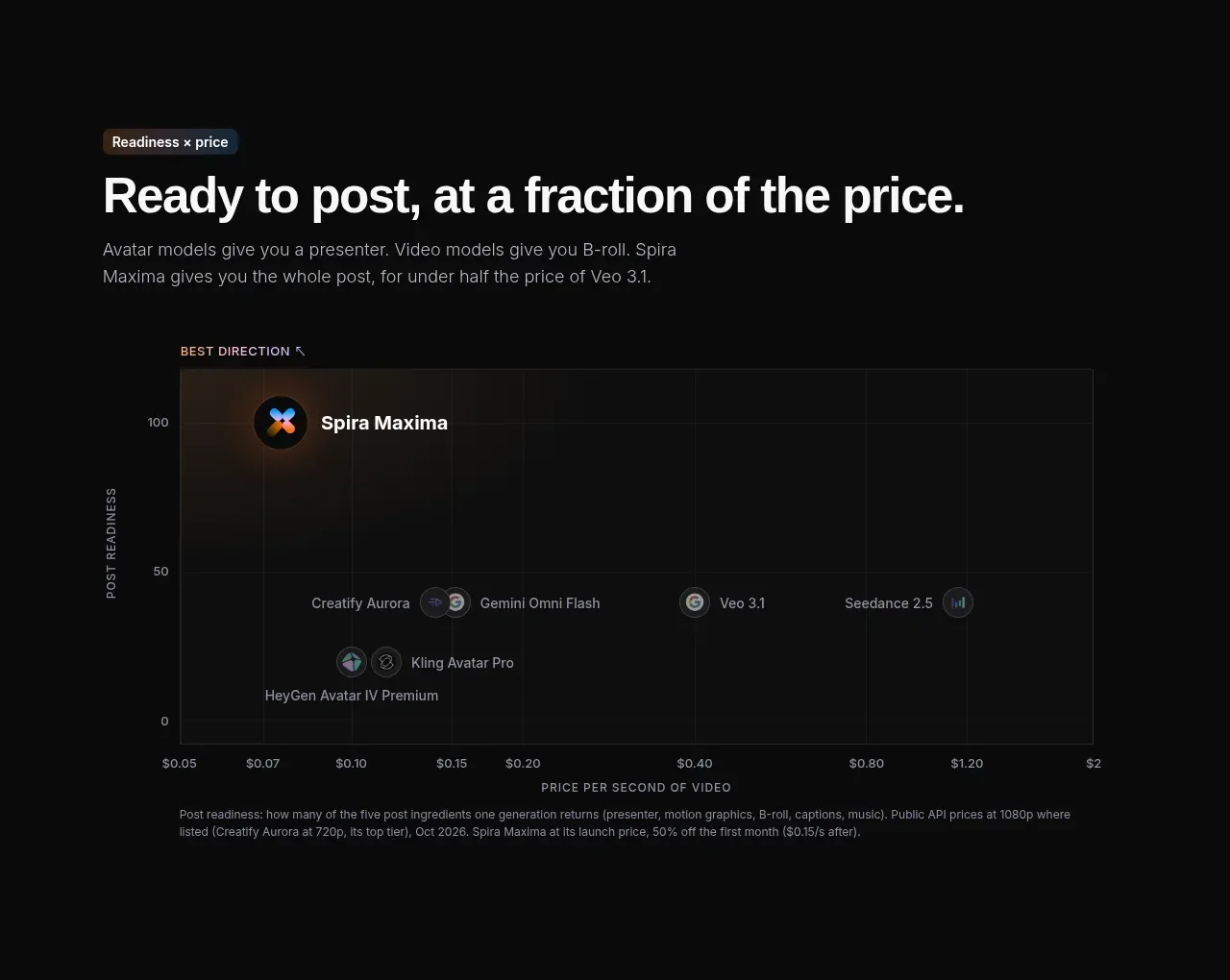
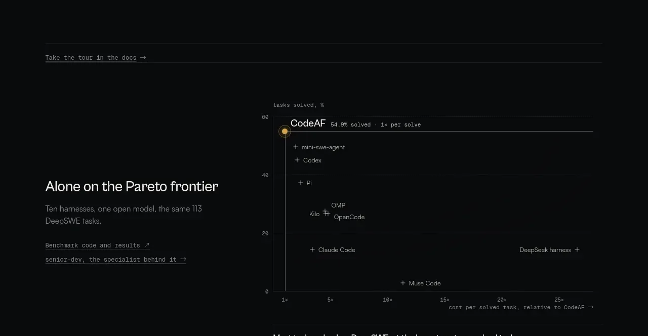
A benchmark section combines a small documentation prompt with a Pareto-style scatter plot, making the product claim legible through task-success and cost axes rather than a generic testimonial.
Prompt preview
## Reference images

Study these alongside the description below: hierarchy, rhythm, spacing, colour. Build for the product you are asked about, using this design language.

- Component: https://kage-design-assets.t3.tigrisfiles.io/components/codeaf/74fffb9e-aea6-4193-af2d-c8a5b19c270c-1791007528-3.webp
- Full page it was cut from: https://kage-design-assets.t3.tigrisfiles.io/screenshots/codeaf/74fffb9e-aea6-4193-af2d-c8a5b19c270c-1791007420738-full.webp
- Component on Kage: https://kage.design/component/codeaf-chart

## Before you start
Ask what measurable outcome matters for the user's product, which competitors or alternatives are fair to compare, and what data can be shown honestly. Use the following visual logic with the user's data.

Create a dark benchmark section with a subtle top rule and a small documentation link above a large, sparse scatter chart. Include clearly named horizontal and vertical axes, several labeled comparison points, and one highlighted product point with a warm halo. Pair the chart with a short explanatory heading or caption beneath/alongside it that states the decision insight, not just the numbers.

Design language: background #08090a, chart field #0b0d0e, grid and axes #252827, labels #777b79 in 10–11px mono, and main copy #d8dad7. Highlight the primary data point with amber #c29a45 and a thin ring; use subdued gray-blue points for alternatives. Keep chart typography small but readable, preserve generous margins, and offer a responsive stacked chart/caption layout. If the chart is interactive, show tooltip and focus states without visual clutter.

Never: use logos, product names, copy, illustrations, or imagery from the reference.