kage
kage
spira.ai
Design analysis
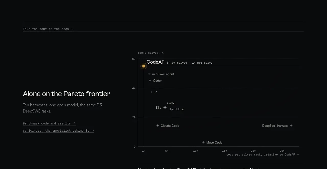
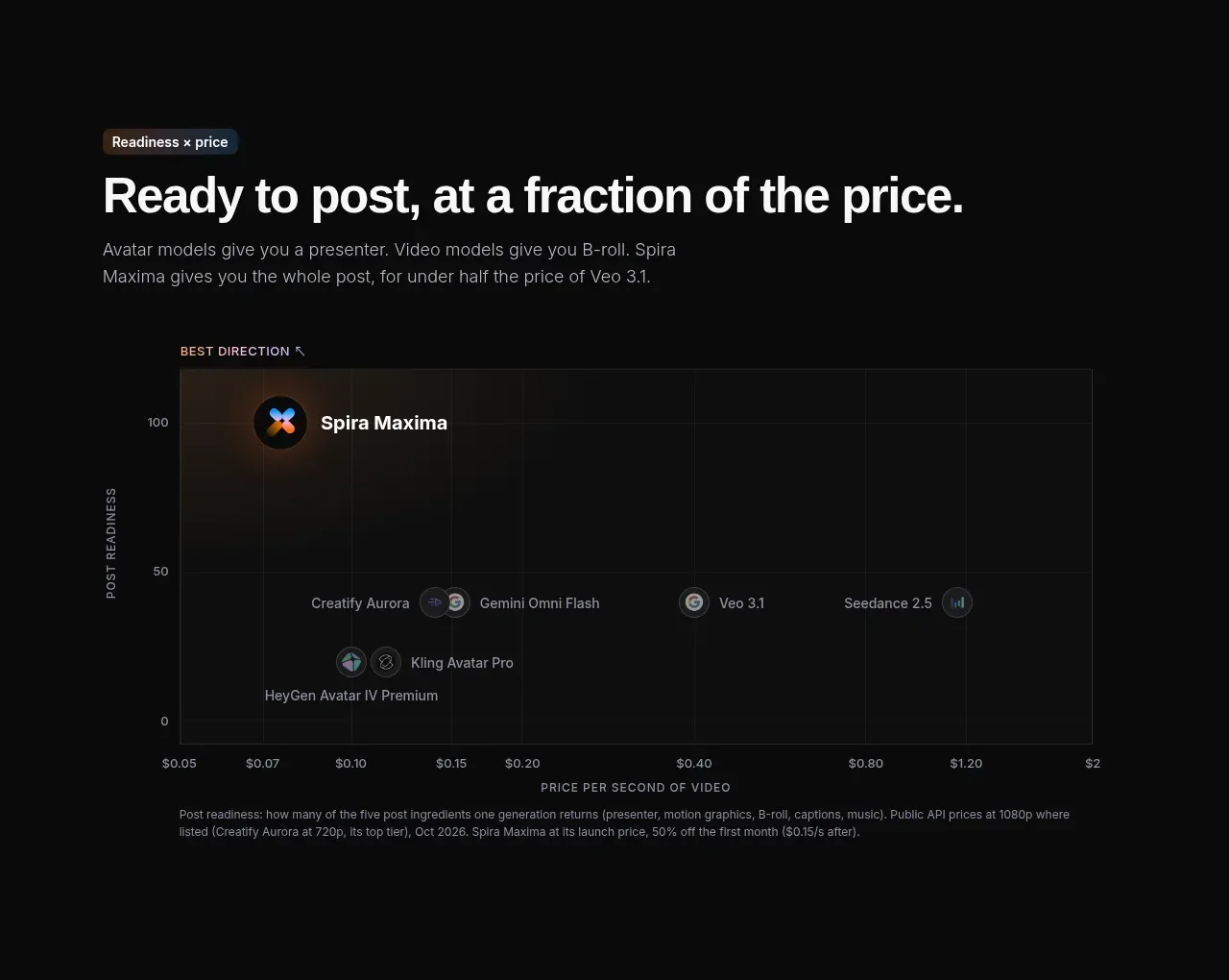
A dark chart section frames a value comparison using price on the horizontal axis and readiness on the vertical axis. Labeled competitor points and a short explanatory caption make the positioning argument self-contained.
Prompt preview
## Reference images

Study these alongside the description below: hierarchy, rhythm, spacing, colour. Build for the product you are asked about, using this design language.

- Component: https://kage-design-assets.t3.tigrisfiles.io/components/spira-maxima/726c84dd-363c-4980-b0d9-b04757b4422a-1791266565-6.webp
- Full page it was cut from: https://kage-design-assets.t3.tigrisfiles.io/screenshots/spira-maxima/726c84dd-363c-4980-b0d9-b04757b4422a-1791266451959-full.webp
- Component on Kage: https://kage.design/component/spira-maxima-chart

## Before you start
Ask what dimensions, comparison set, and trustworthy data matter for the user's product, then apply these principles to that product.

Build a dark analytical chart section with an eyebrow, a large heading about value or positioning, and a short intro. Use a wide bordered chart panel with a subtle black-to-gray gradient, faint grid lines, clear axis titles, compact tick labels, and labeled circular data points. Highlight the user's product with the largest, brightest branded marker and use subdued gray markers for alternatives. Use #0e0f10, #202223 grid lines, #a0a1a4 labels, white headings, and restrained orange/blue highlight colors. Add a concise methodology note beneath the chart in 12–13px muted text. Make the chart responsive, with readable labels and a horizontal scroll or simplified labels on small screens.

Never: use logos, product names, copy, illustrations, or imagery from the reference.