 kage
kage
agentcraft.ai

Design analysis
A product feature section places a phone mockup beside a clear headline and three benefit bullets explaining a daily capture habit.
Prompt preview
## Reference images

Study these alongside the description below: hierarchy, rhythm, spacing, colour. Build for the product you are asked about, using this design language.

- Component: https://kage-design-assets.t3.tigrisfiles.io/components/agent-craft/d8105fc6-c65e-46ba-b702-5f209216873d-1791957790-5.webp
- Full page it was cut from: https://kage-design-assets.t3.tigrisfiles.io/screenshots/agent-craft/d8105fc6-c65e-46ba-b702-5f209216873d-1791957724400-full.webp
- Component on Kage: https://kage.design/component/agent-craft-feature-grid

## Before you start
Ask what the user's product and brand are, then apply these principles to that product rather than copying the reference.

Create a split feature section with a tall device mockup or product screenshot on the left and copy on the right. The copy should have a green eyebrow, a 38–46px serif heading, a short paragraph, and three bullets with small green circular markers and bold lead-ins. Give the device a realistic but generic frame, rounded corners, subtle shadow, and one floating prompt chip to communicate interaction. Use a calm #fafafd background, charcoal #19191d type, muted #707078 body copy, and green #12a878 accents. Align the two columns vertically, use 64–96px outer spacing, and stack them on mobile with the visual first or second depending on the product story.

### Never
- Never reuse logos, product names, copy, illustrations, or imagery from the reference.
- Never reproduce a recognizable app screen; use abstract, user-supplied, or generated product UI.
More components
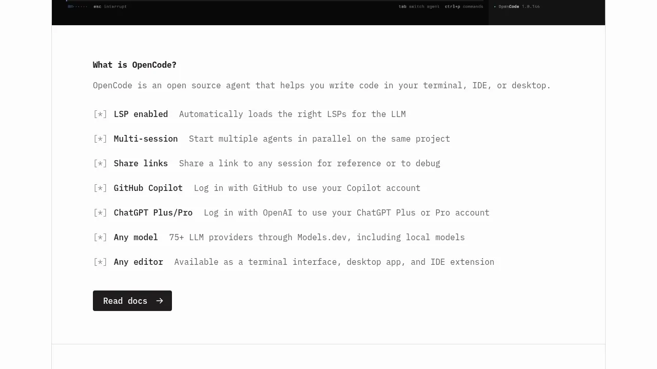
 Core capabilities overview
OpenCode 2.0 · Feature grid
Core capabilities overview
OpenCode 2.0 · Feature grid
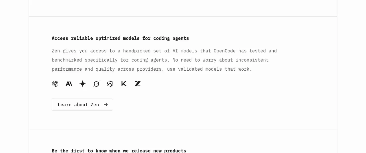 Model access feature block
OpenCode 2.0 · Feature grid
Model access feature block
OpenCode 2.0 · Feature grid
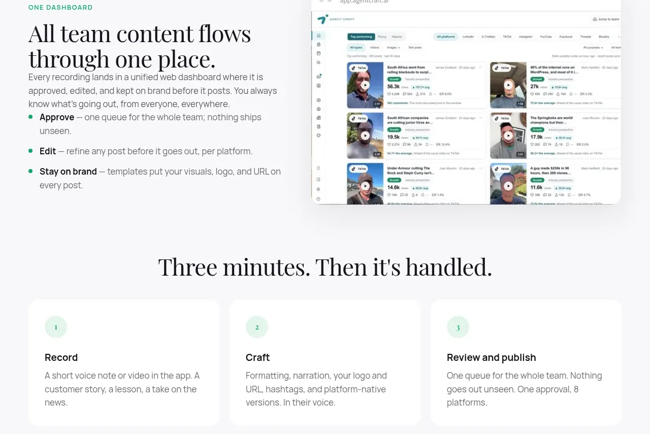
 Unified dashboard workflow
Agent Craft · Feature grid
Unified dashboard workflow
Agent Craft · Feature grid
 Three-step operating model
Agent Craft · Feature grid
Three-step operating model
Agent Craft · Feature grid
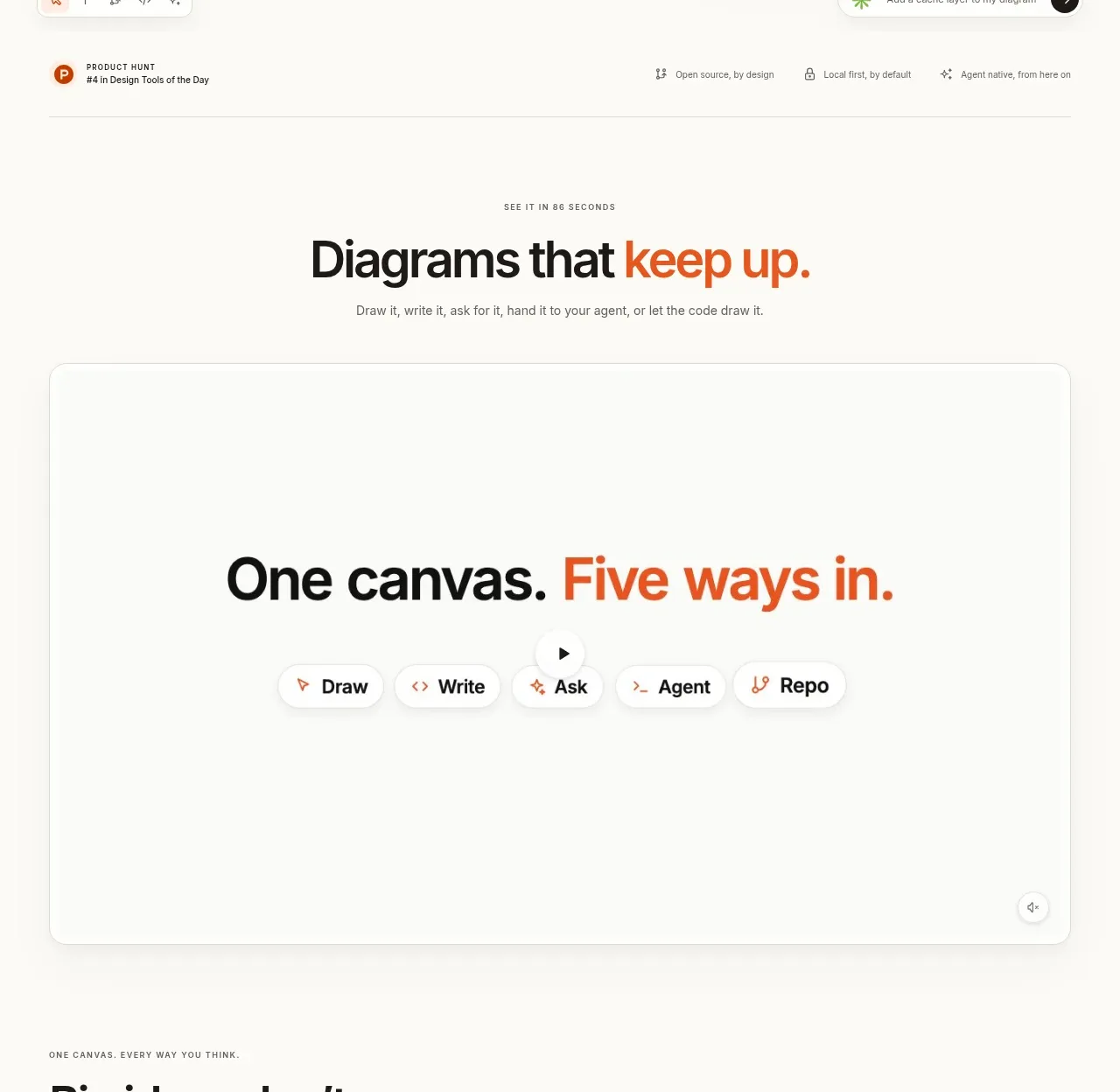
 Canvas modes showcase
OpenFlowKit 2 · Feature grid
Canvas modes showcase
OpenFlowKit 2 · Feature grid
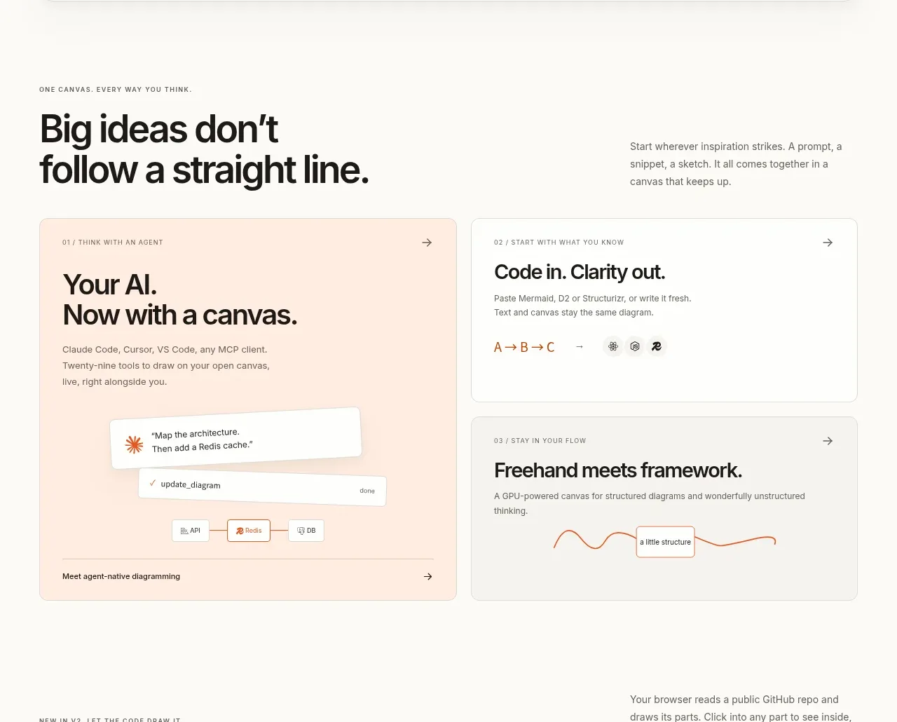 Workflow benefits grid
OpenFlowKit 2 · Feature grid
Workflow benefits grid
OpenFlowKit 2 · Feature grid