 kage
kage
agentcraft.ai

Design analysis
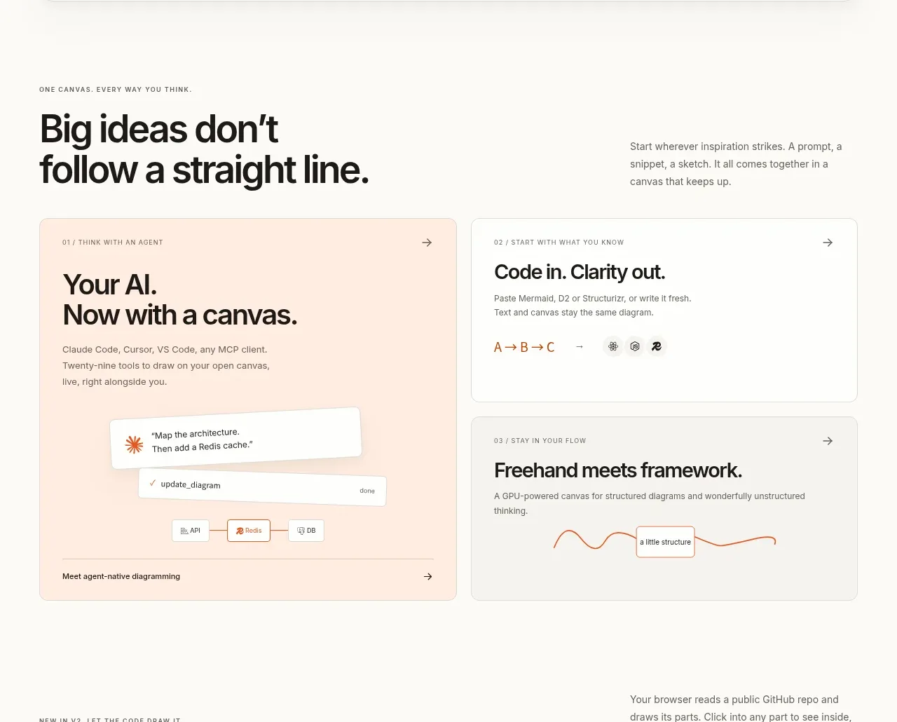
A centered heading introduces three numbered cards that reduce the product workflow to a memorable sequence.
Prompt preview
## Reference images

Study these alongside the description below: hierarchy, rhythm, spacing, colour. Build for the product you are asked about, using this design language.

- Component: https://kage-design-assets.t3.tigrisfiles.io/components/agent-craft/d8105fc6-c65e-46ba-b702-5f209216873d-1791957790-7.webp
- Full page it was cut from: https://kage-design-assets.t3.tigrisfiles.io/screenshots/agent-craft/d8105fc6-c65e-46ba-b702-5f209216873d-1791957724400-full.webp
- Component on Kage: https://kage.design/component/agent-craft-feature-grid-3

## Before you start
Ask what the user's product and brand are, then apply these principles to that product rather than copying the reference.

Create a centered process section with a 36–46px serif heading and a single explanatory line. Beneath it, arrange three equal white cards in a row, each with a small mint numbered badge, a bold short title, and two or three lines of description. Use a soft gray background (#fafafd), white cards, 16–18px radius, minimal shadow, 24–28px padding, and generous 24px column gaps. The numbering should establish sequence without relying on color alone. On mobile, stack cards vertically and optionally connect them with a subtle vertical line.

### Never
- Never reuse logos, product names, copy, illustrations, or imagery from the reference.
- Never make the steps vague, overly long, or dependent on decorative imagery.
More components
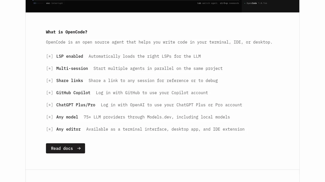
 Core capabilities overview
OpenCode 2.0 · Feature grid
Core capabilities overview
OpenCode 2.0 · Feature grid
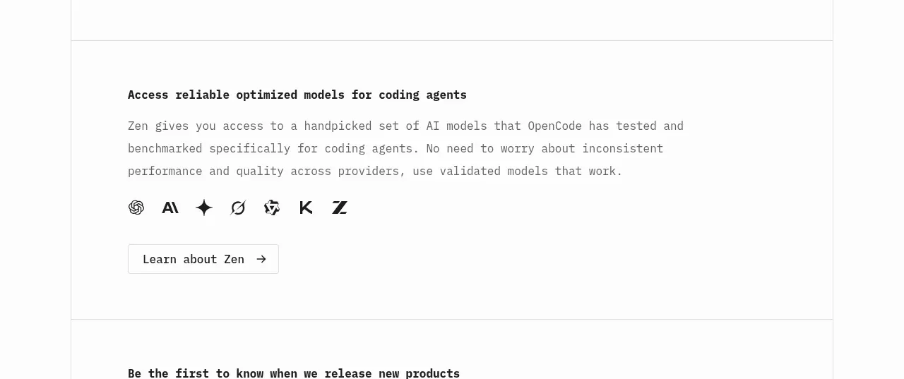 Model access feature block
OpenCode 2.0 · Feature grid
Model access feature block
OpenCode 2.0 · Feature grid

 Mobile capture workflow
Agent Craft · Feature grid
Mobile capture workflow
Agent Craft · Feature grid
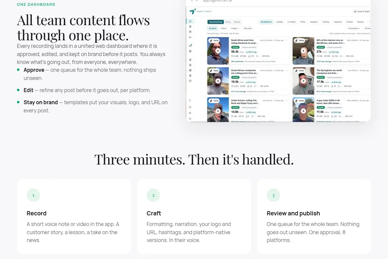 Unified dashboard workflow
Agent Craft · Feature grid
Unified dashboard workflow
Agent Craft · Feature grid
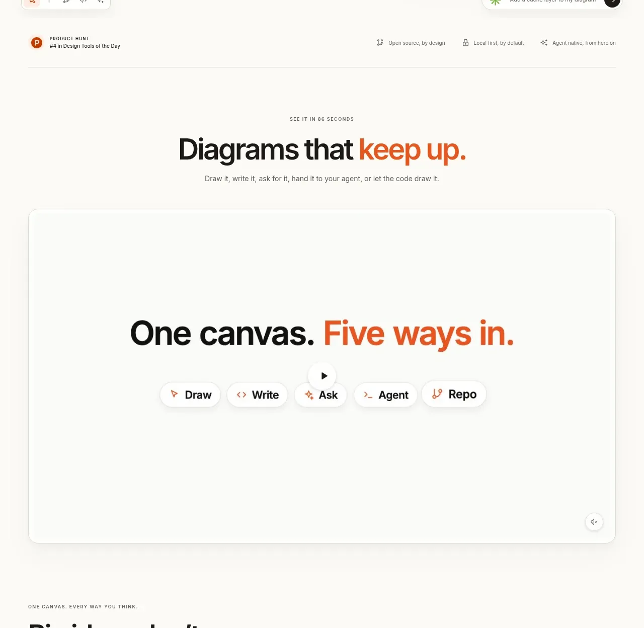
 Canvas modes showcase
OpenFlowKit 2 · Feature grid
Canvas modes showcase
OpenFlowKit 2 · Feature grid
 Workflow benefits grid
OpenFlowKit 2 · Feature grid
Workflow benefits grid
OpenFlowKit 2 · Feature grid