 kage
kage
openflowkit.com
Design analysis
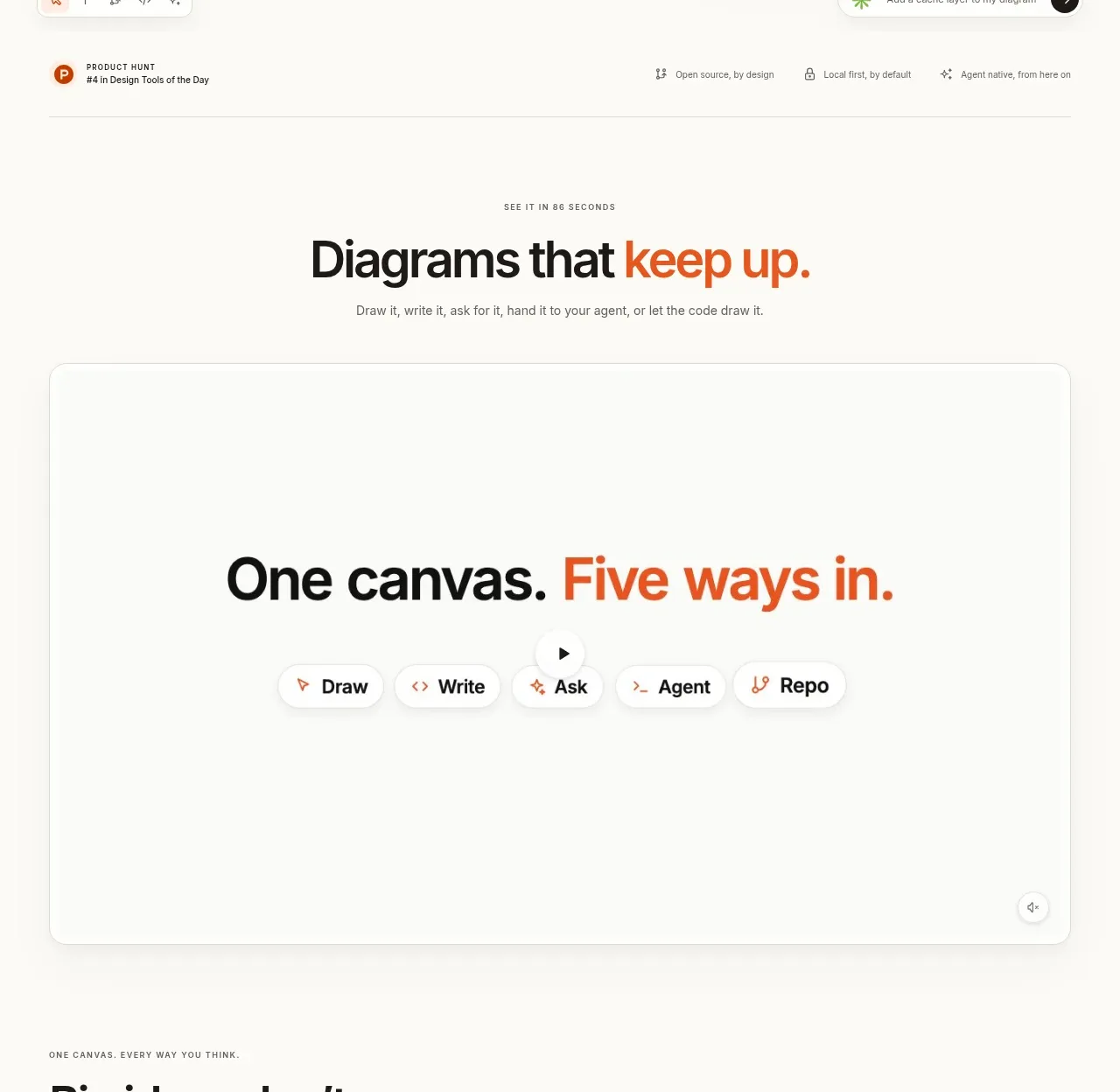
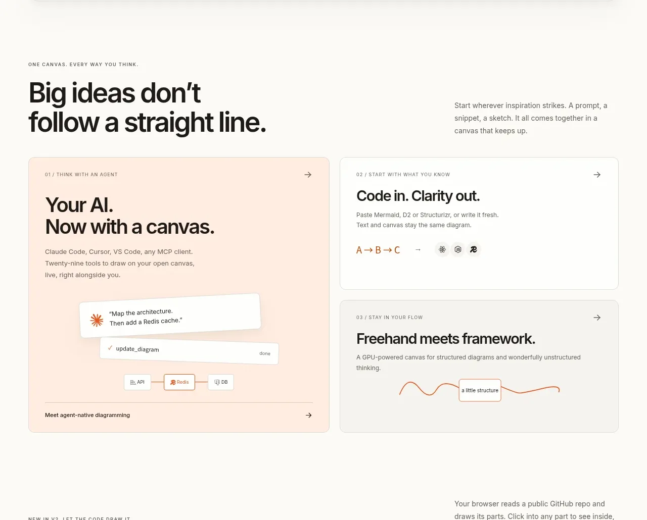
A short section heading introduces a large framed demo surface, with a prominent “five ways in” concept and pill-like mode selectors that suggest multiple workflows.
Prompt preview
## Reference images

Study these alongside the description below: hierarchy, rhythm, spacing, colour. Build for the product you are asked about, using this design language.

- Component: https://kage-design-assets.t3.tigrisfiles.io/components/openflowkit-2/3de20331-4179-415d-a7ba-29915155b155-1791957759-2.webp
- Full page it was cut from: https://kage-design-assets.t3.tigrisfiles.io/screenshots/openflowkit-2/3de20331-4179-415d-a7ba-29915155b155-1791957697393-full.webp
- Component on Kage: https://kage.design/component/openflowkit-2-feature-grid

## Before you start
Ask what core workspace or canvas the user's product has and which input modes matter most to its users. Adapt the showcase to those workflows.

Build a section that introduces a flexible product canvas. Start with a small eyebrow, a concise heading with one emphasized accent phrase, and a muted one-line explanation. Below it, place a large rounded demo frame spanning most of the content width; use a white surface against `#fbfaf7`, a 1px border in `#e5e2dc`, 12–16px radius, and a very subtle shadow. Center a row of pill tabs or mode chips near the upper portion of the frame, with one active chip using pale orange (`#fff0e7`) and orange text (`#c94714`), while inactive chips remain white/gray. Leave substantial blank space in the demo panel for a future interactive preview and add a small unobtrusive control in one corner. Use a bold 34–48px heading, 14–16px body text, and consistent 8px spacing increments. Make tabs keyboard accessible and visibly active.

Never use the reference's logo, product name, copy, illustrations, imagery, or exact UI labels.
More components
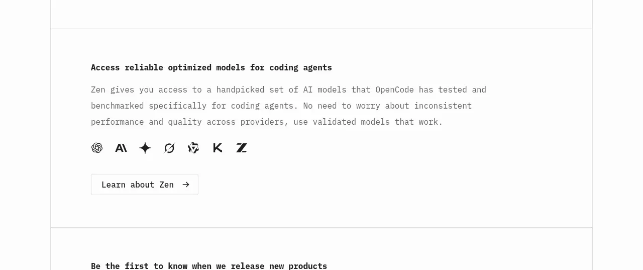
 Model access feature block
OpenCode 2.0 · Feature grid
Model access feature block
OpenCode 2.0 · Feature grid
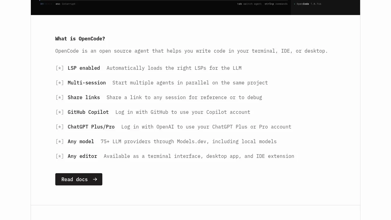 Core capabilities overview
OpenCode 2.0 · Feature grid
Core capabilities overview
OpenCode 2.0 · Feature grid
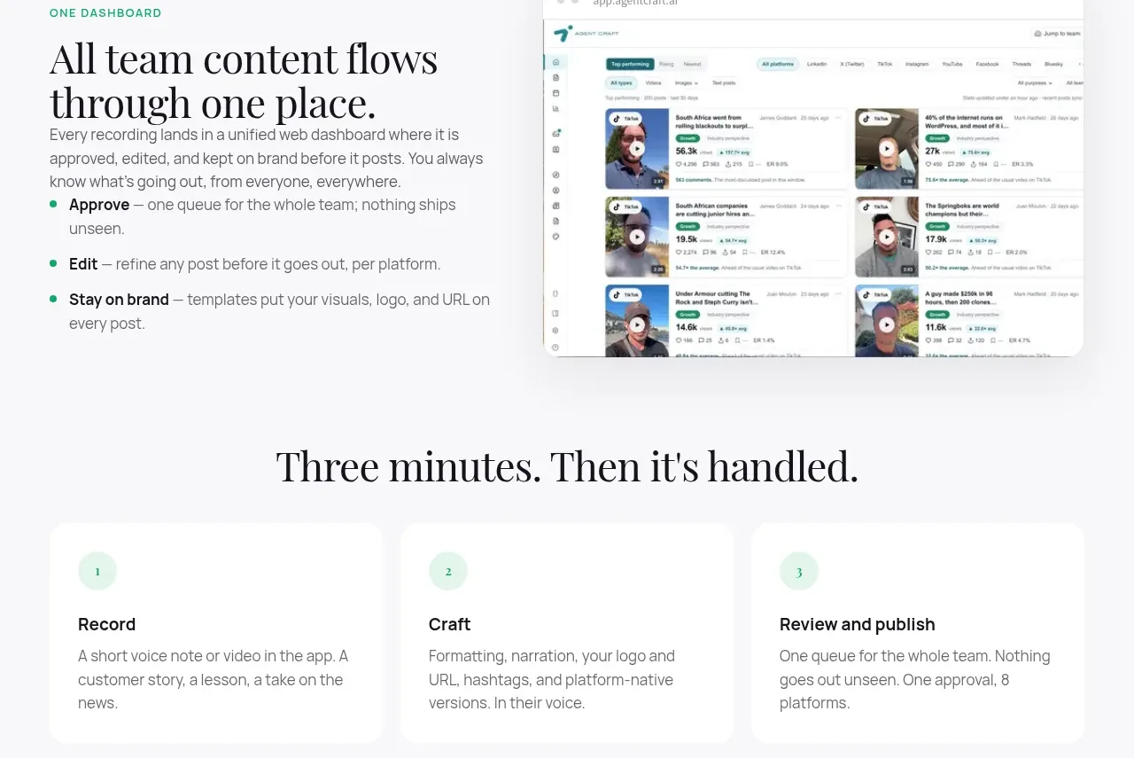
 Unified dashboard workflow
Agent Craft · Feature grid
Unified dashboard workflow
Agent Craft · Feature grid
 Three-step operating model
Agent Craft · Feature grid
Three-step operating model
Agent Craft · Feature grid
 Mobile capture workflow
Agent Craft · Feature grid
Mobile capture workflow
Agent Craft · Feature grid
 Workflow benefits grid
OpenFlowKit 2 · Feature grid
Workflow benefits grid
OpenFlowKit 2 · Feature grid