 kage
kage
openflowkit.com
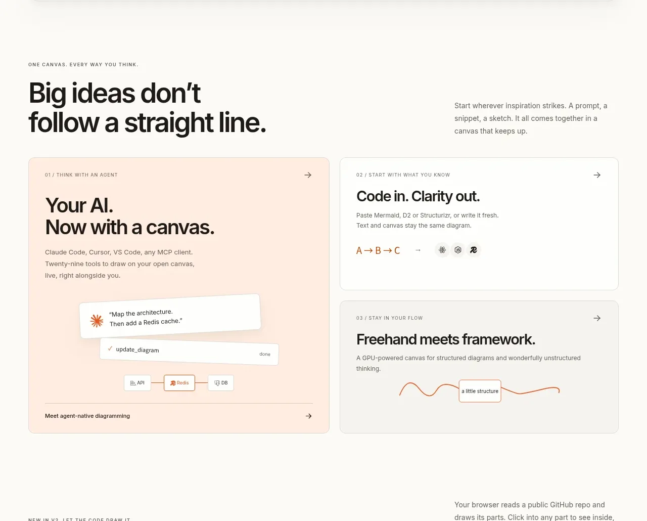
Design analysis
A two-column editorial layout pairs a strong left-side proposition with three varied cards, using color and diagram snippets to make abstract workflow benefits tangible.
Prompt preview
## Reference images

Study these alongside the description below: hierarchy, rhythm, spacing, colour. Build for the product you are asked about, using this design language.

- Component: https://kage-design-assets.t3.tigrisfiles.io/components/openflowkit-2/3de20331-4179-415d-a7ba-29915155b155-1791957760-3.webp
- Full page it was cut from: https://kage-design-assets.t3.tigrisfiles.io/screenshots/openflowkit-2/3de20331-4179-415d-a7ba-29915155b155-1791957697393-full.webp
- Component on Kage: https://kage.design/component/openflowkit-2-feature-grid-2

## Before you start
Ask what three or four product benefits are most valuable and what evidence or mini-interactions can demonstrate each one. Build a tailored benefit story.

Create an editorial benefits section on a warm off-white background. Use a two-column introductory row: a small uppercase eyebrow and large 40–48px heading on the left, with a compact supporting paragraph on the right. Below, build a responsive card grid: one larger feature card and two stacked smaller cards. Use 12px corner radii, 1px `#e4e0d9` borders, and minimal shadows. Give the primary card a soft peach background (`#ffeadc`) and the secondary cards white or very light gray (`#f7f6f2`). Each card needs a tiny numbered eyebrow, bold 20–24px title, short muted description, arrow affordance, and a small abstract UI snippet made from neutral boxes, lines, and tags. Keep orange (`#d94b16`) for emphasis and active states only. Stack cards on mobile.

Never use the reference's logo, product name, copy, illustrations, imagery, or exact card diagrams.
More components
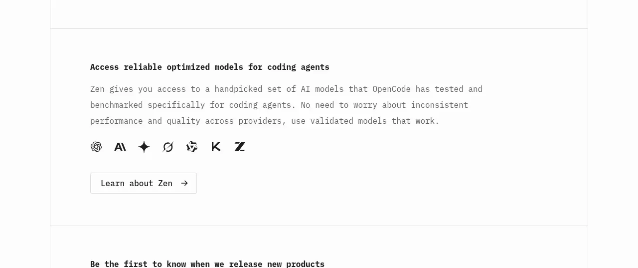
 Model access feature block
OpenCode 2.0 · Feature grid
Model access feature block
OpenCode 2.0 · Feature grid
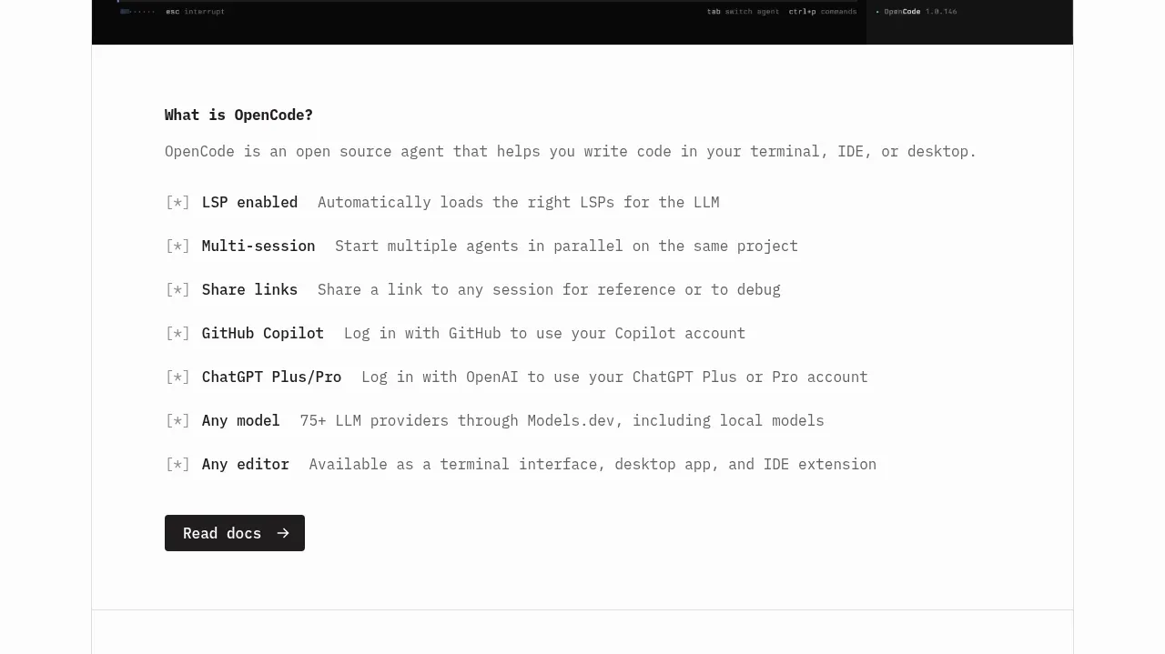 Core capabilities overview
OpenCode 2.0 · Feature grid
Core capabilities overview
OpenCode 2.0 · Feature grid
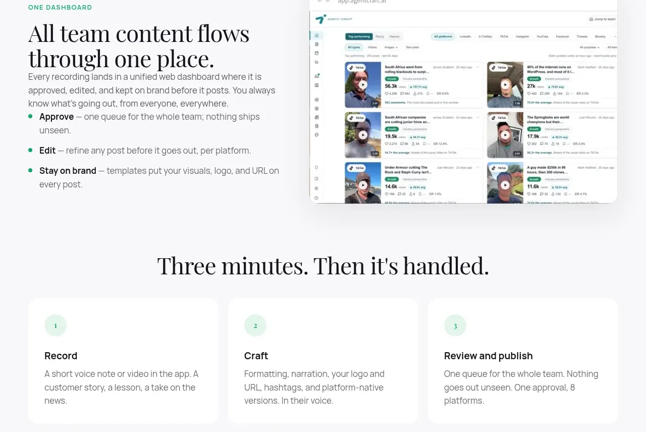
 Unified dashboard workflow
Agent Craft · Feature grid
Unified dashboard workflow
Agent Craft · Feature grid
 Three-step operating model
Agent Craft · Feature grid
Three-step operating model
Agent Craft · Feature grid
 Mobile capture workflow
Agent Craft · Feature grid
Mobile capture workflow
Agent Craft · Feature grid
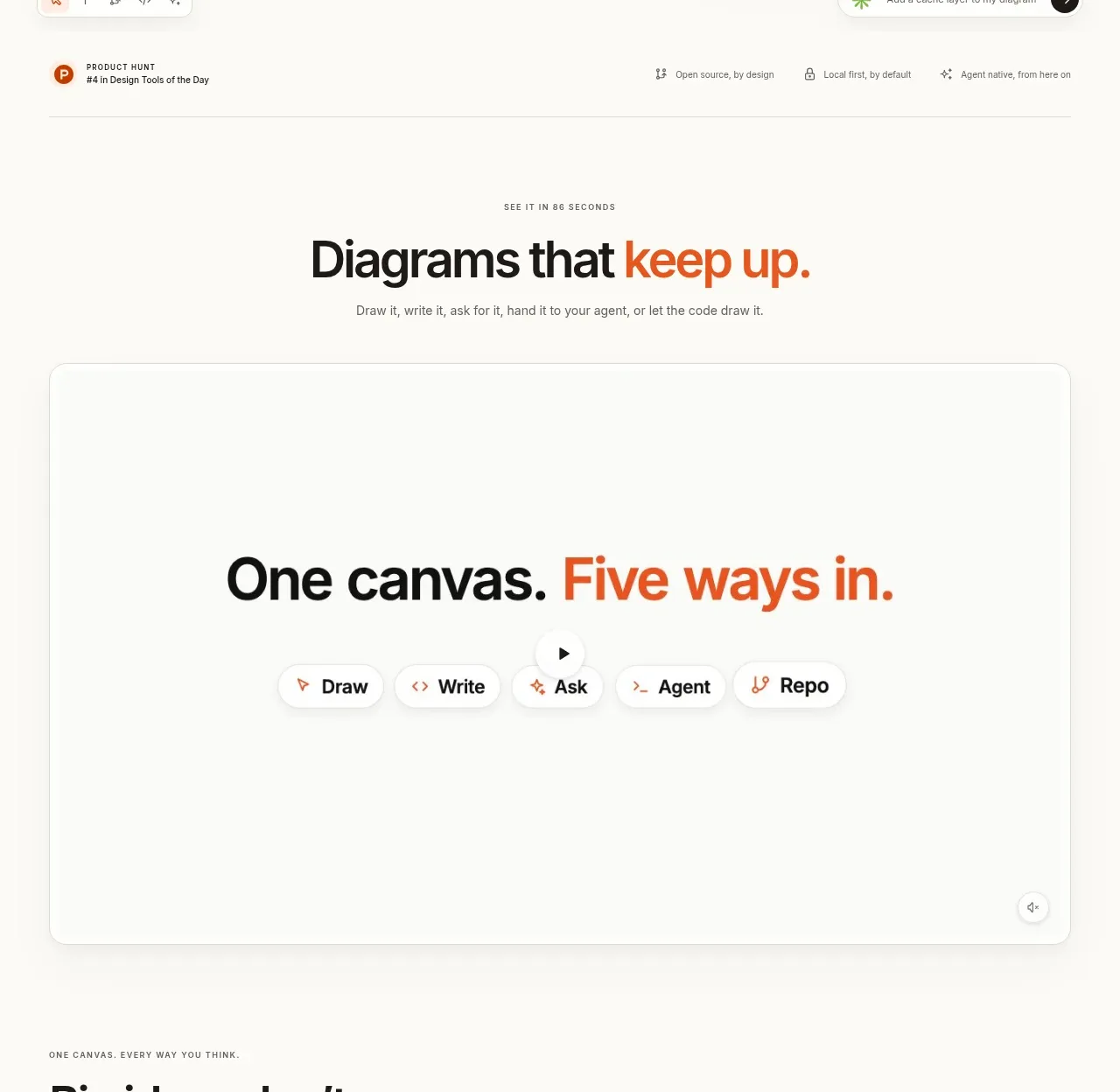
 Canvas modes showcase
OpenFlowKit 2 · Feature grid
Canvas modes showcase
OpenFlowKit 2 · Feature grid