 kage
kage
opencode.ai
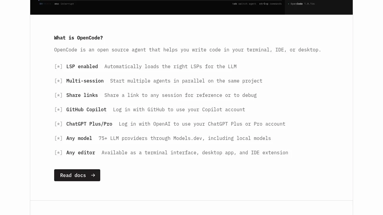
Design analysis
A text-led capability section uses a short explanation, repeated checked benefits, and a single documentation CTA to communicate breadth without visual clutter.
Prompt preview
## Reference images

Study these alongside the description below: hierarchy, rhythm, spacing, colour. Build for the product you are asked about, using this design language.

- Component: https://kage-design-assets.t3.tigrisfiles.io/components/opencode-2-0/565a21f1-5840-46fe-9e23-a71210513fd4-1791957896-2.webp
- Full page it was cut from: https://kage-design-assets.t3.tigrisfiles.io/screenshots/opencode-2-0/565a21f1-5840-46fe-9e23-a71210513fd4-1791957827568-full.webp
- Component on Kage: https://kage.design/component/opencode-2-0-feature-grid

## Before you start
Ask what the user's product does, which capabilities deserve emphasis, and what brand voice to use. Apply the following pattern to that context.

Build a documentation-oriented capabilities section with a compact heading, explanatory paragraph, and a vertical list of 5–8 benefits. Each row should use a small bracket/check marker, a bold capability name, and a muted one-line explanation on the same baseline. Keep the list left aligned in a readable max-width column and finish with one dark rectangular documentation button with an arrow. Use 14–16px technical typography, 28–36px row spacing, off-white background, and minimal decoration. Separate the section with a 1px #e4e4e4 rule and use #111 text plus #777 secondary text. On mobile, allow explanations to wrap beneath their labels while preserving the checklist rhythm.

Never: use the reference logo, product name, copy, illustrations, or imagery.
More components
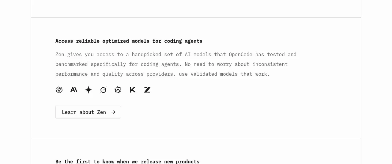
 Model access feature block
OpenCode 2.0 · Feature grid
Model access feature block
OpenCode 2.0 · Feature grid

 Mobile capture workflow
Agent Craft · Feature grid
Mobile capture workflow
Agent Craft · Feature grid
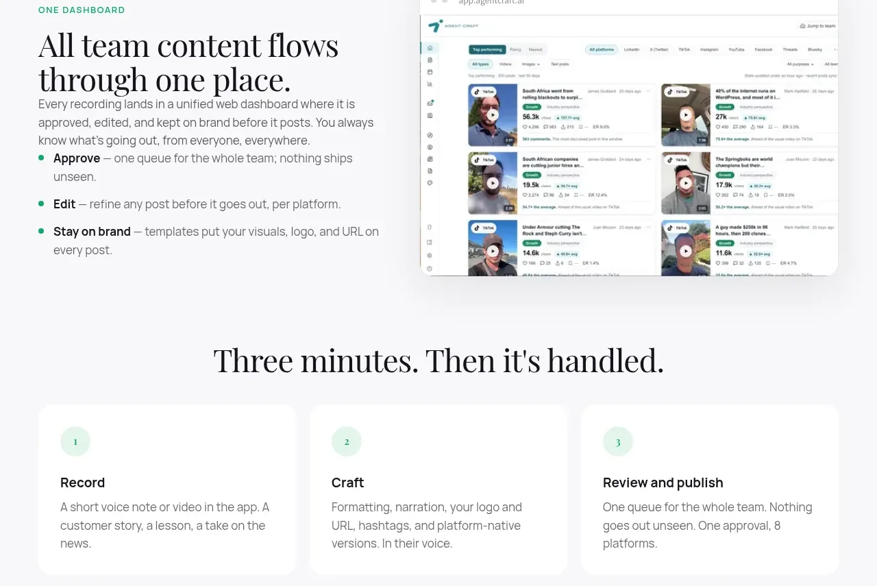 Unified dashboard workflow
Agent Craft · Feature grid
Unified dashboard workflow
Agent Craft · Feature grid
 Three-step operating model
Agent Craft · Feature grid
Three-step operating model
Agent Craft · Feature grid
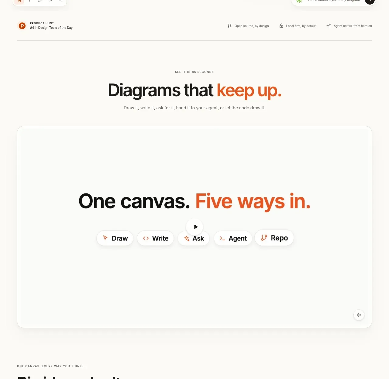
 Canvas modes showcase
OpenFlowKit 2 · Feature grid
Canvas modes showcase
OpenFlowKit 2 · Feature grid
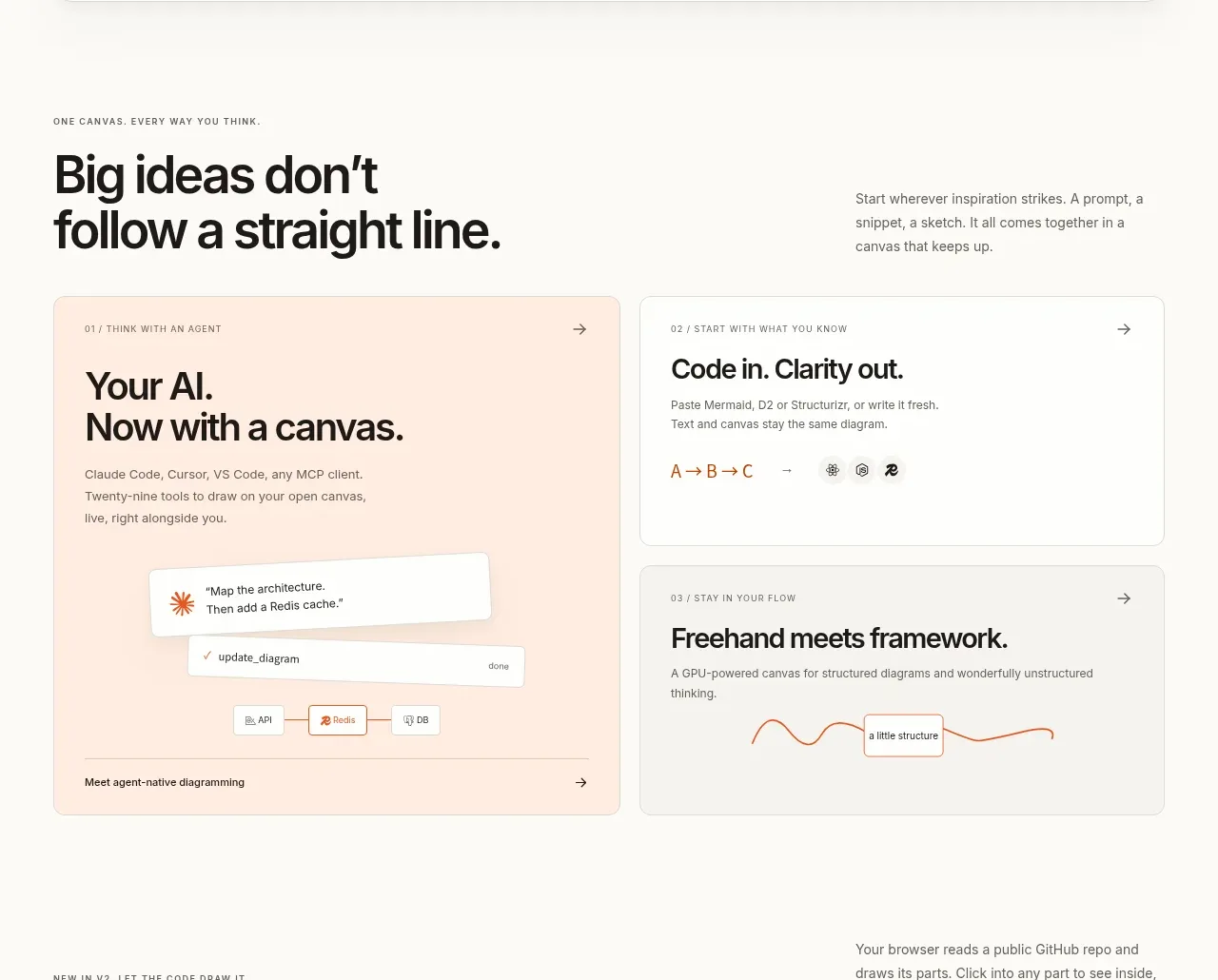 Workflow benefits grid
OpenFlowKit 2 · Feature grid
Workflow benefits grid
OpenFlowKit 2 · Feature grid