 kage
kage
opencode.ai
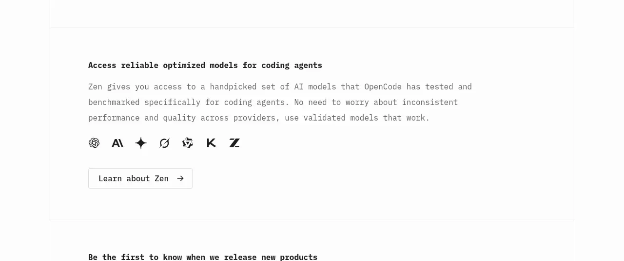
Design analysis
A focused product sub-feature explains optimized model access, reinforces it with a compact provider row, and ends with a secondary learn-more action.
Prompt preview
## Reference images

Study these alongside the description below: hierarchy, rhythm, spacing, colour. Build for the product you are asked about, using this design language.

- Component: https://kage-design-assets.t3.tigrisfiles.io/components/opencode-2-0/565a21f1-5840-46fe-9e23-a71210513fd4-1791957897-6.webp
- Full page it was cut from: https://kage-design-assets.t3.tigrisfiles.io/screenshots/opencode-2-0/565a21f1-5840-46fe-9e23-a71210513fd4-1791957827568-full.webp
- Component on Kage: https://kage.design/component/opencode-2-0-feature-grid-2

## Before you start
Ask what adjacent feature or integration the user's product should promote and which partners or capabilities are genuinely relevant. Apply this layout to those answers.

Build a focused feature section with a bold heading, a two-to-three-line explanatory paragraph, a horizontal row of abstract provider/category marks, and a light secondary CTA. Keep the content left aligned in a constrained column. Use a 14–16px heading, 13–15px body copy with 1.7 line height, and small monochrome marks with ample spacing. The section should feel quieter than the hero: white background, thin border separation, #111 text, #777 body text, and a white button with a light #d9d9d9 border, 4px radius, and arrow. On smaller screens, wrap the marks and retain a clear button target.

Never: use the reference logo, product name, copy, illustrations, or imagery.
More components
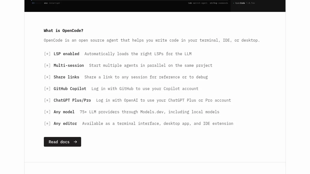
 Core capabilities overview
OpenCode 2.0 · Feature grid
Core capabilities overview
OpenCode 2.0 · Feature grid

 Mobile capture workflow
Agent Craft · Feature grid
Mobile capture workflow
Agent Craft · Feature grid
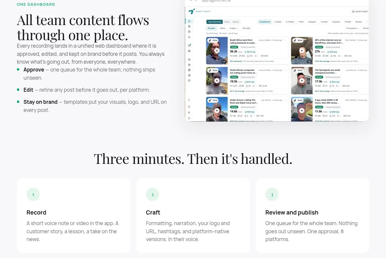 Unified dashboard workflow
Agent Craft · Feature grid
Unified dashboard workflow
Agent Craft · Feature grid
 Three-step operating model
Agent Craft · Feature grid
Three-step operating model
Agent Craft · Feature grid
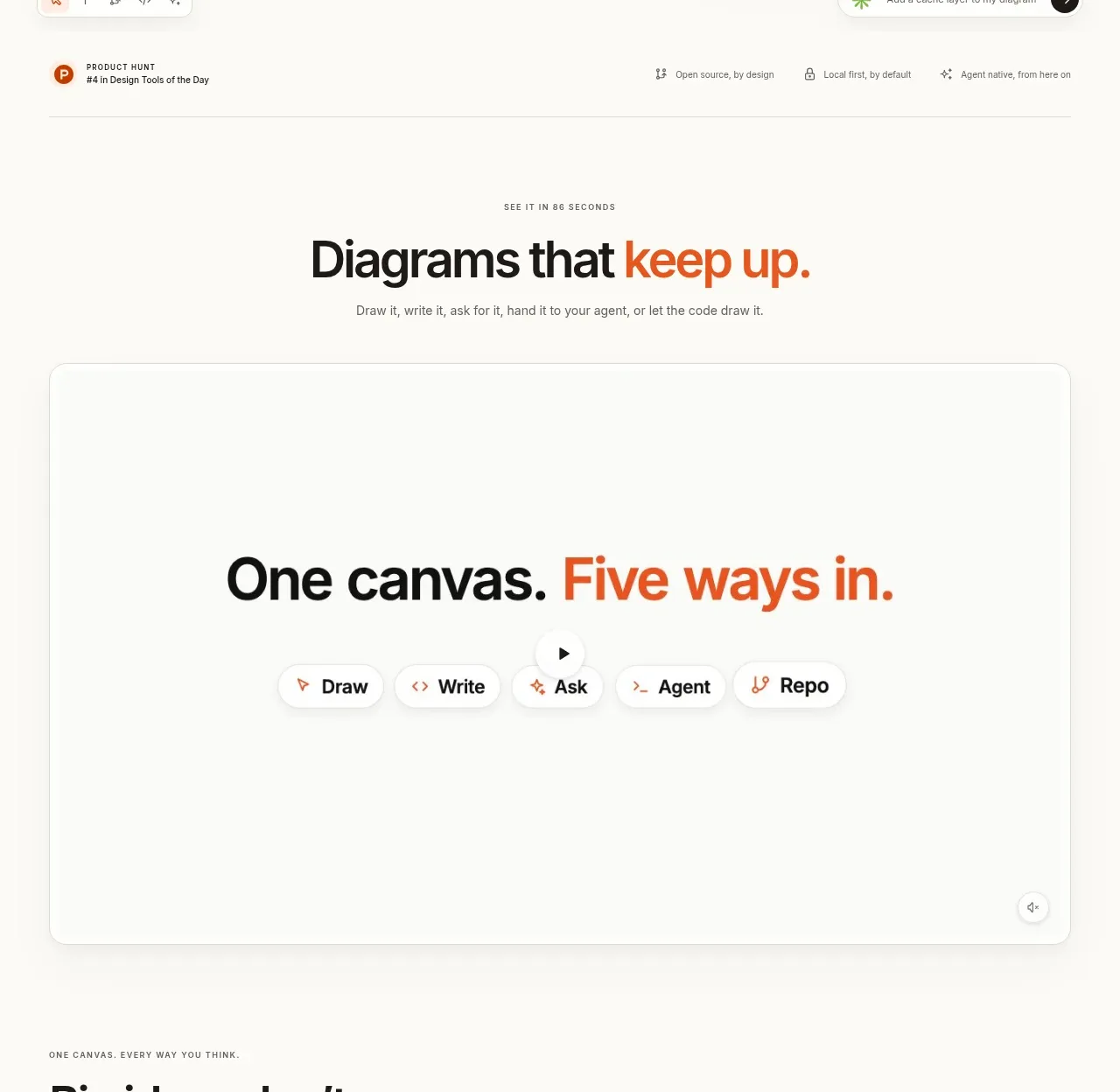
 Canvas modes showcase
OpenFlowKit 2 · Feature grid
Canvas modes showcase
OpenFlowKit 2 · Feature grid
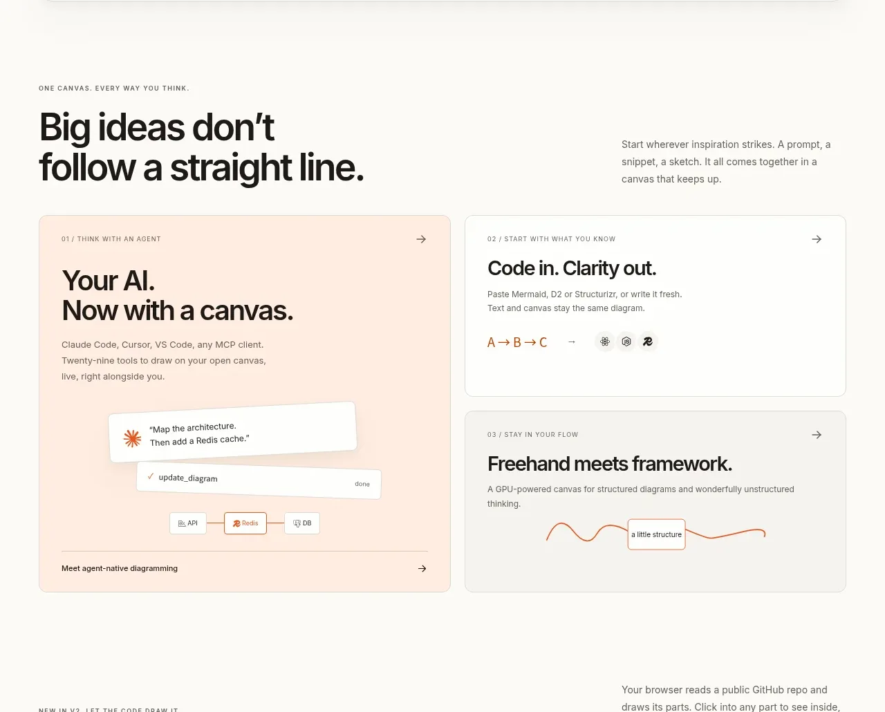 Workflow benefits grid
OpenFlowKit 2 · Feature grid
Workflow benefits grid
OpenFlowKit 2 · Feature grid