 kage
agentgrid.io
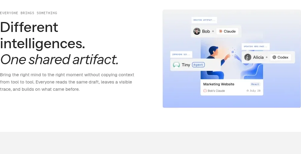
Design analysis
A split editorial section pairs a large typographic statement with a cool-toned collaboration visual.
Prompt preview
## Reference images

Study these alongside the description below: hierarchy, rhythm, spacing, colour. Build for the product you are asked about, using this design language.

- Component: https://kage-design-assets.t3.tigrisfiles.io/components/agentgrid-io/a4a816d7-f557-4fb4-82e6-3348f23e6057-1792994474-6.webp
- Full page it was cut from: https://kage-design-assets.t3.tigrisfiles.io/screenshots/agentgrid-io/a4a816d7-f557-4fb4-82e6-3348f23e6057-1792994443669-full.webp
- Component on Kage: https://kage.design/component/agentgrid-feature-grid-4

## Before you start
Ask what the user's product and brand are, then apply these principles to that product rather than copying the reference.

Build a two-column editorial feature on white. Put a small uppercase eyebrow, oversized two-line heading, and restrained explanatory paragraph in the left column; emphasize the second phrase with italic styling. Put a contained visual panel in the right column with a pale blue/lilac gradient, a shared artifact card, and a few labeled participant chips. Use a 40/60 or 45/55 split, 64px vertical padding, 18px heading line-height, and generous whitespace. Keep the visual supportive rather than dominant, with a 10px radius and soft border.

Never: use logos, product names, copy, illustrations, or imagery from the reference.
More components
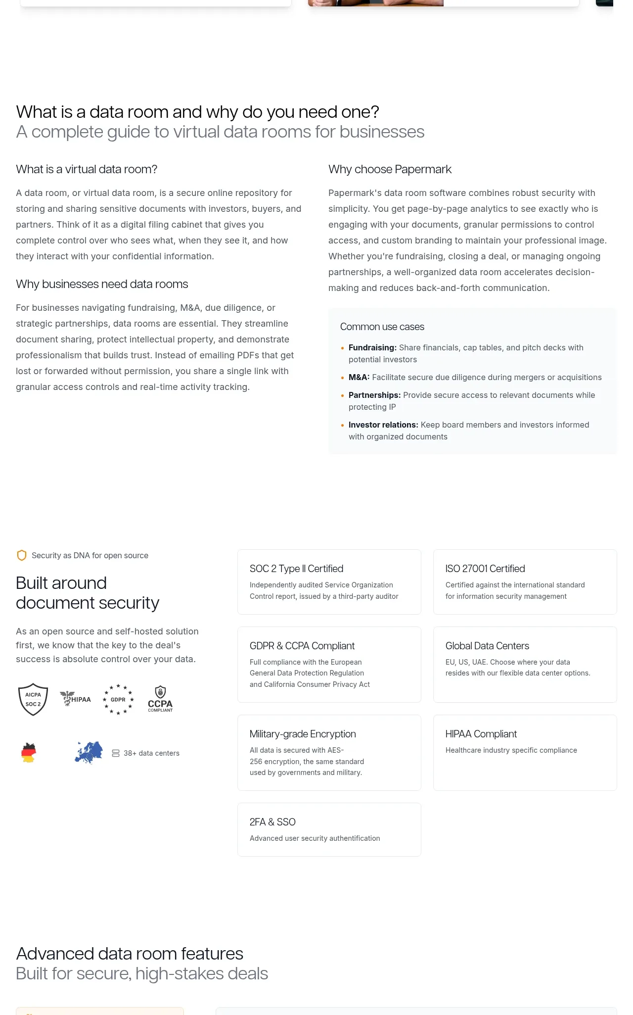
 Data-room education and security overview
Papermark Data Rooms · Feature grid
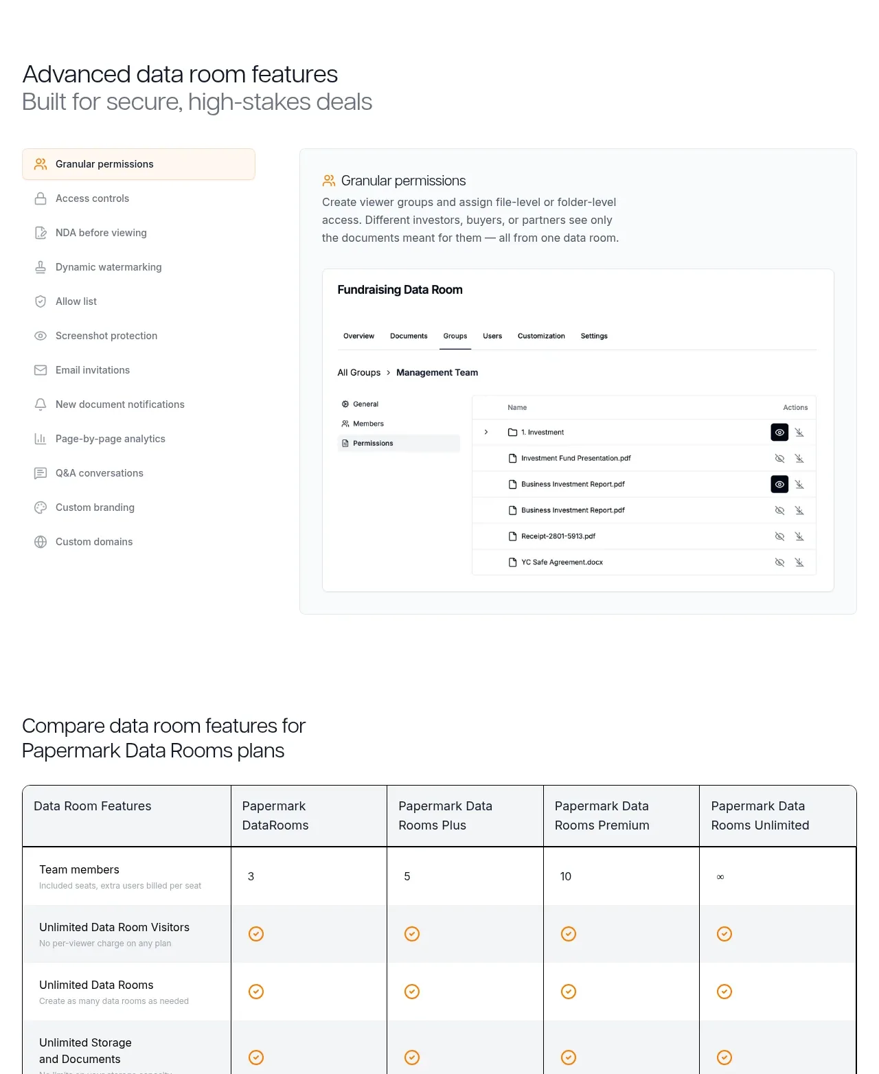 Advanced data-room features
Papermark Data Rooms · Feature grid
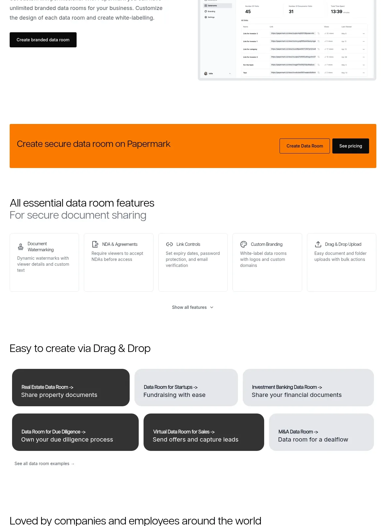 Workflow demonstrations
Papermark Data Rooms · Feature grid
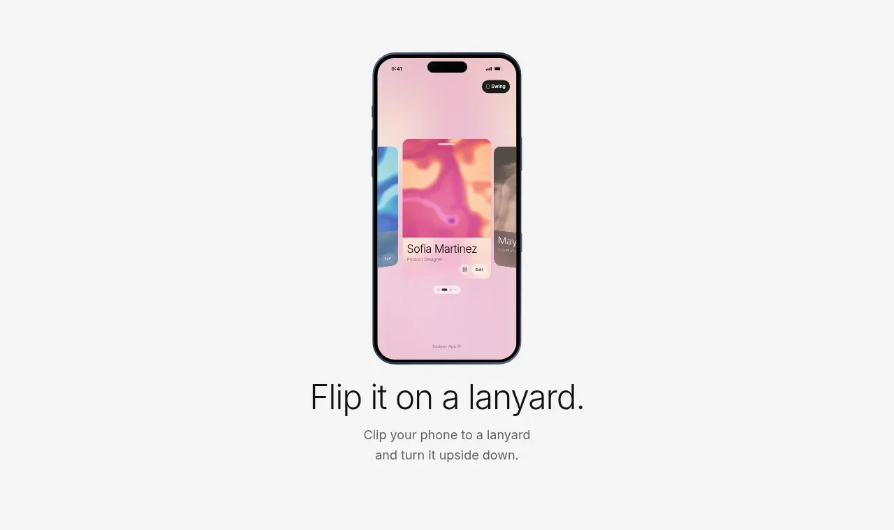
 Lanyard use-case feature
Badgey · Feature grid
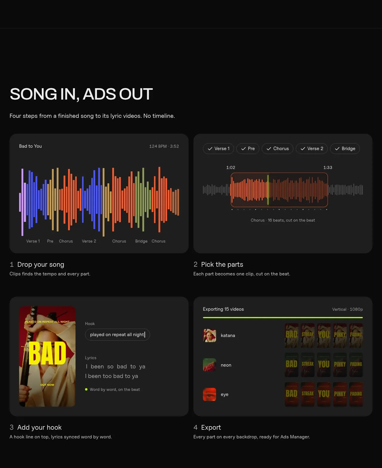
 Four-step workflow
Clips by Plastic · Feature grid
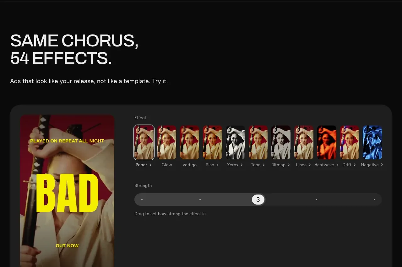 Effects and customization panel
Clips by Plastic · Feature grid