 kage
kage
latitude.so
Design analysis
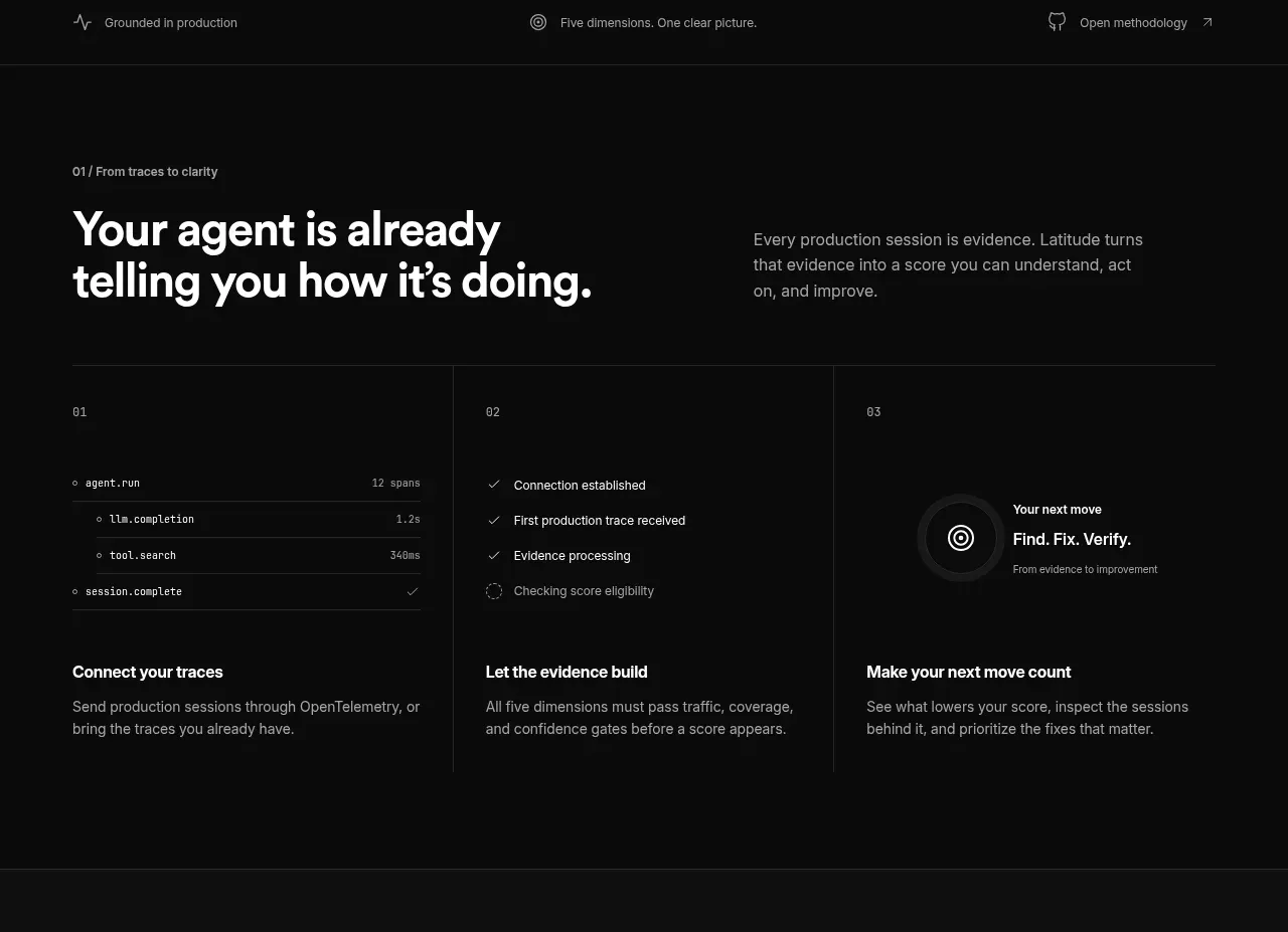
A dark explanatory section introduces the core idea, then uses three equal columns to turn an abstract benchmark into a simple observe, interpret, and act workflow.
Prompt preview
## Reference images

Study these alongside the description below: hierarchy, rhythm, spacing, colour. Build for the product you are asked about, using this design language.

- Component: https://kage-design-assets.t3.tigrisfiles.io/components/agentscore/bf3a39fb-f256-40cb-bcdd-3b9ee37cde16-1790229736-2.webp
- Full page it was cut from: https://kage-design-assets.t3.tigrisfiles.io/screenshots/agentscore/bf3a39fb-f256-40cb-bcdd-3b9ee37cde16-1790229689528-full.webp
- Component on Kage: https://kage.design/component/agentscore-feature-grid

## Before you start
Ask what the user's product workflow is and which three stages best explain its value. Apply the principles below to that product.

Build a dark section with a two-column introductory row: a large left heading and a compact right paragraph. Below it, add three equal-width cards separated by fine vertical rules. Each card should have a small numeric label, a compact evidence or status visual at the top, a short bold title, and two lines of explanatory copy. Use a 50px page gutter, a max-width around 800px, and a horizontal rule above the card row. The background should be near-black (#090909), with borders in #292929, primary text #f4f4f4, secondary text #929292, and a tiny muted label in #777. Use 30–34px section heading type, 15px body copy, 12px labels, 24–32px card padding, and minimal radius or square editorial edges. Keep the three columns visually equal and let the miniature status visuals support comprehension without becoming illustrations. Add subtle hover emphasis to a card only if interaction is useful.

Never: use logos, product names, copy, illustrations, or imagery from the reference.
More components

 Spend visibility and daily-cost breakdown
Subscrr · Feature grid
Spend visibility and daily-cost breakdown
Subscrr · Feature grid
 Reminders and simple setup flow
Subscrr · Feature grid
Reminders and simple setup flow
Subscrr · Feature grid

 Security and permissions cards
NotchPop · Feature grid
Security and permissions cards
NotchPop · Feature grid
 Focused feature cards
NotchPop · Feature grid
Focused feature cards
NotchPop · Feature grid
 Interactive product demonstration
NotchPop · Feature grid
Interactive product demonstration
NotchPop · Feature grid
 Quiet information cards
NotchPop · Feature grid
Quiet information cards
NotchPop · Feature grid