 kage
kage
latitude.so
Design analysis
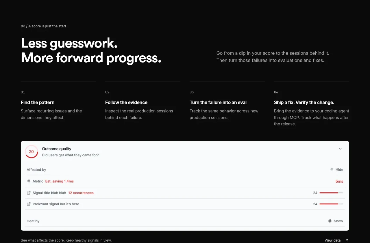
A second process section shifts from explanation to action, presenting four compact stages above a wide, light dashboard evidence card.
Prompt preview
## Reference images

Study these alongside the description below: hierarchy, rhythm, spacing, colour. Build for the product you are asked about, using this design language.

- Component: https://kage-design-assets.t3.tigrisfiles.io/components/agentscore/bf3a39fb-f256-40cb-bcdd-3b9ee37cde16-1790229737-4.webp
- Full page it was cut from: https://kage-design-assets.t3.tigrisfiles.io/screenshots/agentscore/bf3a39fb-f256-40cb-bcdd-3b9ee37cde16-1790229689528-full.webp
- Component on Kage: https://kage.design/component/agentscore-feature-grid-2

## Before you start
Ask what recurring improvement loop your product enables and what evidence or result should appear in its supporting visual. Apply the structure to that product.

Build a dark section with a two-column heading row, followed by four evenly distributed process items in a single row. Each item has a small index, a concise bold title, and a short explanation. Below them, place a wide rounded light UI evidence card that demonstrates the outcome: use a clean white surface, compact rows, a status indicator, and small metric bars. Keep the card clearly subordinate to the process narrative. Use #0b0b0b background, #f5f5f5 text, #959595 secondary text, #252525 rules, and a white card (#fafafa) with muted gray text and one restrained accent color such as #cf3d55. Use 30–36px heading type, 13–15px copy, 12px labels, 28px item gaps, and 12px card radius. Add responsive wrapping for the four items and preserve readable card density on mobile.

Never: use logos, product names, copy, illustrations, or imagery from the reference.
More components

 Spend visibility and daily-cost breakdown
Subscrr · Feature grid
Spend visibility and daily-cost breakdown
Subscrr · Feature grid
 Reminders and simple setup flow
Subscrr · Feature grid
Reminders and simple setup flow
Subscrr · Feature grid

 Security and permissions cards
NotchPop · Feature grid
Security and permissions cards
NotchPop · Feature grid
 Focused feature cards
NotchPop · Feature grid
Focused feature cards
NotchPop · Feature grid
 Interactive product demonstration
NotchPop · Feature grid
Interactive product demonstration
NotchPop · Feature grid
 Quiet information cards
NotchPop · Feature grid
Quiet information cards
NotchPop · Feature grid