 kage
kage
latitude.so
Design analysis
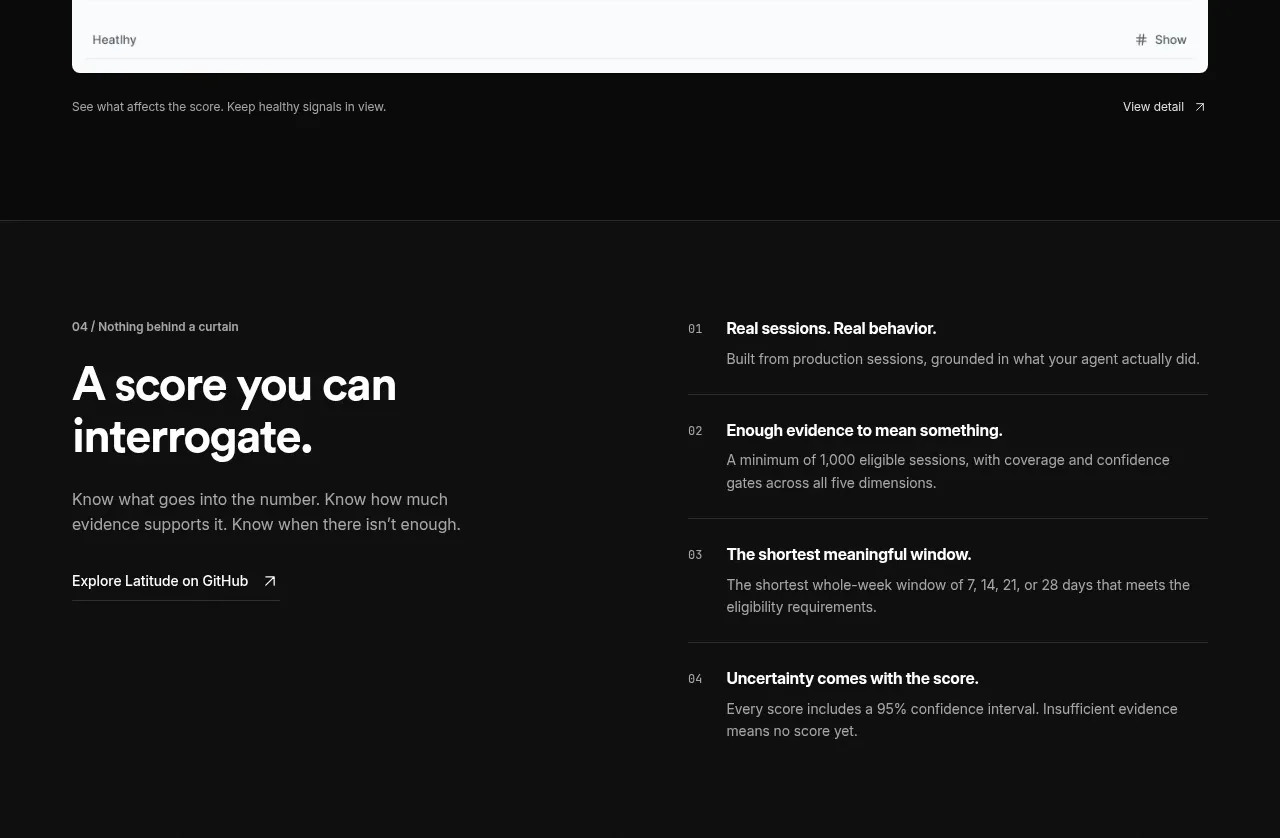
A final explanatory band uses a left-side claim and CTA beside a numbered list of four principles, making the scoring methodology feel inspectable and trustworthy.
Prompt preview
## Reference images

Study these alongside the description below: hierarchy, rhythm, spacing, colour. Build for the product you are asked about, using this design language.

- Component: https://kage-design-assets.t3.tigrisfiles.io/components/agentscore/bf3a39fb-f256-40cb-bcdd-3b9ee37cde16-1790229737-5.webp
- Full page it was cut from: https://kage-design-assets.t3.tigrisfiles.io/screenshots/agentscore/bf3a39fb-f256-40cb-bcdd-3b9ee37cde16-1790229689528-full.webp
- Component on Kage: https://kage.design/component/agentscore-feature-grid-3

## Before you start
Ask what makes the user's system trustworthy, inspectable, or explainable. Turn those ideas into a short claim and a list of principles for that product.

Create a dark two-column methodology section. On the left, show a small section marker, a strong two-line heading, a short paragraph, and a text-link CTA with an arrow. On the right, show four numbered principles separated by thin horizontal rules; each has a bold one-line title and a muted explanatory sentence. Align the top of both columns and leave generous breathing room below the content. Use a 50px outer gutter, a 40/60 column split, near-black #0b0b0b background, white #f3f3f3 headings, #979797 body text, and #282828 separators. Use 32–38px heading type, 14–15px body copy, 12px indices, and 20–26px vertical spacing between list items. Make the text link brighten on hover and ensure the layout becomes a stacked flow on small screens.

Never: use logos, product names, copy, illustrations, or imagery from the reference.
More components

 Spend visibility and daily-cost breakdown
Subscrr · Feature grid
Spend visibility and daily-cost breakdown
Subscrr · Feature grid
 Reminders and simple setup flow
Subscrr · Feature grid
Reminders and simple setup flow
Subscrr · Feature grid

 Security and permissions cards
NotchPop · Feature grid
Security and permissions cards
NotchPop · Feature grid
 Focused feature cards
NotchPop · Feature grid
Focused feature cards
NotchPop · Feature grid
 Interactive product demonstration
NotchPop · Feature grid
Interactive product demonstration
NotchPop · Feature grid
 Quiet information cards
NotchPop · Feature grid
Quiet information cards
NotchPop · Feature grid