 kage
kage
buddy.works
Design analysis
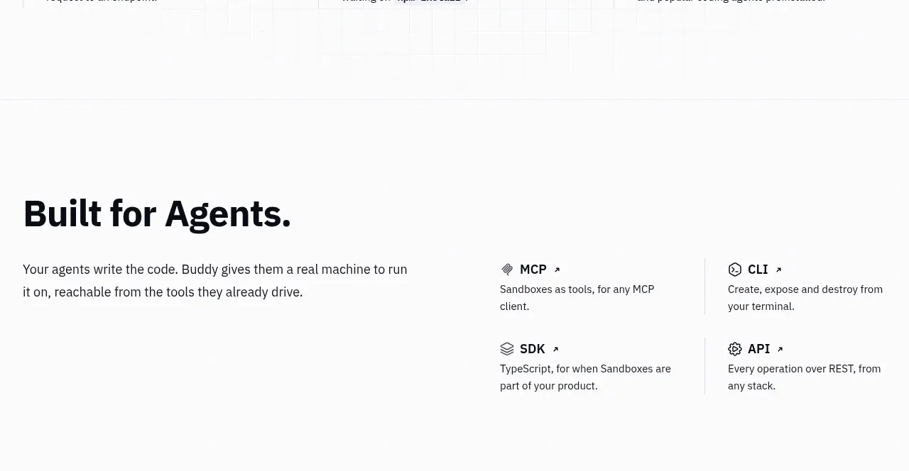
A broad statement about the target user sits beside a compact matrix of integration cards, balancing narrative positioning with concrete entry points.
Prompt preview
## Reference images

Study these alongside the description below: hierarchy, rhythm, spacing, colour. Build for the product you are asked about, using this design language.

- Component: https://kage-design-assets.t3.tigrisfiles.io/components/ai-sandboxes-by-buddy/f0e6e8b3-2b0a-4e1e-b3c7-06d5e5447056-1792130830-5.webp
- Full page it was cut from: https://kage-design-assets.t3.tigrisfiles.io/screenshots/ai-sandboxes-by-buddy/f0e6e8b3-2b0a-4e1e-b3c7-06d5e5447056-1792130620611-full.webp
- Component on Kage: https://kage.design/component/ai-sandboxes-by-buddy-feature-grid-2

## Before you start
Ask who the user's ideal operator or developer is, which integrations are real, and what action each integration should lead to. Then use this structure for a bespoke section.

Create an integrations section with a large editorial heading and supporting paragraph on the left, plus a two-by-two matrix of compact integration cards on the right. Each card should have a small utility icon, a concise name, a one-sentence description, and an optional arrow affordance. Use strong alignment, vertical hairline separators, and plenty of negative space rather than boxed cards everywhere. Keep typography near-black #14161C, muted copy #596069, and icons in dark gray with one lime or cyan accent. Add subtle hover movement or a border-color transition, but do not make the interaction distracting. Stack the matrix below the narrative on mobile.

Never: use the reference's product name, exact integration names, exact copy, logos, illustrations, or imagery.
More components

 Data-to-action engine
Salience · Feature grid
Data-to-action engine
Salience · Feature grid
 Actionable alert workflow
Salience · Feature grid
Actionable alert workflow
Salience · Feature grid
 Trust proof and core outcomes
Salience · Feature grid
Trust proof and core outcomes
Salience · Feature grid
 Three-step implementation flow
Salience · Feature grid
Three-step implementation flow
Salience · Feature grid
 What analytics misses
Salience · Feature grid
What analytics misses
Salience · Feature grid

 Workflow features and capabilities
CrewTower Mod for Claude Code · Feature grid
Workflow features and capabilities
CrewTower Mod for Claude Code · Feature grid