 kage
kage
salience.com

Design analysis
A high-contrast dark band pairs a strong explanatory statement with a vertically divided list of concrete capabilities, creating a visual reset and stronger persuasion.
Prompt preview
## Reference images

Study these alongside the description below: hierarchy, rhythm, spacing, colour. Build for the product you are asked about, using this design language.

- Component: https://kage-design-assets.t3.tigrisfiles.io/components/salience/db9244f7-ec48-4516-9a93-11a957a9eab9-1792303420-5.webp
- Full page it was cut from: https://kage-design-assets.t3.tigrisfiles.io/screenshots/salience/db9244f7-ec48-4516-9a93-11a957a9eab9-1792303314589-full.webp
- Component on Kage: https://kage.design/component/salience-feature-grid-3

## Before you start
Ask what important signals the user's customers currently miss and which capabilities resolve those gaps. Turn them into a benefit-led dark section.

Create a full-width near-black section (#050605) with a two-column max-width layout. The left column contains a small uppercase eyebrow, a large 38–48px white heading, and muted explanatory text. The right column is a stacked list of five benefits separated by thin charcoal rules (#242824). Each row begins with a small lime square icon (#8bea72), a bold 14px title, and one or two lines of grey-green description. Keep the left column sticky only if the page context supports it; otherwise align both columns at the top. Use 80–104px vertical padding, 32–48px column gap, and restrained motion on row hover. Ensure contrast, focus states, and responsive stacking are accessible.

Never use logos, product names, copy, illustrations, or imagery from the reference.
More components

 Actionable alert workflow
Salience · Feature grid
Actionable alert workflow
Salience · Feature grid
 Data-to-action engine
Salience · Feature grid
Data-to-action engine
Salience · Feature grid
 Trust proof and core outcomes
Salience · Feature grid
Trust proof and core outcomes
Salience · Feature grid
 Three-step implementation flow
Salience · Feature grid
Three-step implementation flow
Salience · Feature grid

 Workflow features and capabilities
CrewTower Mod for Claude Code · Feature grid
Workflow features and capabilities
CrewTower Mod for Claude Code · Feature grid
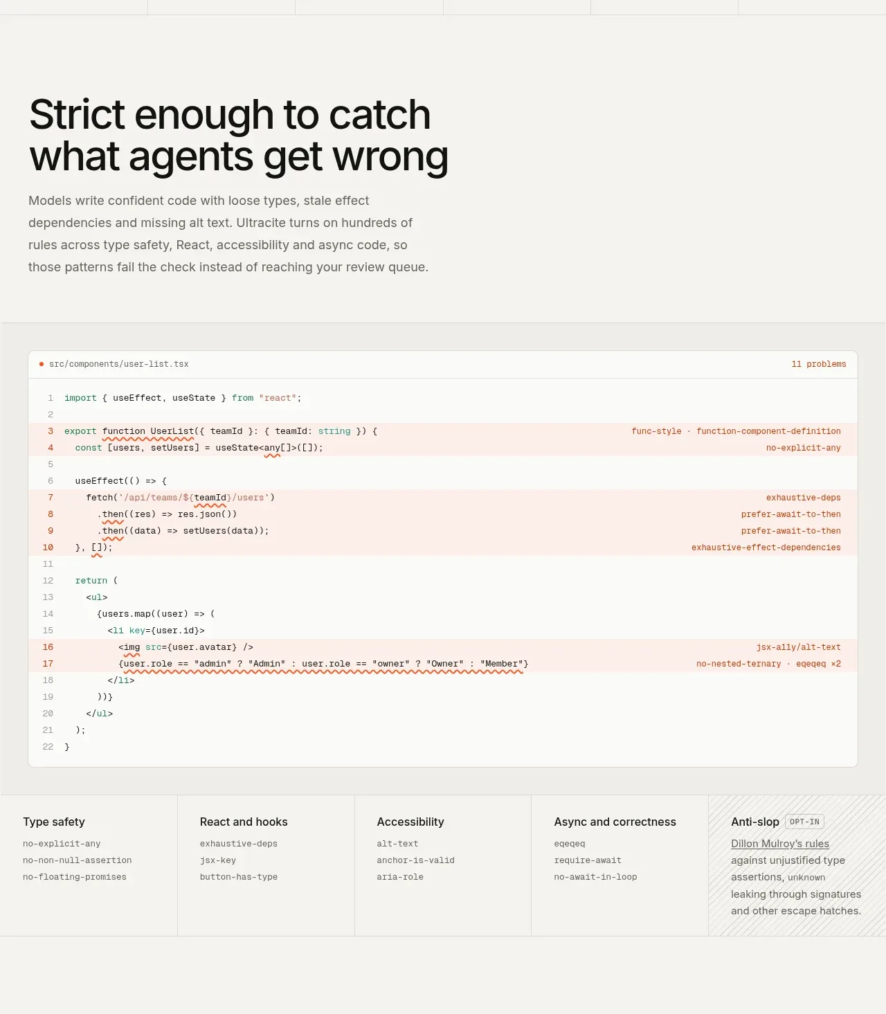
 Rules caught before review
Ultracite v8 · Feature grid
Rules caught before review
Ultracite v8 · Feature grid