 kage
kage
salience.com

Design analysis
This instructional section reduces implementation anxiety by showing a linear connect-observe-act sequence, supporting details, integrations, and setup links.
Prompt preview
## Reference images

Study these alongside the description below: hierarchy, rhythm, spacing, colour. Build for the product you are asked about, using this design language.

- Component: https://kage-design-assets.t3.tigrisfiles.io/components/salience/db9244f7-ec48-4516-9a93-11a957a9eab9-1792303420-4.webp
- Full page it was cut from: https://kage-design-assets.t3.tigrisfiles.io/screenshots/salience/db9244f7-ec48-4516-9a93-11a957a9eab9-1792303314589-full.webp
- Component on Kage: https://kage.design/component/salience-feature-grid-2

## Before you start
Ask how the user's product is installed or adopted and what the three most important stages are. Use that workflow to create a clear explanatory section.

Build a white “how it works” band with a small uppercase label, a two-line 40–50px heading, and a short reassurance sentence. Below, create three equal step columns connected by a faint horizontal rule or arrow. Each step has a numbered micro-label, a simple line icon, a 16px title, and concise explanatory copy. Add a secondary metadata row beneath with implementation facts and a compact integration strip, followed by two understated text links. Use 64–88px section padding, 24px grid gaps, near-black typography (#111111), secondary text (#69716a), pale dividers (#e7ebe5), and tiny accent green details (#8bea72). The connectors should disappear or become vertical on mobile. Make the sequence scannable rather than decorative.

Never use logos, product names, copy, illustrations, or imagery from the reference.
More components

 Actionable alert workflow
Salience · Feature grid
Actionable alert workflow
Salience · Feature grid
 Data-to-action engine
Salience · Feature grid
Data-to-action engine
Salience · Feature grid
 Trust proof and core outcomes
Salience · Feature grid
Trust proof and core outcomes
Salience · Feature grid
 What analytics misses
Salience · Feature grid
What analytics misses
Salience · Feature grid

 Workflow features and capabilities
CrewTower Mod for Claude Code · Feature grid
Workflow features and capabilities
CrewTower Mod for Claude Code · Feature grid
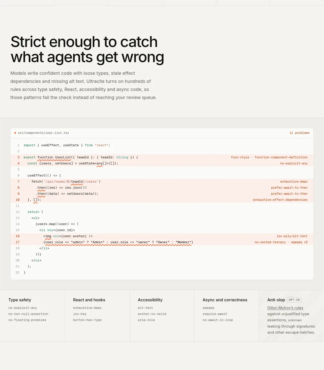
 Rules caught before review
Ultracite v8 · Feature grid
Rules caught before review
Ultracite v8 · Feature grid