 kage
kage
crewtower.app

Design analysis
A large editorial feature section combines a heading with a three-column gallery of workflow states and a second grid of smaller capabilities, showing concrete product behavior rather than relying on abstract claims.
Prompt preview
## Reference images

Study these alongside the description below: hierarchy, rhythm, spacing, colour. Build for the product you are asked about, using this design language.

- Component: https://kage-design-assets.t3.tigrisfiles.io/components/crewtower-mod-for-claude-code/6a95b5f4-2bf6-41f9-aa93-70409ededf43-1792303419-2.webp
- Full page it was cut from: https://kage-design-assets.t3.tigrisfiles.io/screenshots/crewtower-mod-for-claude-code/6a95b5f4-2bf6-41f9-aa93-70409ededf43-1792303277739-full.webp
- Component on Kage: https://kage.design/component/crewtower-mod-for-claude-code-feature-grid

## Before you start
Ask what the user's product's most important workflows are and which capabilities deserve visual proof. Use the answers to invent original examples.

Build a feature section with a small uppercase eyebrow, a strong left-aligned heading, and a responsive three-column grid. Each feature card should pair a soft colored media panel with a compact dark UI/status mockup, followed by a concise title and supporting explanation. Use alternating pastel panels such as #dcd9f4, #f4dcd8, and #d6edf0, with #151515 mockups, thin muted borders, and 16px corner radii. Follow the image-first cards with a second three-column capability grid using small black icon tiles, bold 15–16px titles, and muted 13–14px descriptions. Keep a consistent 18–24px card gap, 56–80px section padding, and align all text to a shared grid. Use hover elevation or a subtle border transition, but do not make the visuals distracting.

Never use logos, product names, copy, illustrations, or imagery from the reference.
More components

 What analytics misses
Salience · Feature grid
What analytics misses
Salience · Feature grid
 Data-to-action engine
Salience · Feature grid
Data-to-action engine
Salience · Feature grid
 Three-step implementation flow
Salience · Feature grid
Three-step implementation flow
Salience · Feature grid
 Trust proof and core outcomes
Salience · Feature grid
Trust proof and core outcomes
Salience · Feature grid
 Actionable alert workflow
Salience · Feature grid
Actionable alert workflow
Salience · Feature grid
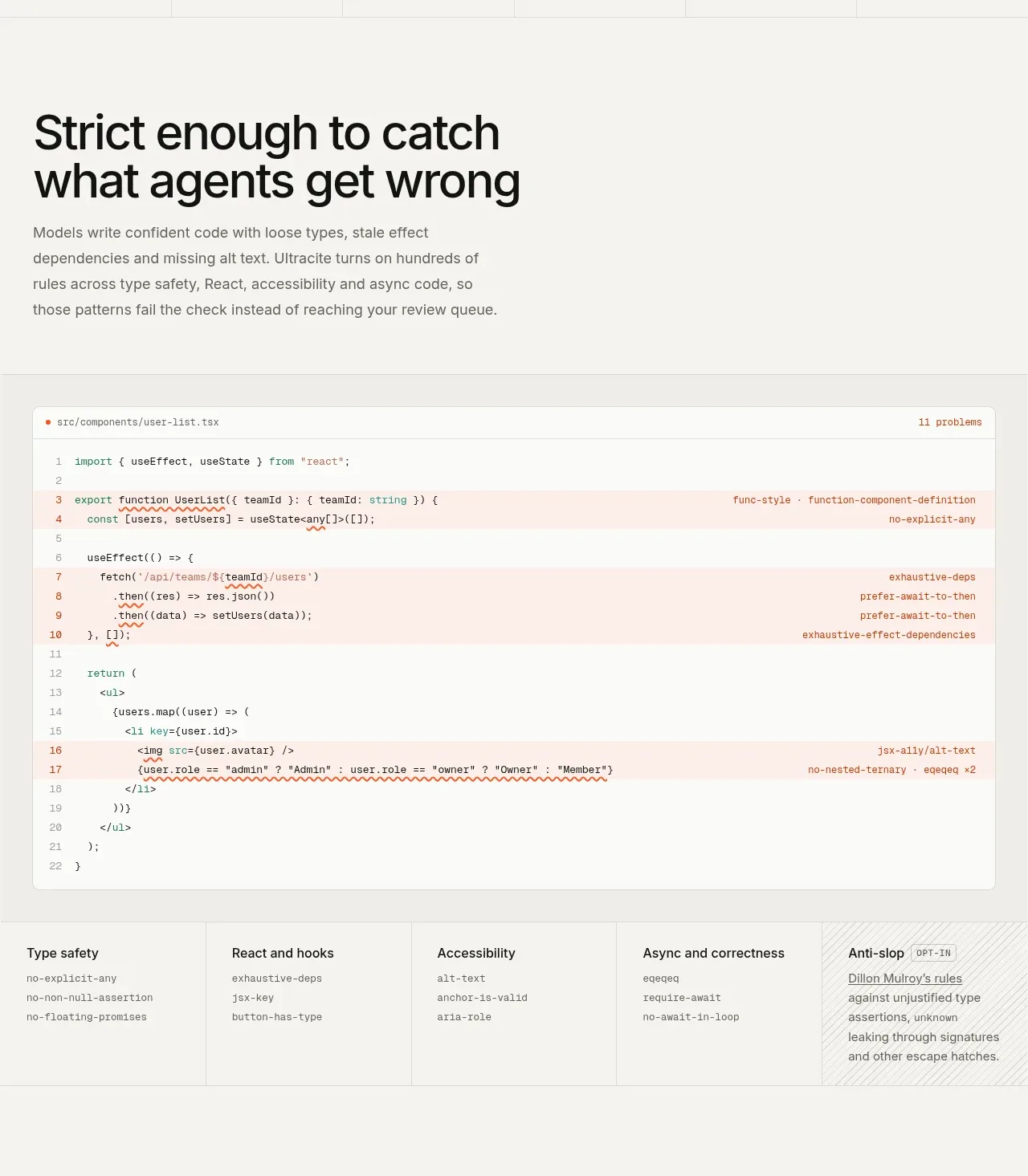
 Rules caught before review
Ultracite v8 · Feature grid
Rules caught before review
Ultracite v8 · Feature grid