 kage
kage
salience.com

Design analysis
A product screenshot-like alert panel is balanced by clear explanatory copy and a lower integration strip, showing how the system turns detection into action.
Prompt preview
## Reference images

Study these alongside the description below: hierarchy, rhythm, spacing, colour. Build for the product you are asked about, using this design language.

- Component: https://kage-design-assets.t3.tigrisfiles.io/components/salience/db9244f7-ec48-4516-9a93-11a957a9eab9-1792303421-6.webp
- Full page it was cut from: https://kage-design-assets.t3.tigrisfiles.io/screenshots/salience/db9244f7-ec48-4516-9a93-11a957a9eab9-1792303314589-full.webp
- Component on Kage: https://kage.design/component/salience-feature-grid-4

## Before you start
Ask what events your product detects, who receives them, and what action should follow. Build an original alert-workflow section around that job.

Create a light section with a two-column layout: left-side heading, eyebrow, short paragraph, and a small supporting note; right-side a polished dashboard-style alert panel. The panel should be a generic UI composition made from HTML/CSS: white surface, 1px border (#dfe5df), 10px radius, compact toolbar, green status pills, alert rows, severity markers, and action buttons. Do not use a photographic screenshot. Give the panel a soft shadow and let it overlap neither adjacent content nor the viewport. Beneath the main row, add a “fits how you work” strip with 5–6 small capability items in columns. Use black text, muted grey copy, pale green highlights (#dfffd7), and a white background. Include hover/focus affordances for alert rows and buttons.

Never use logos, product names, copy, illustrations, or imagery from the reference.
More components

 What analytics misses
Salience · Feature grid
What analytics misses
Salience · Feature grid
 Data-to-action engine
Salience · Feature grid
Data-to-action engine
Salience · Feature grid
 Trust proof and core outcomes
Salience · Feature grid
Trust proof and core outcomes
Salience · Feature grid
 Three-step implementation flow
Salience · Feature grid
Three-step implementation flow
Salience · Feature grid

 Workflow features and capabilities
CrewTower Mod for Claude Code · Feature grid
Workflow features and capabilities
CrewTower Mod for Claude Code · Feature grid
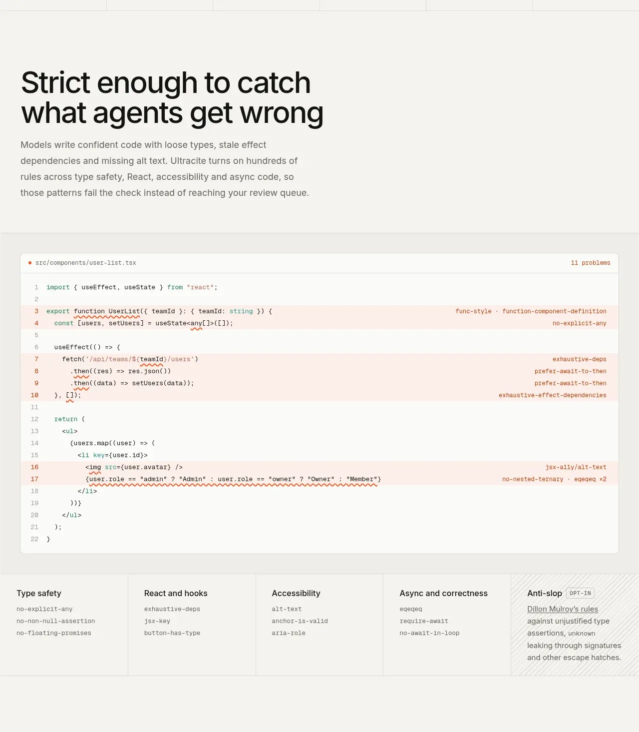
 Rules caught before review
Ultracite v8 · Feature grid
Rules caught before review
Ultracite v8 · Feature grid