 kage
kage
salience.com

Design analysis
A restrained proof band moves from credibility signals into four concise outcome cards, making the value legible before the audience-specific section.
Prompt preview
## Reference images

Study these alongside the description below: hierarchy, rhythm, spacing, colour. Build for the product you are asked about, using this design language.

- Component: https://kage-design-assets.t3.tigrisfiles.io/components/salience/db9244f7-ec48-4516-9a93-11a957a9eab9-1792303419-2.webp
- Full page it was cut from: https://kage-design-assets.t3.tigrisfiles.io/screenshots/salience/db9244f7-ec48-4516-9a93-11a957a9eab9-1792303314589-full.webp
- Component on Kage: https://kage.design/component/salience-feature-grid

## Before you start
Ask for the user's proof points, customer types, and the four strongest outcomes. Translate them into an original proof-and-benefits section.

Build a white trust section with a centred uppercase credibility label, a single horizontal row of 5–7 customer or integration names rendered as neutral text placeholders, then a thin divider. Under it, show four equal-width benefit columns with tiny accent icons, short bold titles, and 2–3 lines of supporting copy. Use a 12-column grid with consistent gutters, generous 56–72px vertical padding, 14px body text, and 12–13px labels. Use white (#ffffff), near-black (#111111), muted grey (#69716a), pale green icon accents (#c9ffc0), and hairline borders (#e7ebe5). Avoid heavy cards; let alignment and whitespace provide structure. On mobile stack the columns and allow proof items to wrap.

Never use logos, product names, copy, illustrations, or imagery from the reference.
More components

 Actionable alert workflow
Salience · Feature grid
Actionable alert workflow
Salience · Feature grid
 Data-to-action engine
Salience · Feature grid
Data-to-action engine
Salience · Feature grid
 Three-step implementation flow
Salience · Feature grid
Three-step implementation flow
Salience · Feature grid
 What analytics misses
Salience · Feature grid
What analytics misses
Salience · Feature grid

 Workflow features and capabilities
CrewTower Mod for Claude Code · Feature grid
Workflow features and capabilities
CrewTower Mod for Claude Code · Feature grid
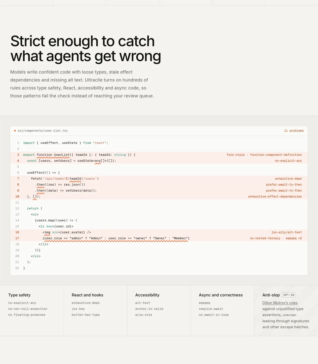
 Rules caught before review
Ultracite v8 · Feature grid
Rules caught before review
Ultracite v8 · Feature grid