 kage
kage
airjelly.ai

Design analysis
A concise trust-focused block pairs a privacy promise with a single low-friction action. The copy is left aligned in a narrow editorial column, allowing the button and message to feel calm rather than sales-heavy.
Prompt preview
## Reference images

Study these alongside the description below: hierarchy, rhythm, spacing, colour. Build for the product you are asked about, using this design language.

- Component: https://kage-design-assets.t3.tigrisfiles.io/components/airjelly/990a635f-6745-4f3e-9b4f-9fb8b62b8b48-1792044311-6.webp
- Full page it was cut from: https://kage-design-assets.t3.tigrisfiles.io/screenshots/airjelly/990a635f-6745-4f3e-9b4f-9fb8b62b8b48-1792044207019-full.webp
- Component on Kage: https://kage.design/component/airjelly-cta

## Before you start
Ask what trust, security, or privacy concern matters most for the user's product, then make this reassurance specific to that product.

Build a quiet reassurance CTA in a centered max-width container. Use a muted eyebrow, a large two-line or single-line heading, two lines of supporting copy, and one white outlined pill button with an arrow or action affordance. Keep the composition left aligned, with generous top and bottom padding around 64–84px. Use #111111 for the heading, #6F6F6F for body text, white background, and #E5E5E5 borders with a 20px radius. The button should have a subtle lift or border-colour change on hover and a clear focus ring. Avoid urgency language; the section should feel transparent and reassuring.

Never: use logos, product names, copy, illustrations, or imagery from the reference.
More components
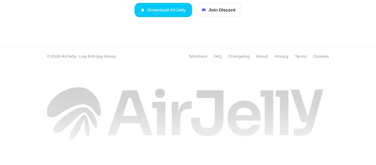
 Download conversion close
AirJelly · Call to action
Download conversion close
AirJelly · Call to action
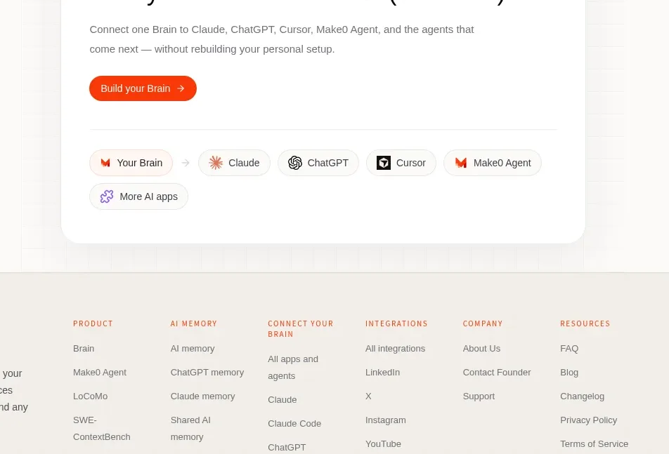
 Build-your-brain conversion card
Make0 Brain · Call to action
Build-your-brain conversion card
Make0 Brain · Call to action

 Color-framed conversion call to action
Pancake · Call to action
Color-framed conversion call to action
Pancake · Call to action
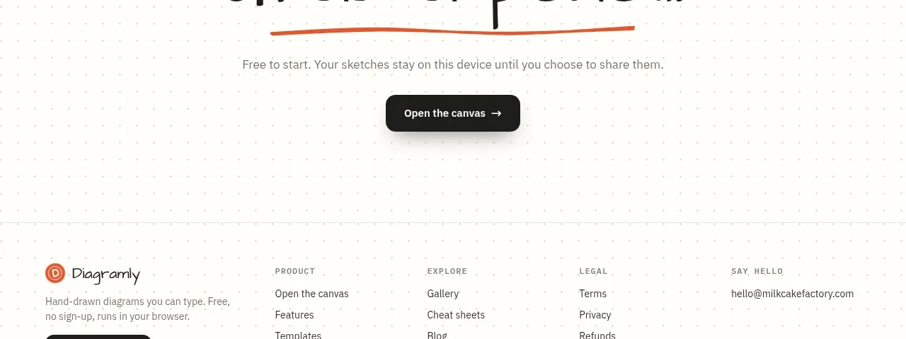
 Final action banner
Diagramly · Call to action
Final action banner
Diagramly · Call to action
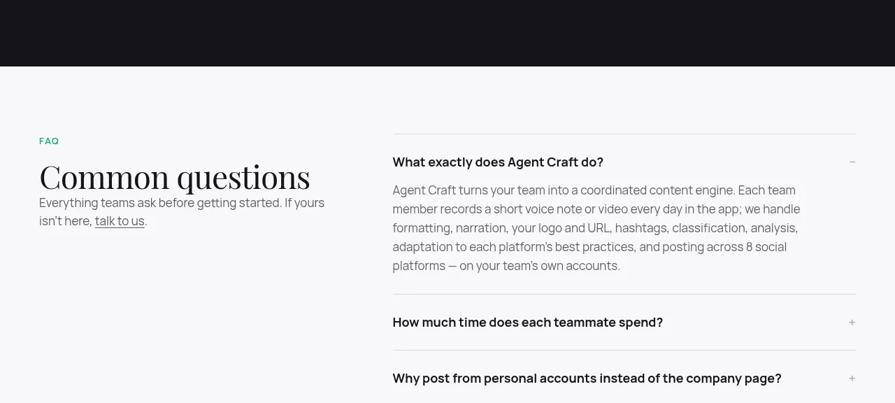
 High-contrast demo CTA
Agent Craft · Call to action
High-contrast demo CTA
Agent Craft · Call to action
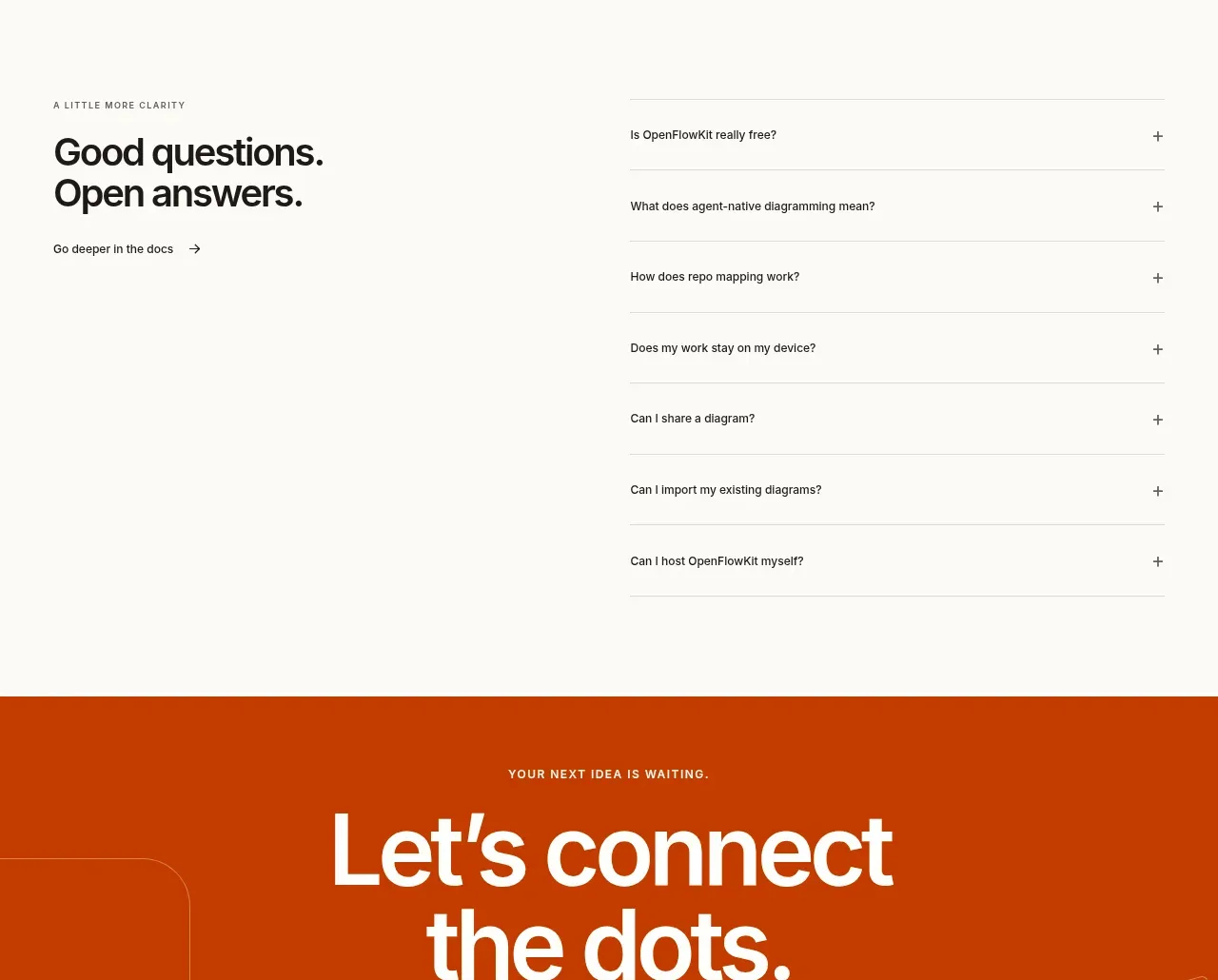
 Open-source closing CTA
OpenFlowKit 2 · Call to action
Open-source closing CTA
OpenFlowKit 2 · Call to action