 kage
kage
airjelly.ai
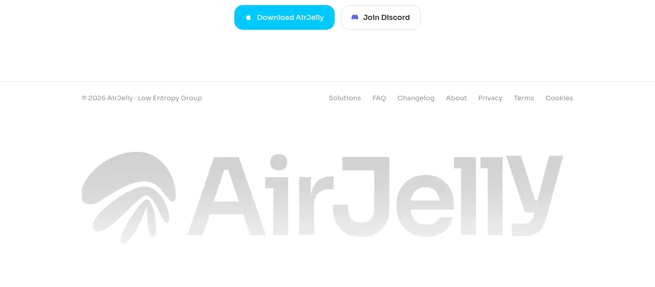
Design analysis
The final conversion section returns to centered alignment and repeats the core action pair after a direct, memorable headline. The generous whitespace makes the ending feel decisive and uncluttered.
Prompt preview
## Reference images

Study these alongside the description below: hierarchy, rhythm, spacing, colour. Build for the product you are asked about, using this design language.

- Component: https://kage-design-assets.t3.tigrisfiles.io/components/airjelly/990a635f-6745-4f3e-9b4f-9fb8b62b8b48-1792044312-9.webp
- Full page it was cut from: https://kage-design-assets.t3.tigrisfiles.io/screenshots/airjelly/990a635f-6745-4f3e-9b4f-9fb8b62b8b48-1792044207019-full.webp
- Component on Kage: https://kage.design/component/airjelly-cta-2

## Before you start
Ask what final action the user's product wants visitors to take and what practical reassurance they need immediately before taking it, then build this closing CTA around that.

Create a centered closing CTA with a small muted eyebrow, a bold two-line headline, one or two lines of supporting copy, and two adjacent pill buttons. Use a white canvas and generous 72–96px vertical padding. The primary button should use a vivid brand accent such as #16C7E8 with white text; the secondary should be white with a #E5E5E5 border and dark text. Keep the content column narrow and centered, use 18–24px button radii, and provide hover, focus, and mobile wrapping states. The closing message should feel confident and concrete without adding extra navigation or visual noise.

Never: use logos, product names, copy, illustrations, or imagery from the reference.
More components

 Privacy reassurance call to action
AirJelly · Call to action
Privacy reassurance call to action
AirJelly · Call to action

 Build-your-brain conversion card
Make0 Brain · Call to action
Build-your-brain conversion card
Make0 Brain · Call to action

 Color-framed conversion call to action
Pancake · Call to action
Color-framed conversion call to action
Pancake · Call to action
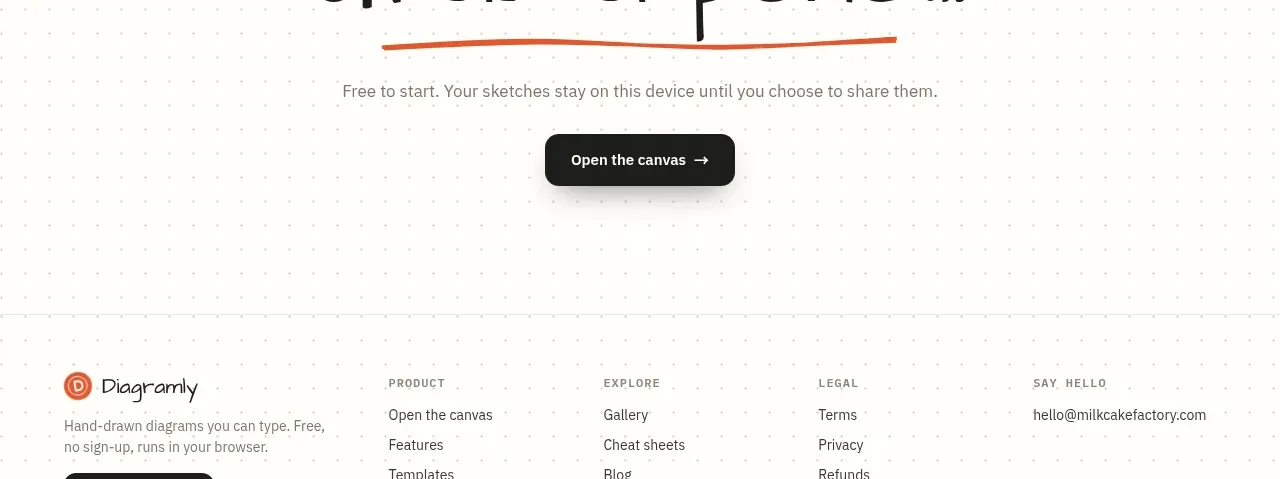
 Final action banner
Diagramly · Call to action
Final action banner
Diagramly · Call to action

 High-contrast demo CTA
Agent Craft · Call to action
High-contrast demo CTA
Agent Craft · Call to action
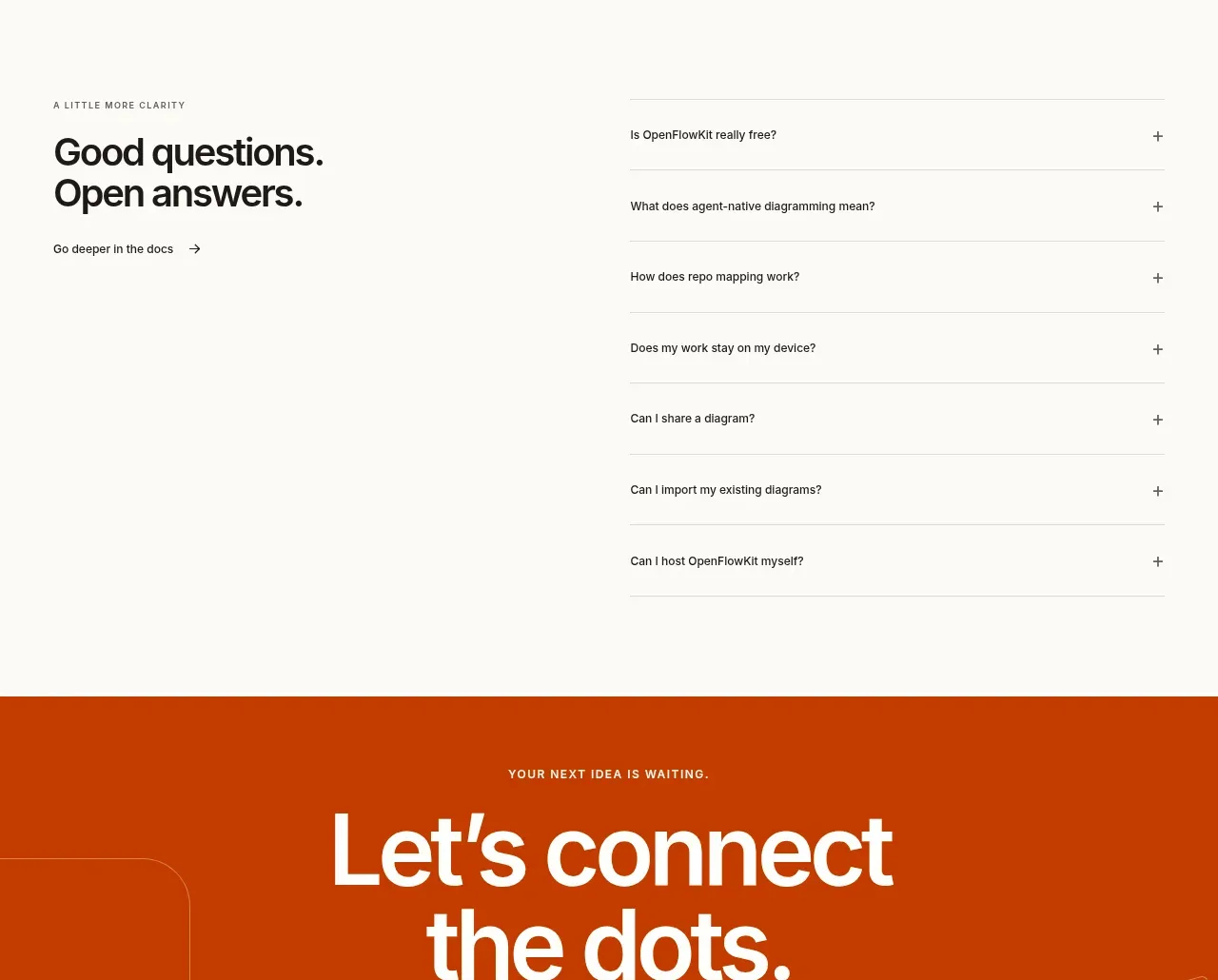
 Open-source closing CTA
OpenFlowKit 2 · Call to action
Open-source closing CTA
OpenFlowKit 2 · Call to action