 kage
kage
pancake.ai

Design analysis
A centered conversion panel uses a cream inset and bold curved color rails at both sides. A short headline, supporting sentence, and two-button choice make the next action unmistakable.
Prompt preview
## Reference images

Study these alongside the description below: hierarchy, rhythm, spacing, colour. Build for the product you are asked about, using this design language.

- Component: https://kage-design-assets.t3.tigrisfiles.io/components/pancake/f2dcc4e1-7584-486e-8c34-37279d03f6e2-1792044192-4.webp
- Full page it was cut from: https://kage-design-assets.t3.tigrisfiles.io/screenshots/pancake/f2dcc4e1-7584-486e-8c34-37279d03f6e2-1792044073540-full.webp
- Component on Kage: https://kage.design/component/pancake-cta

## Before you start
Ask what conversion action matters most for the user's product, whether the audience prefers self-serve or sales contact, and which brand accents should frame the moment. Apply those choices to the component.

Build a wide, centered CTA panel within a warm ivory page. Use a cream inner surface near `#fffaf2`, 14–18px corner radius, and a playful but controlled abstract border motif: several thick curved vertical or diagonal bands in coral `#f45b87`, lavender `#a77af2`, blue `#3e55d8`, mint `#62c9a4`, and apricot `#ffbd78` clipped at the left and right edges. Keep the center uncluttered. Center a 36–44px dark-plum headline, a short 15–17px supporting paragraph, and a horizontal pair of primary and soft-secondary buttons. Use 12px radii, clear hover/focus states, and at least 48px touch targets. On narrow screens, stack the buttons and reduce the decorative bands so they never obscure text.

Never: use the reference logo, product name, exact copy, illustrations, or imagery.
More components
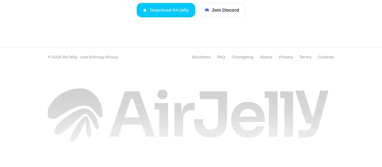
 Download conversion close
AirJelly · Call to action
Download conversion close
AirJelly · Call to action
 Privacy reassurance call to action
AirJelly · Call to action
Privacy reassurance call to action
AirJelly · Call to action
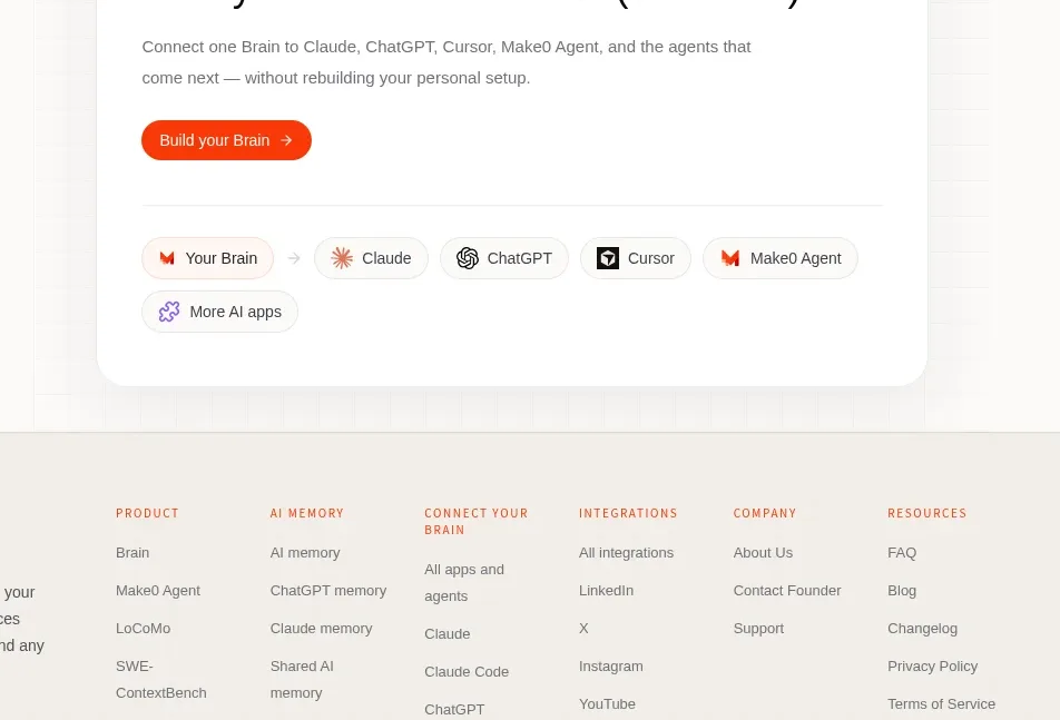
 Build-your-brain conversion card
Make0 Brain · Call to action
Build-your-brain conversion card
Make0 Brain · Call to action
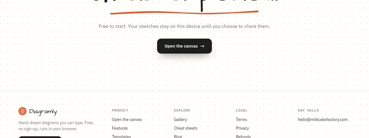
 Final action banner
Diagramly · Call to action
Final action banner
Diagramly · Call to action
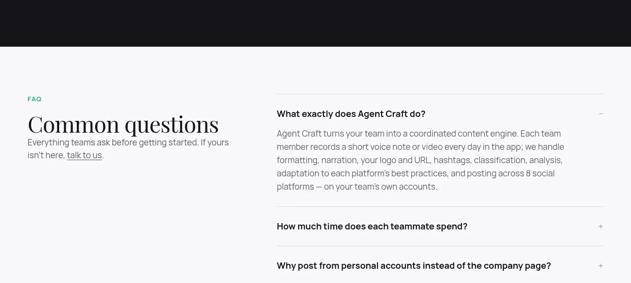
 High-contrast demo CTA
Agent Craft · Call to action
High-contrast demo CTA
Agent Craft · Call to action
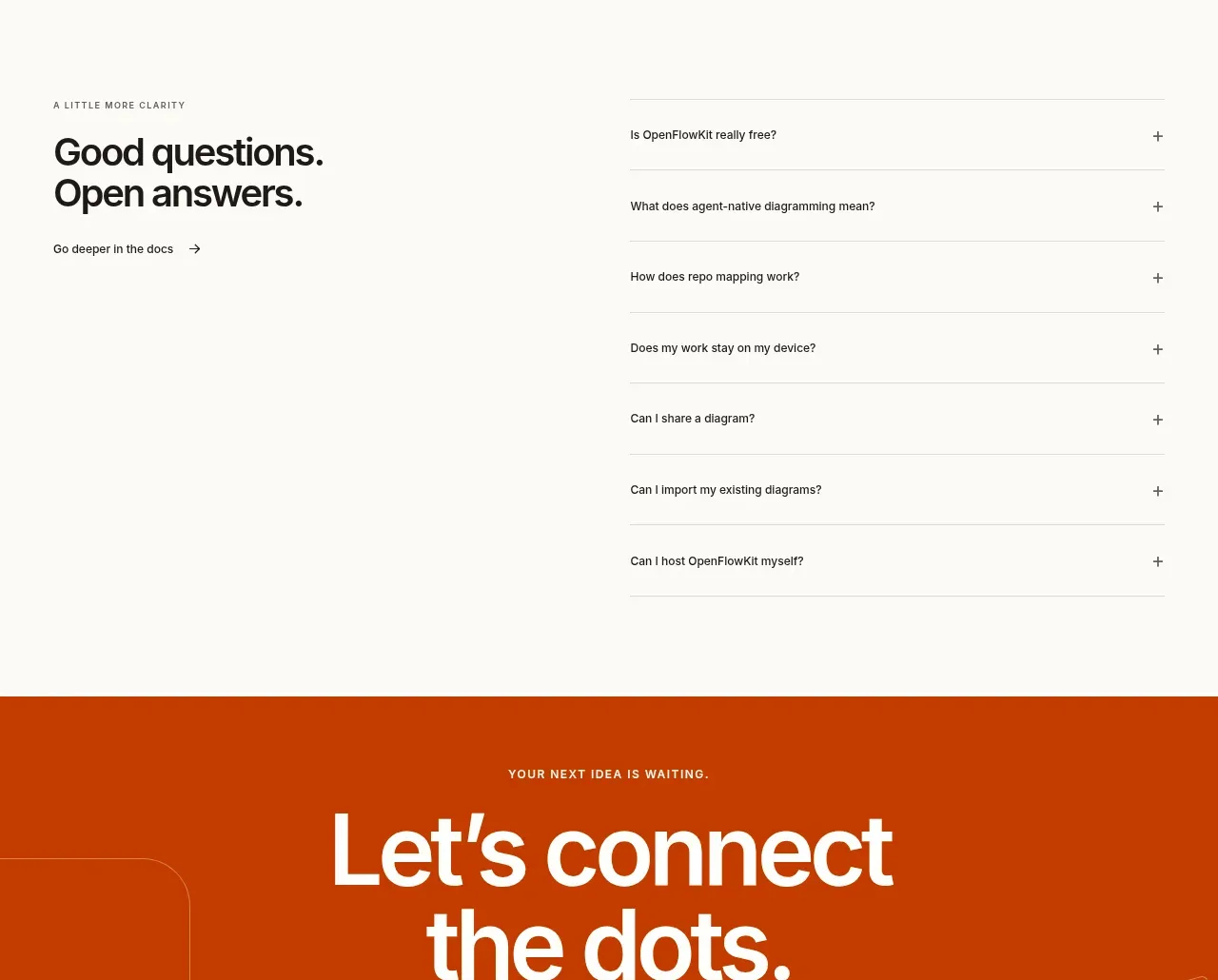
 Open-source closing CTA
OpenFlowKit 2 · Call to action
Open-source closing CTA
OpenFlowKit 2 · Call to action