 kage
kage
openflowkit.com

Design analysis
A bright closing section pairs a large product statement with a simple orbital mark treatment and one decisive action.
Prompt preview
## Reference images

Study these alongside the description below: hierarchy, rhythm, spacing, colour. Build for the product you are asked about, using this design language.

- Component: https://kage-design-assets.t3.tigrisfiles.io/components/openflowkit-2/3de20331-4179-415d-a7ba-29915155b155-1791957764-11.webp
- Full page it was cut from: https://kage-design-assets.t3.tigrisfiles.io/screenshots/openflowkit-2/3de20331-4179-415d-a7ba-29915155b155-1791957697393-full.webp
- Component on Kage: https://kage.design/component/openflowkit-2-cta-2

## Before you start
Ask what final action the user's product wants visitors to take and whether the brand is open-source, community-led, or commercially oriented. Adapt the CTA accordingly.

Create a spacious closing CTA on a warm off-white background. Use a split layout: an abstract circular/orbital visual on the left made from thin gray rings, small labels, and a simple centered geometric mark; on the right, a small eyebrow, large three-line heading with the final line in orange, concise reassurance copy, and one bordered primary action. Use near-black `#11110f`, orange `#e6531c`, pale gray `#dedbd4`, and white surfaces. Keep rings delicate, avoid gradients that overpower the message, and use 14–16px section padding on mobile with a stacked layout. The primary button should be clear, compact, and keyboard accessible.

Never use the reference's logo, product name, copy, illustrations, imagery, or exact orbital artwork.
More components

 High-contrast demo CTA
Agent Craft · Call to action
High-contrast demo CTA
Agent Craft · Call to action
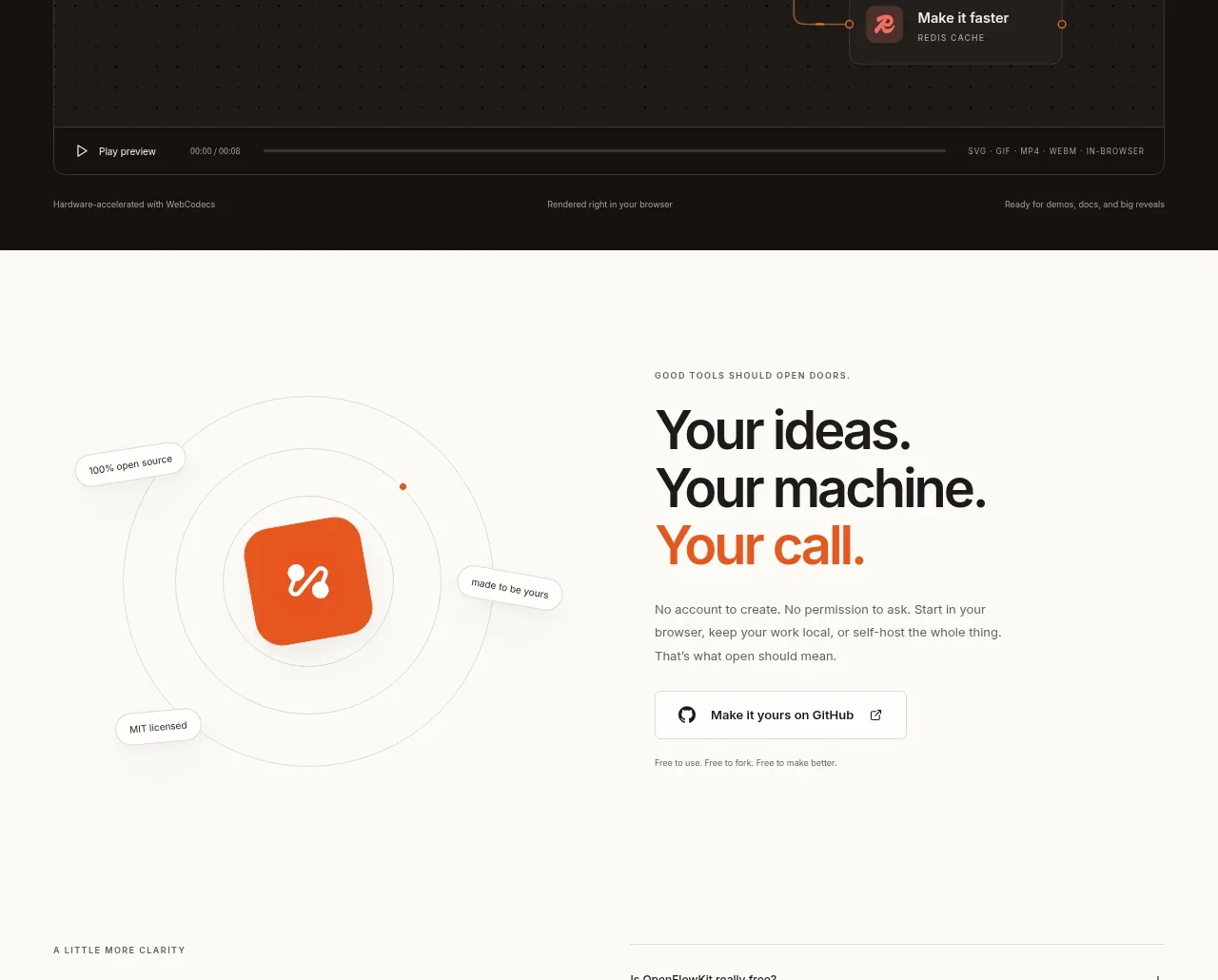
 Cinematic product preview
OpenFlowKit 2 · Call to action
Cinematic product preview
OpenFlowKit 2 · Call to action
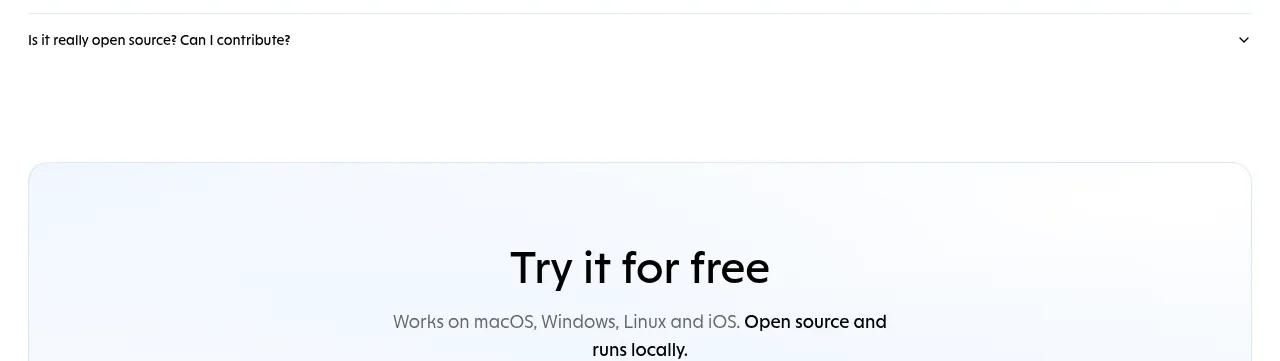
 Free download call to action
OpenWhispr for iOS · Call to action
Free download call to action
OpenWhispr for iOS · Call to action
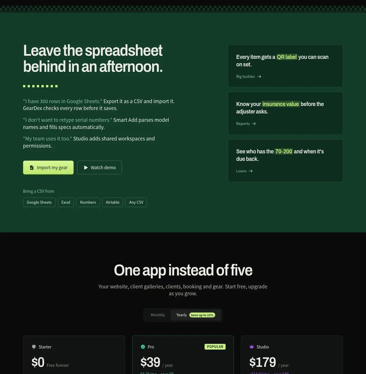
 Spreadsheet replacement import CTA
geardex.app · Call to action
Spreadsheet replacement import CTA
geardex.app · Call to action
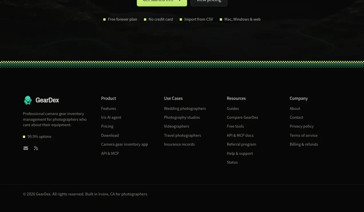 Final conversion call to action
geardex.app · Call to action
Final conversion call to action
geardex.app · Call to action

 Cross-device story CTA
Milepost · Call to action
Cross-device story CTA
Milepost · Call to action