 kage
kage
agentcraft.ai
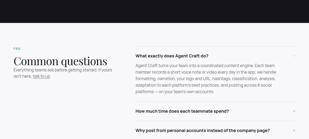
Design analysis
A dark full-width band creates a strong visual reset and focuses attention on one bright, low-friction action.
Prompt preview
## Reference images

Study these alongside the description below: hierarchy, rhythm, spacing, colour. Build for the product you are asked about, using this design language.

- Component: https://kage-design-assets.t3.tigrisfiles.io/components/agent-craft/d8105fc6-c65e-46ba-b702-5f209216873d-1791957791-10.webp
- Full page it was cut from: https://kage-design-assets.t3.tigrisfiles.io/screenshots/agent-craft/d8105fc6-c65e-46ba-b702-5f209216873d-1791957724400-full.webp
- Component on Kage: https://kage.design/component/agent-craft-cta

## Before you start
Ask what the user's product and brand are, then apply these principles to that product rather than copying the reference.

Build a centered conversion band with generous vertical padding and a near-black background (#15151b). Use a 42–56px serif headline in white, optionally highlight one phrase in italic green (#54c99b), then add a muted 15–16px supporting line and one white pill CTA with dark text. Include a small underlined secondary reassurance or trial link below. Keep the content max-width around 560px, center aligned, and leave ample breathing room. Add hover/focus states to the CTA and ensure the contrast and focus ring are accessible.

### Never
- Never reuse logos, product names, copy, illustrations, or imagery from the reference.
- Never use manipulative urgency, hidden terms, or multiple competing primary actions.
More components
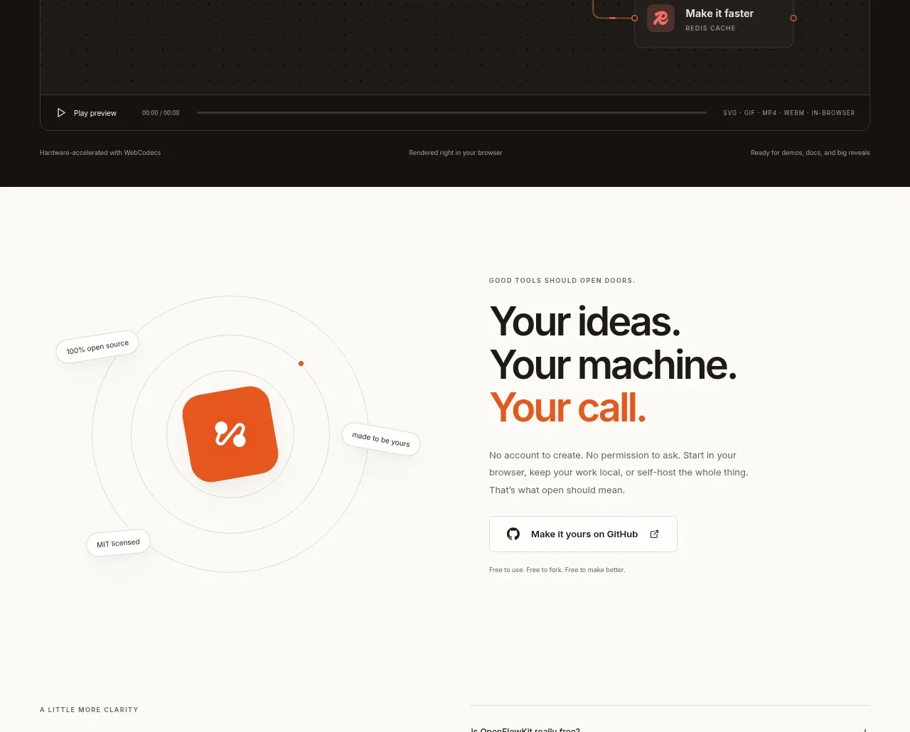
 Cinematic product preview
OpenFlowKit 2 · Call to action
Cinematic product preview
OpenFlowKit 2 · Call to action
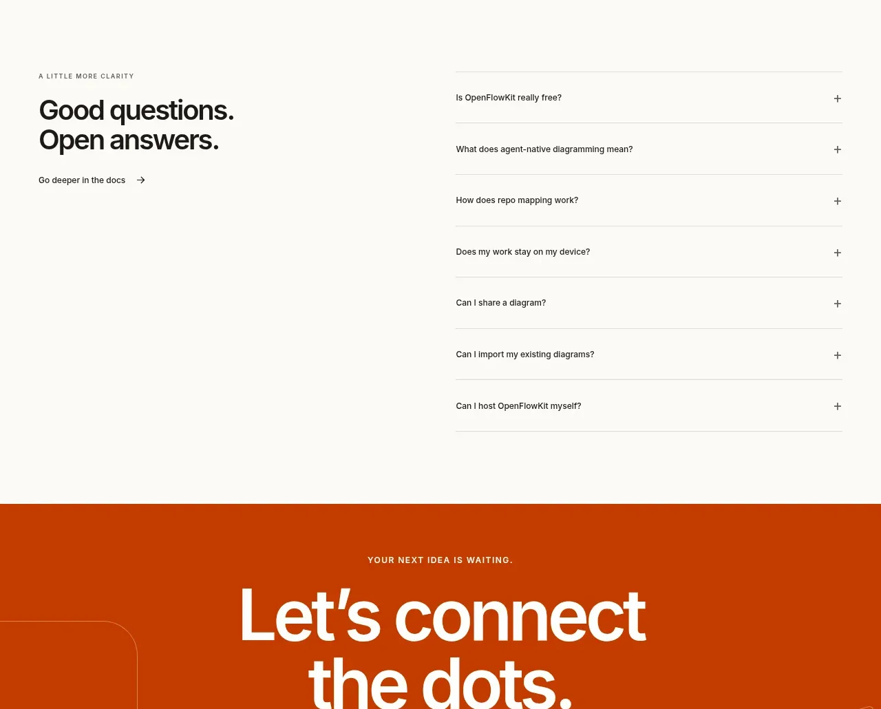 Open-source closing CTA
OpenFlowKit 2 · Call to action
Open-source closing CTA
OpenFlowKit 2 · Call to action

 Free download call to action
OpenWhispr for iOS · Call to action
Free download call to action
OpenWhispr for iOS · Call to action
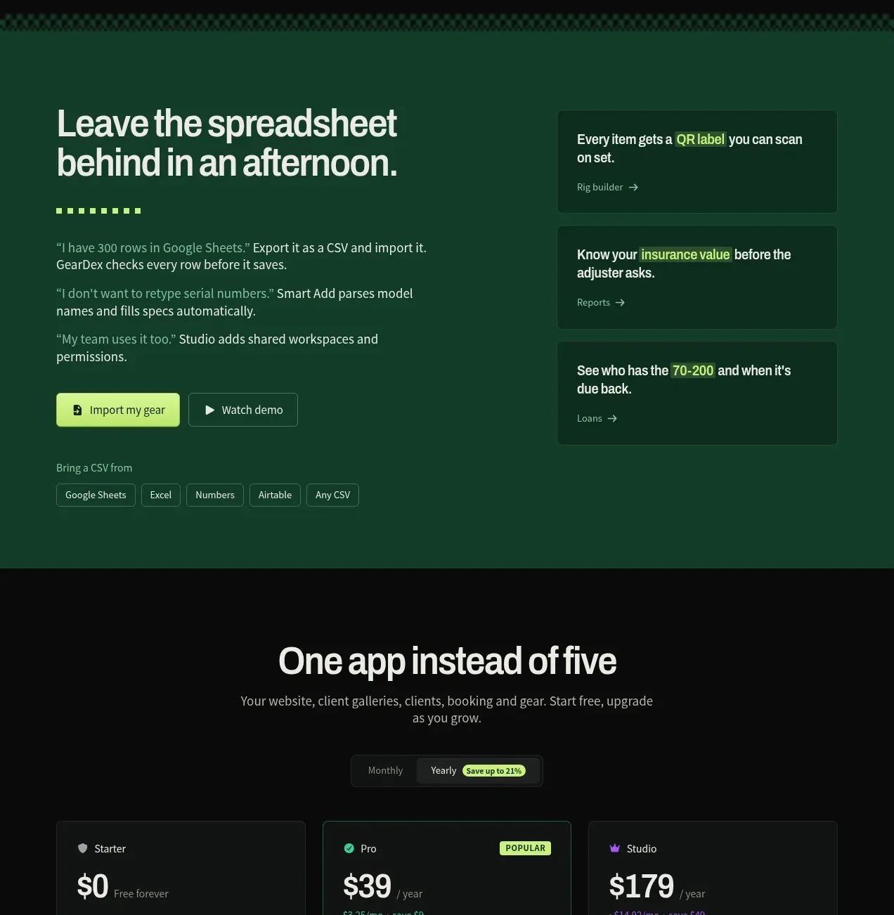
 Spreadsheet replacement import CTA
geardex.app · Call to action
Spreadsheet replacement import CTA
geardex.app · Call to action
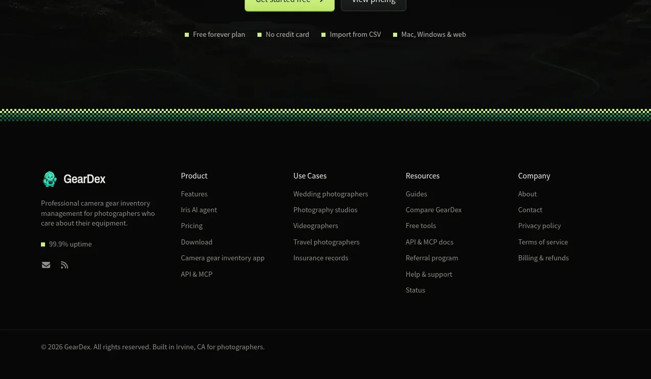 Final conversion call to action
geardex.app · Call to action
Final conversion call to action
geardex.app · Call to action
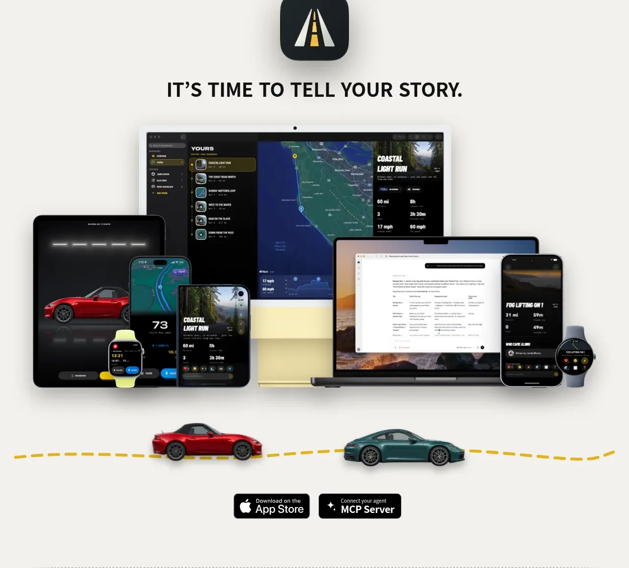
 Cross-device story CTA
Milepost · Call to action
Cross-device story CTA
Milepost · Call to action