 kage
kage
make0.ai

Design analysis
A large rounded callout restates the low-friction setup promise, provides a primary action, and ends with a row of connected integration chips.
Prompt preview
## Reference images

Study these alongside the description below: hierarchy, rhythm, spacing, colour. Build for the product you are asked about, using this design language.

- Component: https://kage-design-assets.t3.tigrisfiles.io/components/make0-brain/19c81372-003a-4a5c-a9ad-89626e51177c-1792044275-6.webp
- Full page it was cut from: https://kage-design-assets.t3.tigrisfiles.io/screenshots/make0-brain/19c81372-003a-4a5c-a9ad-89626e51177c-1792044170316-full.webp
- Component on Kage: https://kage.design/component/make0-brain-cta

## Before you start
Ask what the user's product and brand are, then apply these principles to that product rather than reproducing the reference.

Build a prominent conversion card near the end of the page. Use a white rounded container with a subtle border/shadow on the warm off-white canvas, generous 30–40px internal padding, a small uppercase eyebrow, a 26–32px heading, concise muted supporting text, and one orange-red pill button. Below a light divider, show a flexible row of compact integration/source chips connected by small arrow separators; chips should have white or near-white fills, thin borders, 999px radius, tiny icons represented by generic shapes or text placeholders, and 12–13px labels. Keep the card centered within the main content column and make chips wrap cleanly on mobile.

Never: use logos, product names, copy, illustrations, or imagery from the reference.
More components
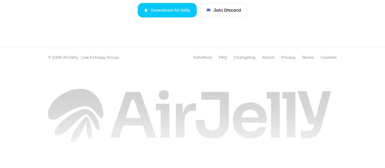
 Download conversion close
AirJelly · Call to action
Download conversion close
AirJelly · Call to action
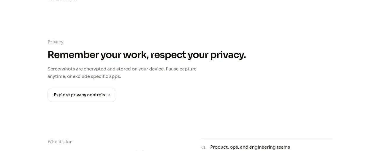 Privacy reassurance call to action
AirJelly · Call to action
Privacy reassurance call to action
AirJelly · Call to action

 Color-framed conversion call to action
Pancake · Call to action
Color-framed conversion call to action
Pancake · Call to action
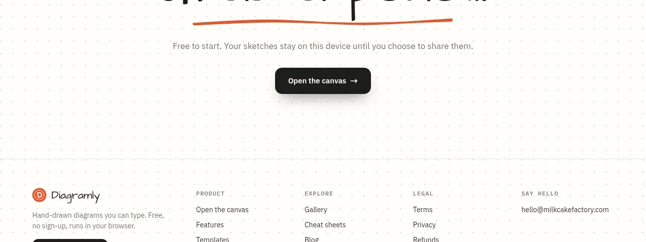
 Final action banner
Diagramly · Call to action
Final action banner
Diagramly · Call to action
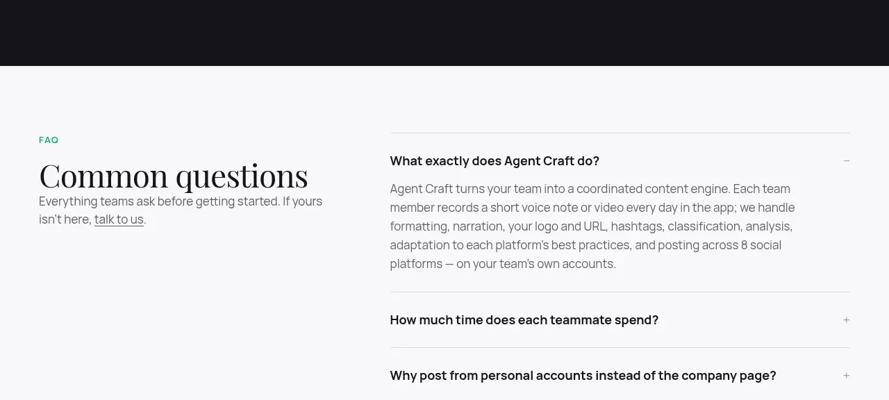
 High-contrast demo CTA
Agent Craft · Call to action
High-contrast demo CTA
Agent Craft · Call to action
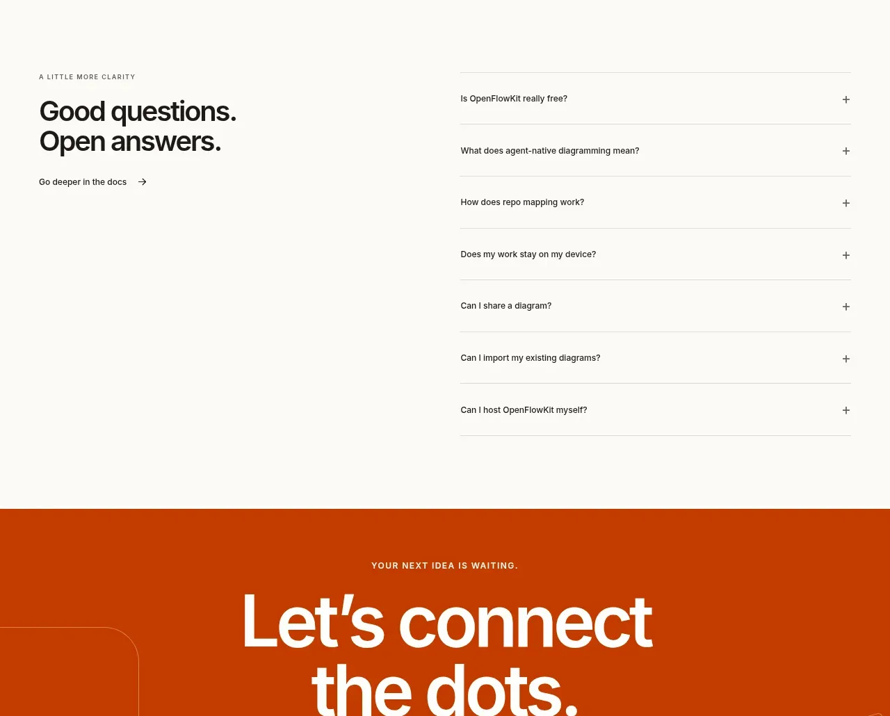
 Open-source closing CTA
OpenFlowKit 2 · Call to action
Open-source closing CTA
OpenFlowKit 2 · Call to action