 kage
kage
albie.school
Design analysis
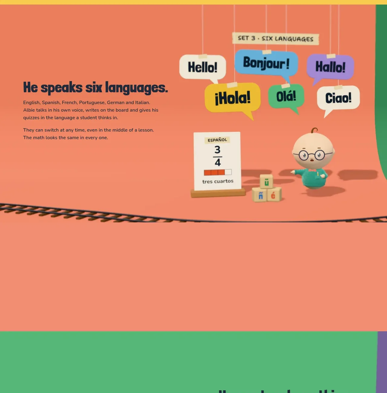
The coral section uses a strong headline on the left and a lively cluster of visual language examples on the right to make breadth feel tangible and memorable.
Prompt preview
## Reference images

Study these alongside the description below: hierarchy, rhythm, spacing, colour. Build for the product you are asked about, using this design language.

- Component: https://kage-design-assets.t3.tigrisfiles.io/components/albie/924ea594-904d-48ee-866c-6d109761f321-1791439550-4.webp
- Full page it was cut from: https://kage-design-assets.t3.tigrisfiles.io/screenshots/albie/924ea594-904d-48ee-866c-6d109761f321-1791439457023-full.webp
- Component on Kage: https://kage.design/component/albie-feature-grid-3

## Before you start
Ask what breadth, localization, or personalization story matters for the user's product. Ask which examples are authentic to the user's audience and use those instead of the reference examples.

Design a colourful capability section with a coral background around #F27F63. Place a concise text block on the left and a playful visual system on the right, such as speech bubbles, cards, tags, or examples that communicate variety. Use a cream eyebrow, dark navy #17263A headings, and a controlled accent palette of yellow #F7C843, green #42B77A, purple #8D72C8, and cream #FFF3D2. Vary the shapes and scale slightly but keep a clear alignment grid and accessible text contrast. Include one short explanatory paragraph beneath the headline and enough vertical padding that the decorative examples do not feel cramped. On mobile, convert the cluster to a tidy wrapping grid rather than letting items collide.

Never: copy logos, product names, copy, illustrations, or imagery from the reference.
More components

 Privacy and optional intelligence
Mailwell · Feature grid
Privacy and optional intelligence
Mailwell · Feature grid
 Reliable, recoverable actions
Mailwell · Feature grid
Reliable, recoverable actions
Mailwell · Feature grid
 Unified account setup
Mailwell · Feature grid
Unified account setup
Mailwell · Feature grid
 Fast local workflow and calm reading
Mailwell · Feature grid
Fast local workflow and calm reading
Mailwell · Feature grid

 Cloud layer workflows
ProcBoss · Feature grid
Cloud layer workflows
ProcBoss · Feature grid
 Operational blind spots
ProcBoss · Feature grid
Operational blind spots
ProcBoss · Feature grid