kage
kage
albie.school
Design analysis
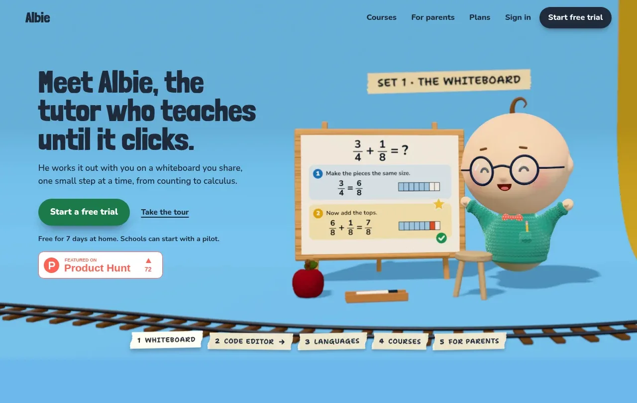
The opening hero pairs a bold promise and two actions with a large character-and-whiteboard visual, then uses a playful tab strip to preview the product areas.
Prompt preview
## Reference images

Study these alongside the description below: hierarchy, rhythm, spacing, colour. Build for the product you are asked about, using this design language.

- Component: https://kage-design-assets.t3.tigrisfiles.io/components/albie/924ea594-904d-48ee-866c-6d109761f321-1791439549-1.webp
- Full page it was cut from: https://kage-design-assets.t3.tigrisfiles.io/screenshots/albie/924ea594-904d-48ee-866c-6d109761f321-1791439457023-full.webp
- Component on Kage: https://kage.design/component/albie-hero

## Before you start
Ask what the user's product is, who it helps, and what action the hero should drive. Ask for the brand colours and visual assets, then apply these principles to that product.

Create a full-width hero directly below the navigation. Use a two-column composition: left-aligned headline, one concise supporting paragraph, primary pill CTA, secondary text link, and a small trust or proof note; reserve the right side for a large product-specific visual. Make the headline oversized, tightly set, dark navy, and slightly playful, while body copy remains compact and highly legible. Use a bright sky-blue background around #68B5DC, dark navy #17263A, green CTA #169B68, and warm cream accents around #F8E7B1. Give the visual enough breathing room to overlap or sit naturally above a decorative baseline. Under the main content, add a small row of tactile paper-like category tabs with slight rotation, cream fills, soft shadows, and dark text. Keep the hierarchy obvious and make both CTAs keyboard accessible.

Never: copy logos, product names, copy, illustrations, or imagery from the reference.