 kage
kage
firecrawl.dev
Design analysis
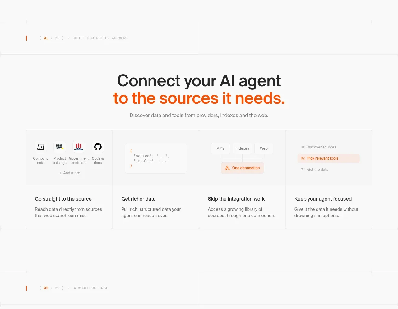
A spacious white section introduces the core value proposition, shows a lightweight source-to-agent workflow, and closes with four concise benefits.
Prompt preview
## Reference images

Study these alongside the description below: hierarchy, rhythm, spacing, colour. Build for the product you are asked about, using this design language.

- Component: https://kage-design-assets.t3.tigrisfiles.io/components/alexandria-by-firecrawl/0b1c70de-f8b6-4b9f-90b5-f9bf706672fa-1790229691-2.webp
- Full page it was cut from: https://kage-design-assets.t3.tigrisfiles.io/screenshots/alexandria-by-firecrawl/0b1c70de-f8b6-4b9f-90b5-f9bf706672fa-1790229655966-full.webp
- Component on Kage: https://kage.design/component/alexandria-by-firecrawl-feature-grid

## Before you start
Ask what the user's product connects, automates, or makes easier, and ask for its brand colors. Apply the following structure to that product.

Build a white feature section with a small uppercase eyebrow, a centered two-line heading with one accent-colored line, and one sentence of supporting copy. Under it, show a wide, low-contrast workflow panel that visually moves from source types through a data/result object and connection layer toward an agent outcome. Use simple icon placeholders, thin #e9e9e9 dividers, pale gray surfaces, and a single warm accent such as #f15a24. Below the panel, place four equal-width benefit columns with short bold titles and two-line descriptions. Keep the section container around 780px wide, use 64–96px vertical spacing, 30–40px grid gaps, 14px labels, 16–18px body text, and avoid heavy cards or shadows. Make the workflow horizontally scrollable or stack cleanly on mobile.

Never: use logos, product names, exact copy, illustrations, or imagery from the reference.
More components

 Spend visibility and daily-cost breakdown
Subscrr · Feature grid
Spend visibility and daily-cost breakdown
Subscrr · Feature grid
 Reminders and simple setup flow
Subscrr · Feature grid
Reminders and simple setup flow
Subscrr · Feature grid

 Security and permissions cards
NotchPop · Feature grid
Security and permissions cards
NotchPop · Feature grid
 Focused feature cards
NotchPop · Feature grid
Focused feature cards
NotchPop · Feature grid
 Interactive product demonstration
NotchPop · Feature grid
Interactive product demonstration
NotchPop · Feature grid
 Quiet information cards
NotchPop · Feature grid
Quiet information cards
NotchPop · Feature grid