 kage
kage
firecrawl.dev
Design analysis
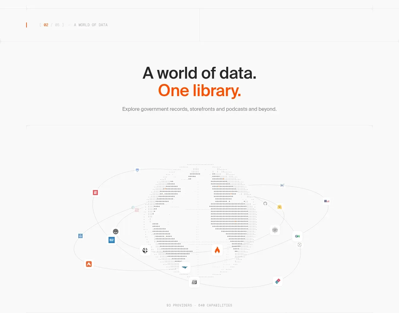
This section frames the scale of the data ecosystem with a centered heading, a large orbital network visualization, and ample white space around the visual.
Prompt preview
## Reference images

Study these alongside the description below: hierarchy, rhythm, spacing, colour. Build for the product you are asked about, using this design language.

- Component: https://kage-design-assets.t3.tigrisfiles.io/components/alexandria-by-firecrawl/0b1c70de-f8b6-4b9f-90b5-f9bf706672fa-1790229692-3.webp
- Full page it was cut from: https://kage-design-assets.t3.tigrisfiles.io/screenshots/alexandria-by-firecrawl/0b1c70de-f8b6-4b9f-90b5-f9bf706672fa-1790229655966-full.webp
- Component on Kage: https://kage.design/component/alexandria-by-firecrawl-feature-grid-2

## Before you start
Ask what ecosystem, catalog, network, or inventory the user's product represents. Ask which visual metaphors fit its brand and accessibility requirements.

Create a white, editorial section with a small section marker, a centered headline split across two lines, and one muted explanatory sentence. Below the heading, reserve a large horizontal visual stage for an abstract network map: a central neutral mass, thin elliptical orbit lines, and small varied nodes distributed around it. The visual should communicate breadth and connected sources without relying on literal reference assets. Use black-gray typography, a single orange accent around #f15a24, very pale gray lines around #e5e5e5, and restrained node colors. Give the visual 280–360px of height and generous surrounding whitespace. Keep the heading at 40–52px, body at 14–16px, and make the stage responsive by simplifying orbit density on mobile.

Never: use Firecrawl or Alexandria names, logos, exact copy, reference map artwork, or reference imagery.
More components

 Spend visibility and daily-cost breakdown
Subscrr · Feature grid
Spend visibility and daily-cost breakdown
Subscrr · Feature grid
 Reminders and simple setup flow
Subscrr · Feature grid
Reminders and simple setup flow
Subscrr · Feature grid

 Security and permissions cards
NotchPop · Feature grid
Security and permissions cards
NotchPop · Feature grid
 Focused feature cards
NotchPop · Feature grid
Focused feature cards
NotchPop · Feature grid
 Interactive product demonstration
NotchPop · Feature grid
Interactive product demonstration
NotchPop · Feature grid
 Quiet information cards
NotchPop · Feature grid
Quiet information cards
NotchPop · Feature grid