 kage
kage
firecrawl.dev
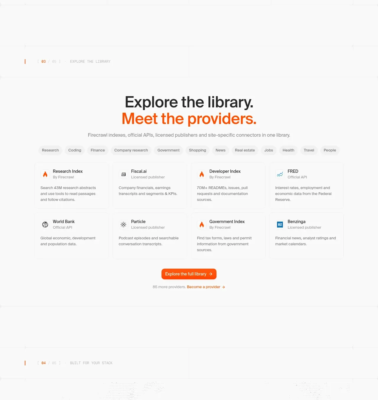
Design analysis
A directory-style section combines a strong heading, category chips, a two-row provider card grid, and a clear browse-all action.
Prompt preview
## Reference images

Study these alongside the description below: hierarchy, rhythm, spacing, colour. Build for the product you are asked about, using this design language.

- Component: https://kage-design-assets.t3.tigrisfiles.io/components/alexandria-by-firecrawl/0b1c70de-f8b6-4b9f-90b5-f9bf706672fa-1790229692-5.webp
- Full page it was cut from: https://kage-design-assets.t3.tigrisfiles.io/screenshots/alexandria-by-firecrawl/0b1c70de-f8b6-4b9f-90b5-f9bf706672fa-1790229655966-full.webp
- Component on Kage: https://kage.design/component/alexandria-by-firecrawl-feature-grid-3

## Before you start
Ask what kinds of providers, integrations, templates, or resources the user's product needs to organize. Ask for the preferred taxonomy and brand accent.

Create a directory section with a small numbered eyebrow, a centered two-line heading where the second line uses the accent color, and a concise description. Add a horizontally wrapping row of compact category filter chips with one active state. Below, build a four-column desktop grid of clean provider/resource cards across two rows. Each card should have a tiny icon placeholder, title, source/type metadata, and a short description; use thin borders, light backgrounds, and modest 8px corners rather than strong shadows. Finish with a centered filled orange button and a quiet secondary provider link. Use a max width near 780px, 20–24px gaps, 48–72px section spacing, 12px chips, 14px metadata, and 16px descriptions. Make filters keyboard accessible and cards responsive.

Never: copy provider names, logos, product names, exact text, illustrations, or imagery from the reference.
More components

 Spend visibility and daily-cost breakdown
Subscrr · Feature grid
Spend visibility and daily-cost breakdown
Subscrr · Feature grid
 Reminders and simple setup flow
Subscrr · Feature grid
Reminders and simple setup flow
Subscrr · Feature grid

 Security and permissions cards
NotchPop · Feature grid
Security and permissions cards
NotchPop · Feature grid
 Focused feature cards
NotchPop · Feature grid
Focused feature cards
NotchPop · Feature grid
 Interactive product demonstration
NotchPop · Feature grid
Interactive product demonstration
NotchPop · Feature grid
 Quiet information cards
NotchPop · Feature grid
Quiet information cards
NotchPop · Feature grid