kage
kage
firecrawl.dev
Design analysis
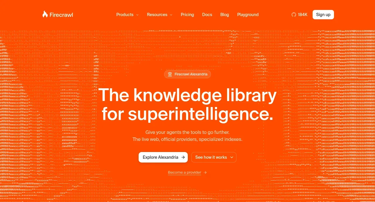
The hero uses a saturated orange field, a technical text-pattern backdrop, a centered two-line proposition, two actions, and a small provider link.
Prompt preview
## Reference images

Study these alongside the description below: hierarchy, rhythm, spacing, colour. Build for the product you are asked about, using this design language.

- Component: https://kage-design-assets.t3.tigrisfiles.io/components/alexandria-by-firecrawl/0b1c70de-f8b6-4b9f-90b5-f9bf706672fa-1790229691-1.webp
- Full page it was cut from: https://kage-design-assets.t3.tigrisfiles.io/screenshots/alexandria-by-firecrawl/0b1c70de-f8b6-4b9f-90b5-f9bf706672fa-1790229655966-full.webp
- Component on Kage: https://kage.design/component/alexandria-by-firecrawl-hero

## Before you start
Ask what the user's product is, what outcome it creates, and what brand personality it should express. Apply these principles to that product rather than recreating the reference.

Create a centered hero directly beneath the navigation. Use a bold, highly legible two-line headline, a short supporting paragraph, one light primary button and one outlined secondary button, followed by a quiet tertiary link. Give the area generous vertical breathing room and keep the content in a narrow readable column. Use a saturated orange-red background close to #ff4f12, white headline text, warm white supporting text, and translucent orange/white controls. Add a subtle abstract technical texture made from dots, code-like glyphs, or fine horizontal traces behind the content at low opacity; it must remain decorative and never compete with the copy. Use a 56–72px desktop headline with tight line-height, 16px body copy, 8–12px button radius, and responsive stacking on mobile.

Never: use Firecrawl or Alexandria names, logos, exact copy, reference illustrations, or reference imagery.