kage
kage
reikacode.com
Design analysis
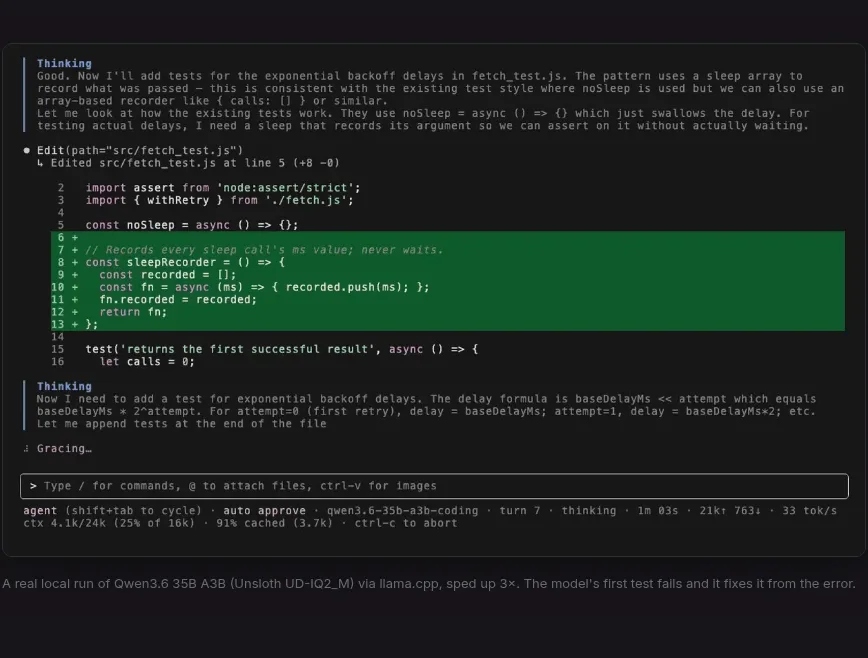
A centered, bordered terminal-style panel makes the product tangible through realistic command output and a highlighted code region, followed by a quiet explanatory caption.
Prompt preview
## Reference images

Study these alongside the description below: hierarchy, rhythm, spacing, colour. Build for the product you are asked about, using this design language.

- Component: https://kage-design-assets.t3.tigrisfiles.io/components/reika/dbc92e41-38c4-497a-81df-7bf52356b7a2-1791439501-2.webp
- Full page it was cut from: https://kage-design-assets.t3.tigrisfiles.io/screenshots/reika/dbc92e41-38c4-497a-81df-7bf52356b7a2-1791439420892-full.webp
- Component on Kage: https://kage.design/component/reika-card

## Before you start
Ask what the user's product is, who it serves, and what its brand personality and preferred visual identity are. Apply the principles below to that product rather than reproducing this reference.

Build a prominent product-demo card on a dark page. Center a panel at roughly 68% of the viewport width, with a nearly black surface around #111113, a subtle 1px border #2b292d, 6–8px radius, and a faint shadow. Render dense monospace terminal content in 10–12px muted gray, with a small highlighted block using deep green around #08732f to show an important result. Include a thin input/status row near the bottom with a darker field and understated border. Below the panel, add a single small caption in #77737b aligned with the panel. Preserve generous surrounding whitespace so the demo reads as the visual centerpiece.

Never: use logos, product names, copy, illustrations, or imagery from the reference.