kage
kage
temprl.org
Design analysis
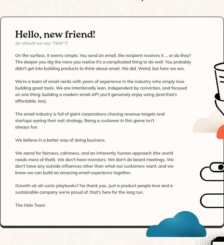
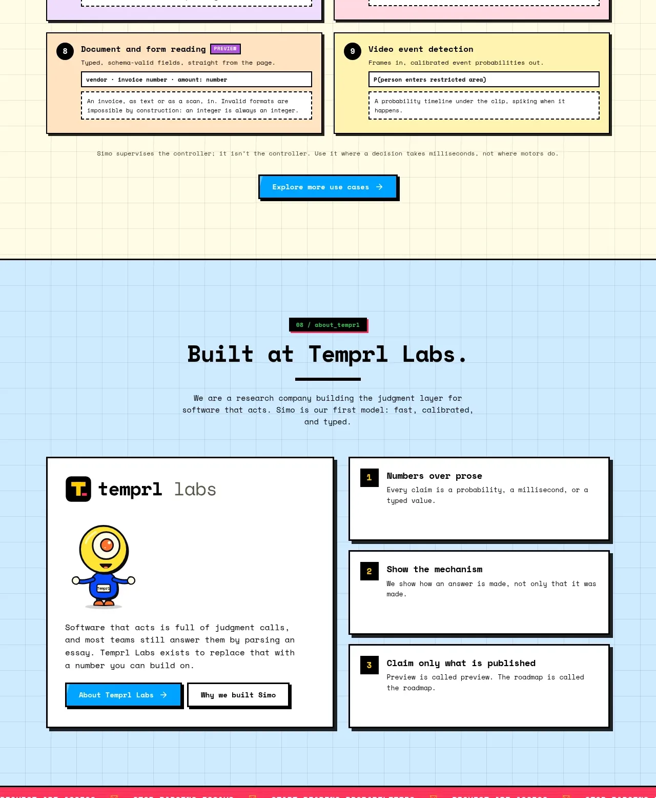
A blue section pairs a compact company/about card with three stacked principles. It balances personality and evidence, giving the product a reason to exist beyond its feature set.
Prompt preview
## Reference images

Study these alongside the description below: hierarchy, rhythm, spacing, colour. Build for the product you are asked about, using this design language.

- Component: https://kage-design-assets.t3.tigrisfiles.io/components/simo/01913313-62ce-4f89-a048-ac4500929f0e-1791525860-9.webp
- Full page it was cut from: https://kage-design-assets.t3.tigrisfiles.io/screenshots/simo/01913313-62ce-4f89-a048-ac4500929f0e-1791525747684-full.webp
- Component on Kage: https://kage.design/component/simo-card

### Before you start
Ask the user about their company story, operating principles, and the evidence they can credibly publish. Then build an original credibility section.

Create a light blue grid section with a centered heading and a short mission statement. Below, use a two-column layout: a larger off-white about card on the left with a simple brand mark area, short story, and one or two links; on the right, stack three compact principle cards with numbered labels and bold titles. Use a restrained palette of blue, yellow, and pink accents, 2px dark outlines, hard shadows, and tight mono metadata. Keep the left card more visual and the right cards more scannable. Make links obvious, provide hover/focus states, and collapse to one column on small screens.

Never: copy the reference's logo, product name, copy, illustrations, imagery, or exact principles.