kage
kage
ancher.ai

Design analysis
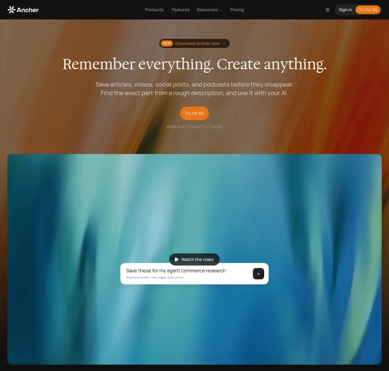
A long, dark editorial landing page pairs oversized high-contrast serif headlines with restrained sans-serif supporting text and small orange section labels. The page moves from a warm abstract-gradient hero and video mockup into comparison panels, proof metrics, alternating feature demonstrations, a six-card capability grid, use-case cards, pricing, FAQ, security, editorial content, and a final CTA; density increases in structured grids and tables, then relaxes again in the closing sections. Thin charcoal dividers, nearly square cards with modest rounding, soft inset shadows, and vivid blurred gradient imagery create hierarchy without bright UI chrome.
Prompt preview
## Reference images

Study these alongside the description below: hierarchy, rhythm, spacing, colour. Build for the product you are asked about, using this design language.

- Full page: https://kage-design-assets.t3.tigrisfiles.io/screenshots/ancher-2-0/49a60068-1f5d-45e9-9623-df337c2895cf-1791871353691-full.webp
- Above the fold: https://kage-design-assets.t3.tigrisfiles.io/screenshots/ancher-2-0/49a60068-1f5d-45e9-9623-df337c2895cf-1791871346872.webp
- Design on Kage: https://kage.design/designs/ancher-2-0-landing-page

## Before you start
Ask the user what they are building, who it is for, and what brand assets they already have (name, colours, type choices, logo, imagery, and product screenshots). Wait for their answers before proceeding. Apply every instruction below to that product, not to the reference website.

## Page structure
1. **Fixed top navigation** — Use a near-black horizontal bar with a compact brand mark at left, centered or grouped links for Products, Features, Resources, and Pricing, and small utility actions plus a warm accent CTA at right.
2. **Hero introduction** — Place a small announcement pill above a large centered serif headline, followed by a short two-line sans-serif explanation and a rounded orange CTA. Use a full-bleed blurred warm abstract gradient behind the hero.
3. **Hero product/video panel** — Immediately below the hero copy, show a wide rounded media panel with a cool blue/teal abstract gradient and a centered playback label plus a floating example input card. Treat it as the visual product promise rather than a literal dense interface.
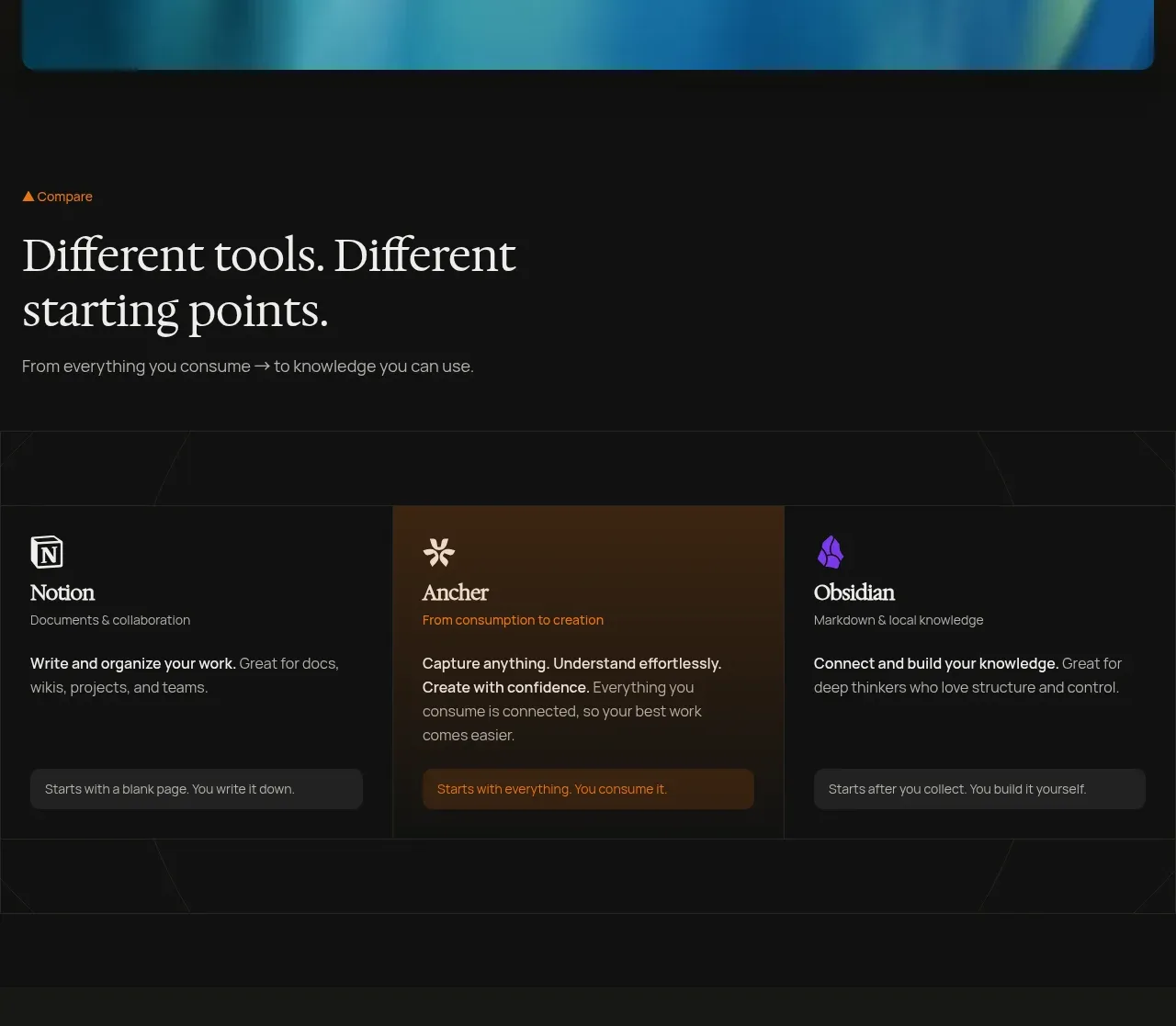
4. **Comparison section** — Introduce the contrast with a small orange section label, a large left-aligned serif heading, and a short supporting line. Follow with a three-column comparison row for an empty-document tool, the product's capture-to-creation approach, and a structured knowledge tool; emphasize the middle column with a warmer tinted background.
5. **Proof/statistics section** — Create a darker, spacious centered block with a small mark, eyebrow text, large serif statement, supporting paragraph, four bordered metric cards, and a subdued secondary CTA.
6. **How-it-works introduction** — Start a new section with an orange label and a large multi-line serif statement explaining the transformation from consuming content to usable work.
7. **Capture feature row** — Use a two-column layout: an abstract purple product visualization on the left and a text panel on the right with orange label, heading, and concise bullet list.
8. **Connect feature row** — Reverse the layout: explanatory copy on the left and a lime/yellow abstract network visualization on the right, with connected content chips arranged around a central mark.
9. **Create feature row** — Return to image-left/text-right. Show a warm framed collage of notes, charts, audio, and content surfaces, paired with copy about producing work in the user's voice.
10. **Capabilities overview** — Add an orange eyebrow and serif heading such as a broad “from save to shipped” idea, then a six-card grid in two rows. Each card has a rounded abstract gradient thumbnail, serif title, and compact description.
11. **Cross-device section** — Use a wide orange-gradient framed browser/product screenshot on the left and a right-side heading about saving from anywhere, a CTA, and stacked expandable-looking rows for Web App, Mobile, and Browser Extension.
12. **Use-cases section** — Present a broad serif heading and short side paragraph with an orange CTA, followed by three equal cards for distinct audiences. Each card uses a colorful abstract image with thin geometric line overlays, a small audience label, serif title, and orange text link.
13. **Pricing section** — Shift to a subtly lighter charcoal background. Add a pricing eyebrow, large serif heading, supporting copy, a text link, a monthly/yearly segmented toggle, and three equal pricing cards for Free, Digest, and Pro. Include price, billing note, description, CTA, and short feature list; distinguish the paid CTA and annual savings with the orange accent.
14. **FAQ section** — Return to the darker background and split the layout: large serif “frequently asked questions” heading on the left and a vertical accordion list on the right. Use thin dividers and plus controls, leaving answers collapsed by default.
15. **Security section** — Add a security eyebrow, large serif reassurance heading, and short paragraph, then a four-column bordered feature row covering encryption, no training, account control, and Google sign-in. Use simple abstract line symbols or neutral placeholders rather than a decorative icon set.
16. **Editorial/blog section** — Introduce an “ideas worth keeping” heading and subdued CTA, then lay out one text-led featured article beside two image-led article cards. Use bright abstract gradient thumbnails, serif titles, short summaries, and small orange read-more links.
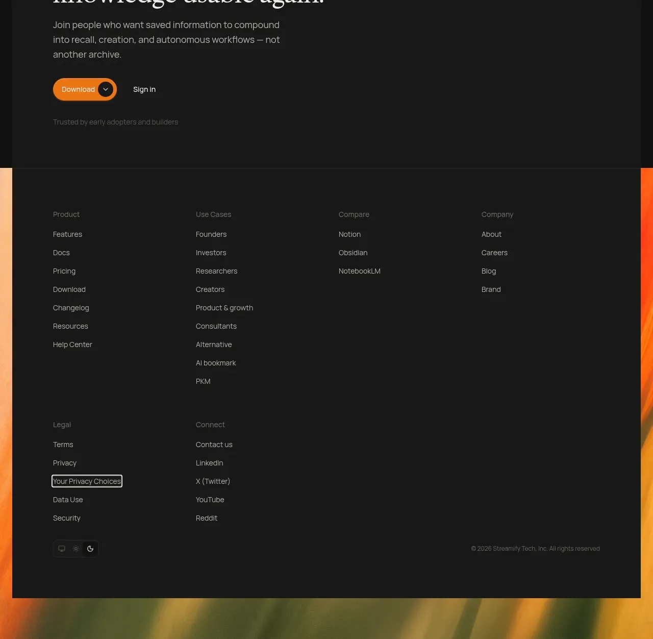
17. **Final CTA panel** — Place a large inset charcoal panel over a low, full-width abstract gradient background. Use an orange eyebrow, oversized serif invitation, short paragraph, primary orange download CTA, secondary sign-in action, and a small trust note.
18. **Footer** — Build a spacious multi-column footer with grouped text links for Product, Use Cases, Compare, Company, Legal, and Connect. Keep typography small and muted, include minimal social/theme controls, a copyright line, and preserve the gradient peeking around the panel edges.

## Design language
- Build hierarchy through contrast between oversized editorial serif headings and compact neutral sans-serif UI text; use sentence-case headlines with generous line-height and a responsive scale that moves from roughly 48–64px desktop hero type to 28–42px section headings and 12–15px body copy.
- Keep the page predominantly near-black, using approximately `#101010` and `#171717` for surfaces, `#242424` for the lighter pricing band, off-white `#F2EEE7` for primary type, and muted gray `#8B8985` for supporting text.
- Reserve a small warm orange accent, approximately `#F47A17` or `#D96A18`, for eyebrows, announcement details, primary CTAs, links, savings labels, and tiny directional marks. Do not use orange as a general fill across the page.
- Use abstract, softly blurred gradient artwork as the visual system: warm orange/red/yellow in hero and CTA areas, cyan/teal/blue for capture and product panels, purple for content capture, lime/yellow for connection, and mixed rainbow gradients for capability cards.
- Change rhythm down the page: begin with a dramatic centered hero, move into dense comparison and proof structures, alternate spacious two-column feature rows, tighten into a six-card grid and pricing matrix, then return to slower FAQ, security, editorial, CTA, and footer sections.
- Use thin charcoal borders around cards and section groups, approximately `#292929` with 1px strokes. Keep corners modestly rounded, around 8–12px for media and cards; avoid pills except for compact controls, tags, and CTAs.
- Keep shadows quiet and localized: use soft black depth or subtle inset shading on cards, with no floating glassmorphism or heavy drop shadows. Let borders and surface changes carry most of the structure.
- Align major content to a wide centered container with generous horizontal padding. Mix centered composition in the hero and proof section with left-aligned editorial headings and alternating media/text rows below.
- Make controls compact and tactile: orange filled buttons for primary actions, dark outlined or gray buttons for secondary actions, small rounded toggles, and plus signs on FAQ rows. Use hover states that slightly brighten the accent or lift the surface without introducing dramatic motion.
- If motion is added, keep it slow and atmospheric: blurred gradients may drift subtly, media cards may fade or float into view, and accordions should expand smoothly. Avoid loud parallax, rapid transitions, or excessive animation.
- Use real product-specific content supplied by the user, but preserve the reference's balance: evocative abstract media carries visual weight while copy stays short, scannable, and editorial.

## Never
- Do not copy the reference's logos, wordmarks, product name, tagline, written copy, illustrations, photography, screenshots, article titles, pricing values, or icon set.
- Do not present the result as Ancher or imply affiliation with it.
- Do not reproduce the exact comparison labels, statistics, testimonials, FAQ questions, or navigation labels; invent equivalents for the user's product.
- Do not use generic stock photography or a mismatched bright SaaS template. Build original abstract artwork or use the user's own brand and product assets while retaining the dark editorial structure.
Components from this page
All components
 Slim dark site navigation
Ancher 2.0 · Navigation
Slim dark site navigation
Ancher 2.0 · Navigation
 Statement hero with demo visual
Ancher 2.0 · Hero
Statement hero with demo visual
Ancher 2.0 · Hero
 Tool comparison cards
Ancher 2.0 · Feature grid
Tool comparison cards
Ancher 2.0 · Feature grid
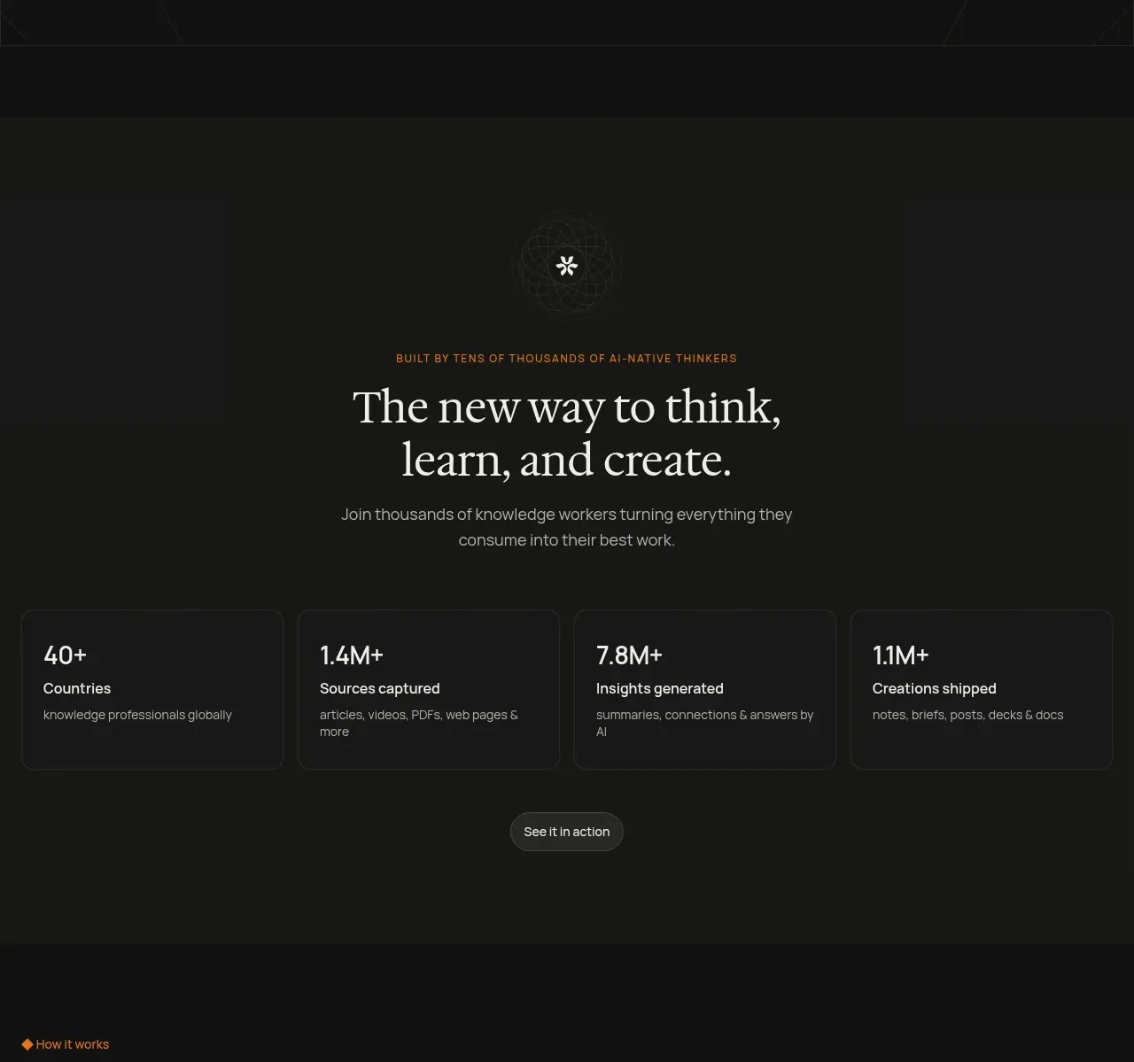 Positioning and proof statistics
Ancher 2.0 · Stats
Positioning and proof statistics
Ancher 2.0 · Stats
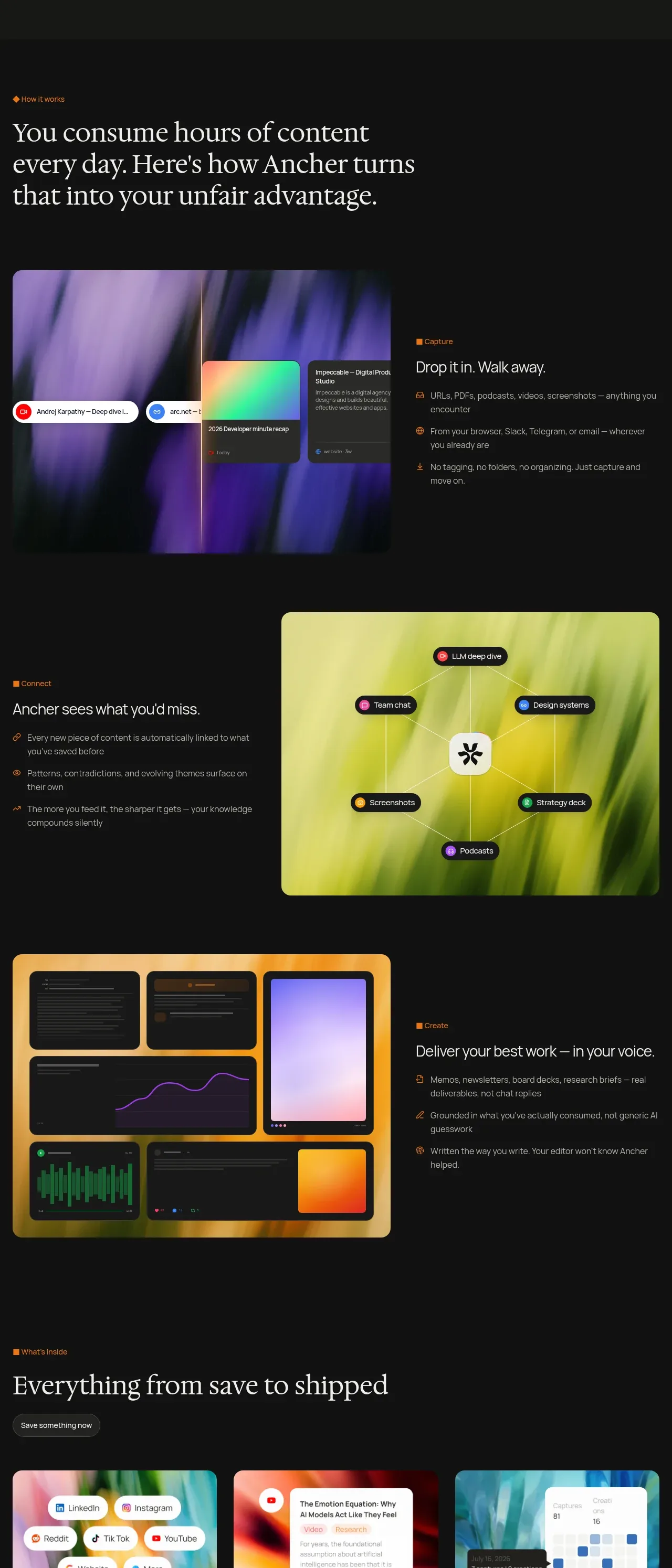 Three-step workflow story
Ancher 2.0 · Feature grid
Three-step workflow story
Ancher 2.0 · Feature grid
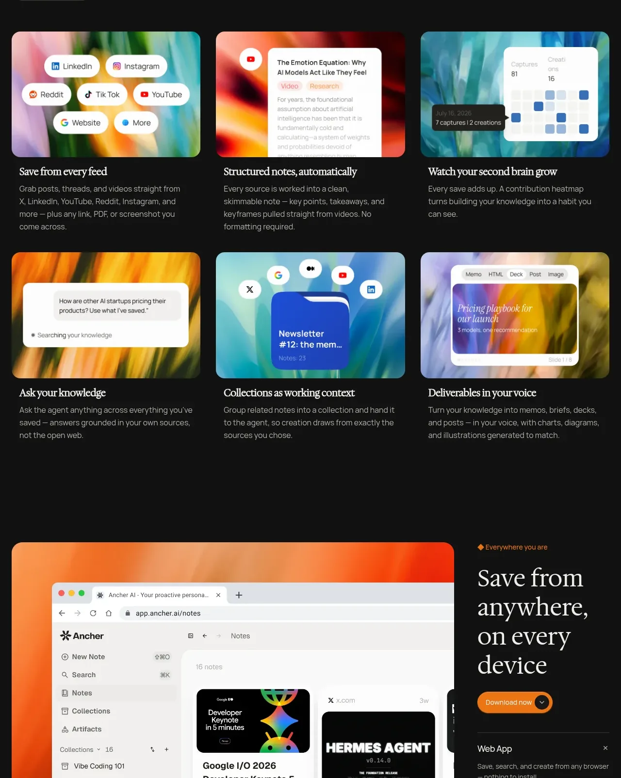 Six capability cards
Ancher 2.0 · Feature grid
Six capability cards
Ancher 2.0 · Feature grid
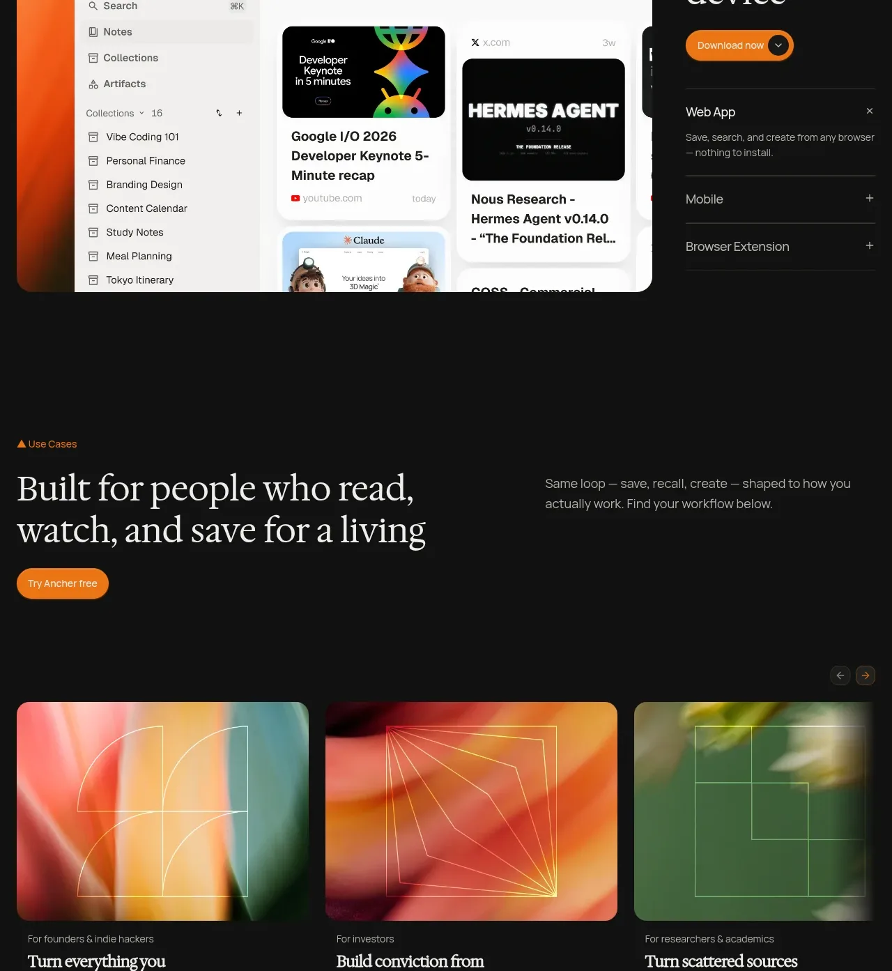 Anywhere and every-device showcase
Ancher 2.0 · Feature grid
Anywhere and every-device showcase
Ancher 2.0 · Feature grid
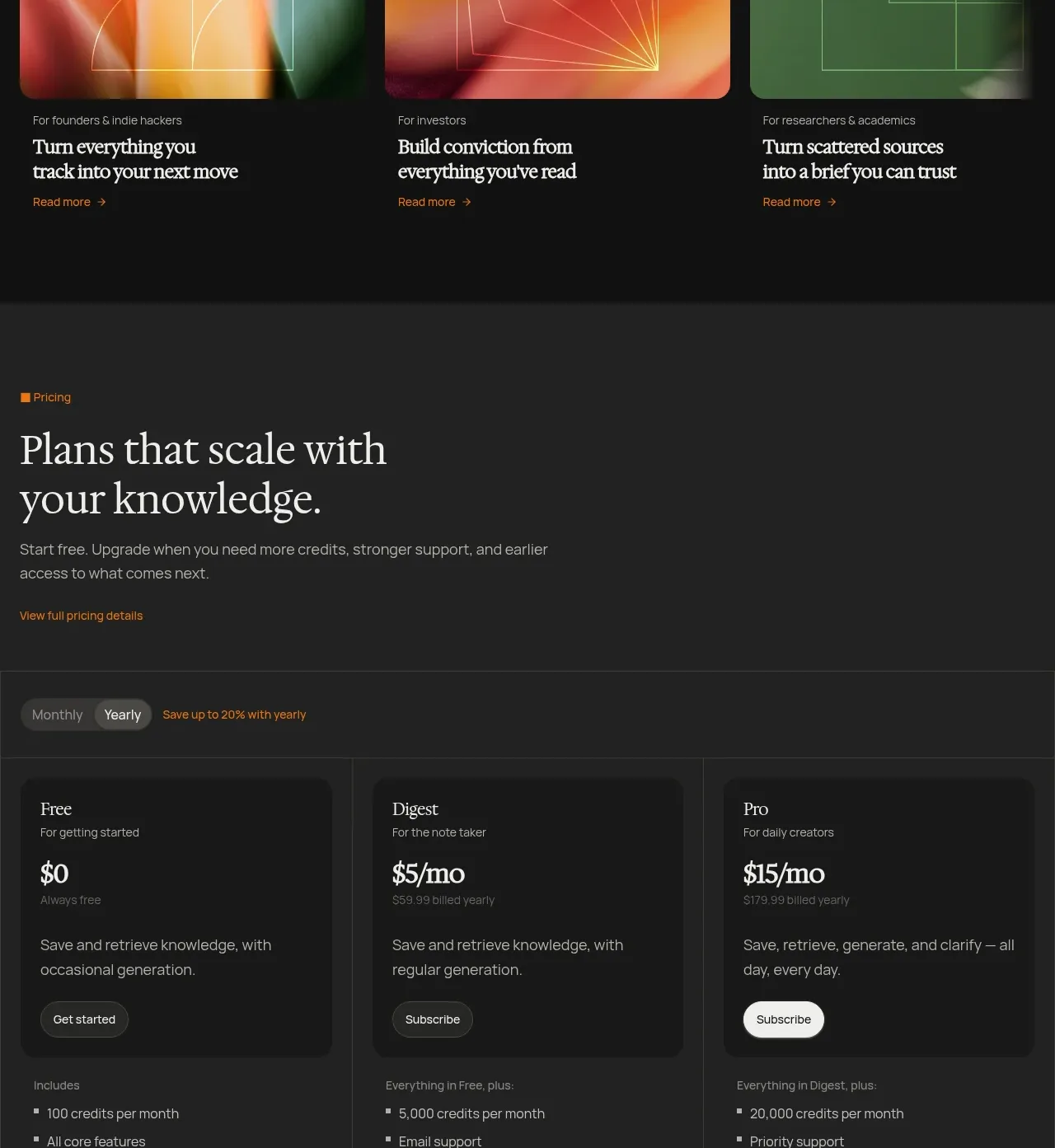 Audience use-case cards
Ancher 2.0 · Card
Audience use-case cards
Ancher 2.0 · Card
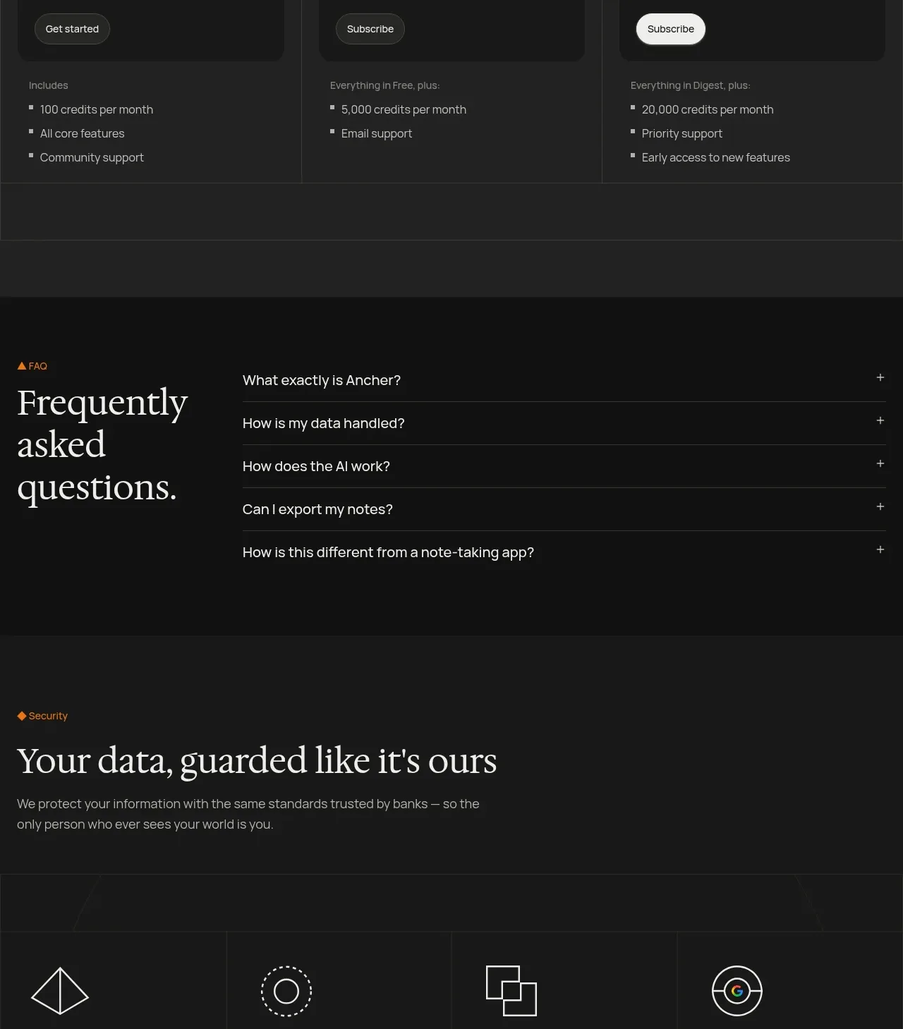 Three-tier pricing table
Ancher 2.0 · Pricing table
Three-tier pricing table
Ancher 2.0 · Pricing table
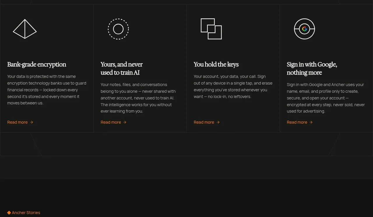 Frequently asked questions
Ancher 2.0 · FAQ
Frequently asked questions
Ancher 2.0 · FAQ
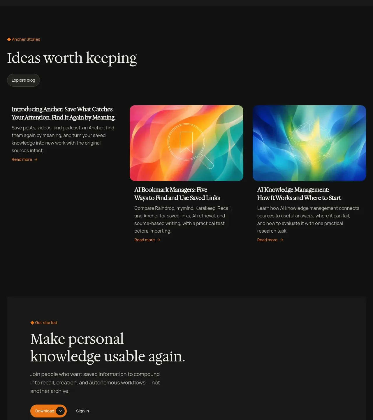 Security and trust principles
Ancher 2.0 · Feature grid
Security and trust principles
Ancher 2.0 · Feature grid
 Editorial stories and conversion footer
Ancher 2.0 · Footer
Editorial stories and conversion footer
Ancher 2.0 · Footer