 kage
kage
ancher.ai
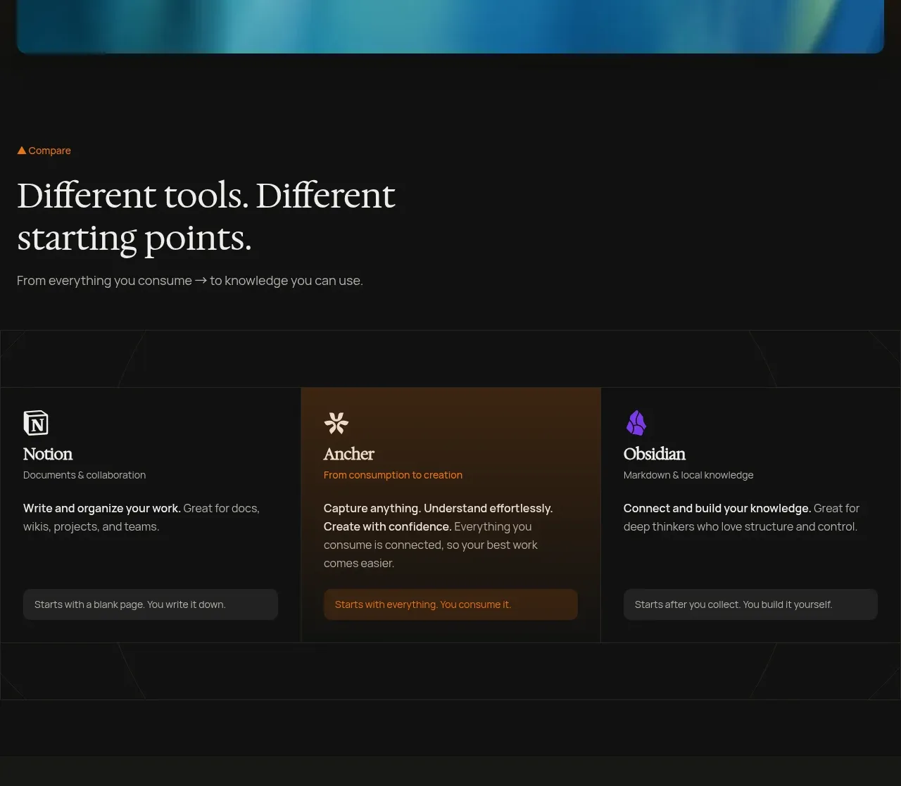
Design analysis
A short editorial introduction leads into three equal comparison cards, with the middle option visually emphasized to guide attention without overwhelming the page.
Prompt preview
## Reference images

Study these alongside the description below: hierarchy, rhythm, spacing, colour. Build for the product you are asked about, using this design language.

- Component: https://kage-design-assets.t3.tigrisfiles.io/components/ancher-2-0/49a60068-1f5d-45e9-9623-df337c2895cf-1791871458-2.webp
- Full page it was cut from: https://kage-design-assets.t3.tigrisfiles.io/screenshots/ancher-2-0/49a60068-1f5d-45e9-9623-df337c2895cf-1791871353691-full.webp
- Component on Kage: https://kage.design/component/ancher-2-0-feature-grid

## Before you start
Ask what product category the user's product belongs to and what alternatives users compare it against. Apply the following pattern to their brand and content.

Build a dark comparison section with a small orange eyebrow, a large left-aligned serif heading, and one muted explanatory sentence. Below it, use three equal-width cards in a single row on desktop and a stacked layout on mobile. Give each card a small icon placeholder, title, short description, supporting paragraph, and low-contrast action strip. Emphasize the recommended card using a restrained amber-to-brown background wash while keeping the other cards near-black. Use #111111 page background, #181818 cards, #3a2414 highlight, ivory serif headings, gray sans-serif copy, and #e98720 accents. Use 1px borders (#292929), 8px card radius, 12–16px internal padding, and consistent card heights. Avoid excessive shadows; use contrast and hierarchy instead.

Never: use logos, product names, copy, illustrations, or imagery from the reference.
More components
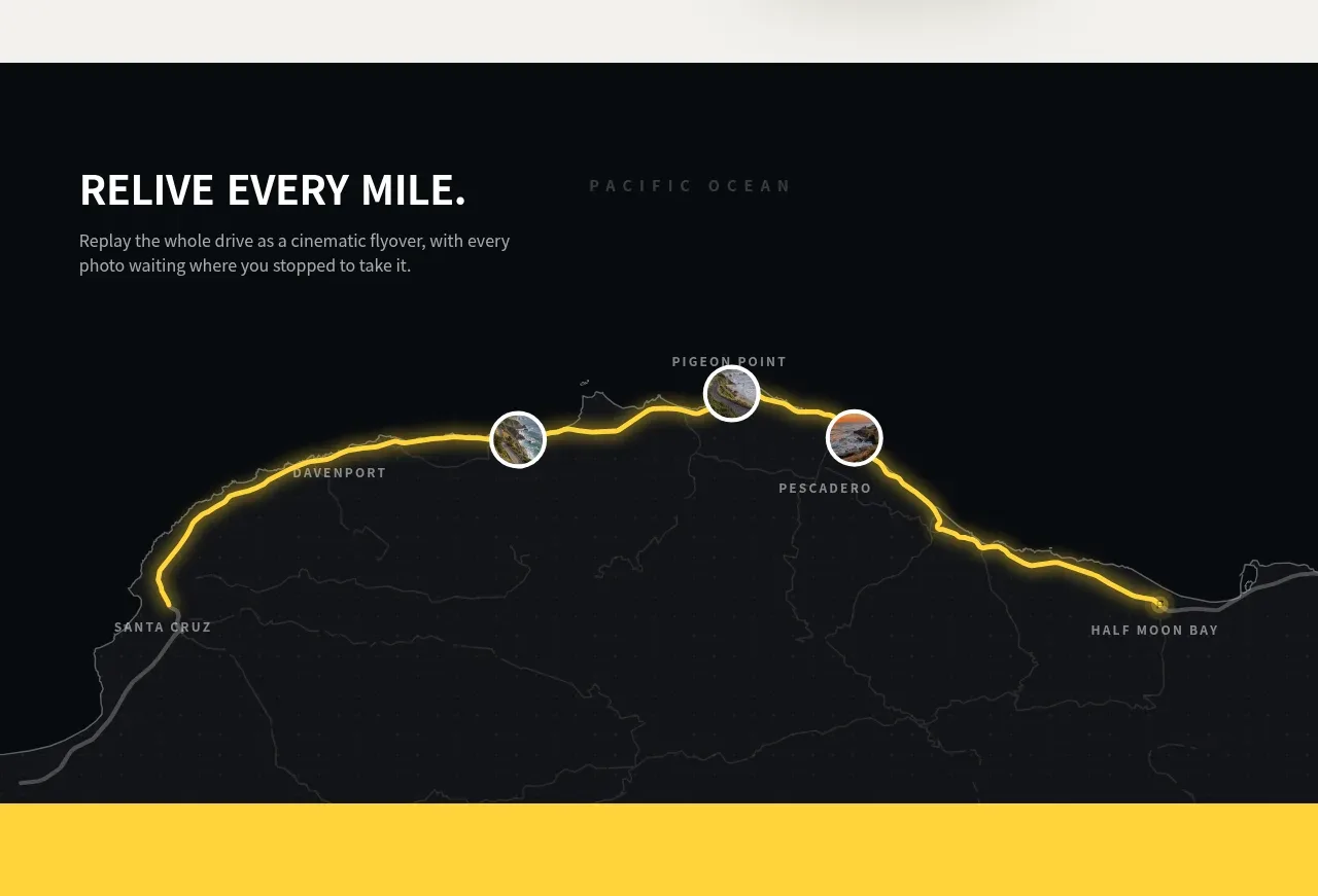
 Route replay map feature
Milepost · Feature grid
Route replay map feature
Milepost · Feature grid
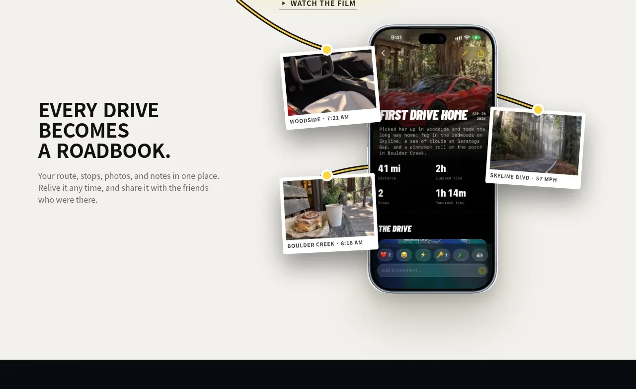 Roadbook feature story
Milepost · Feature grid
Roadbook feature story
Milepost · Feature grid
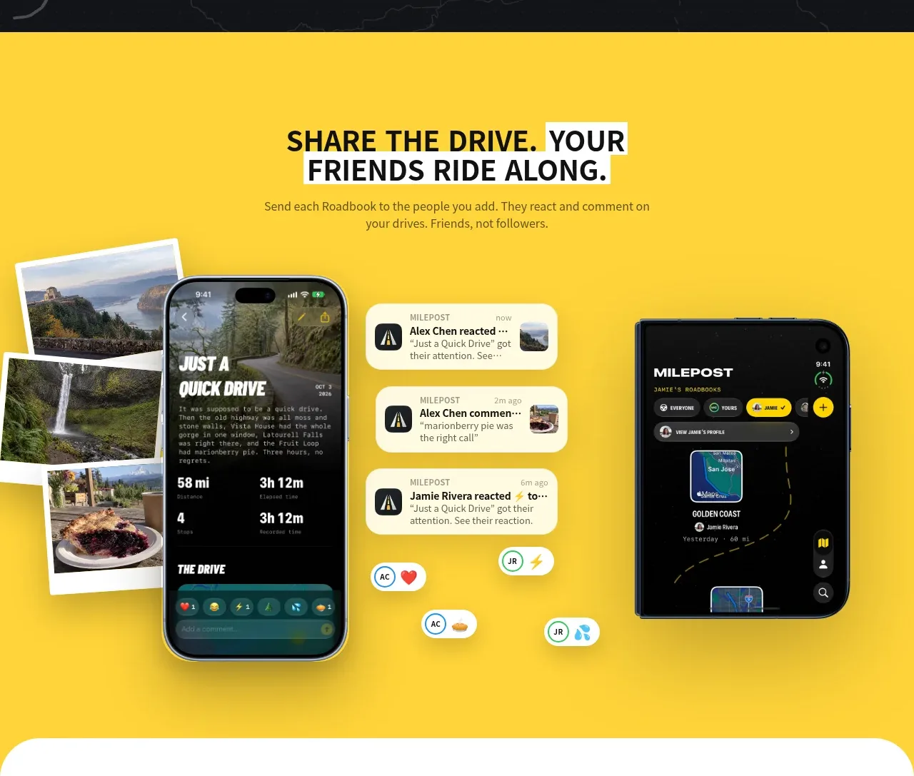 Shared drive feature
Milepost · Feature grid
Shared drive feature
Milepost · Feature grid
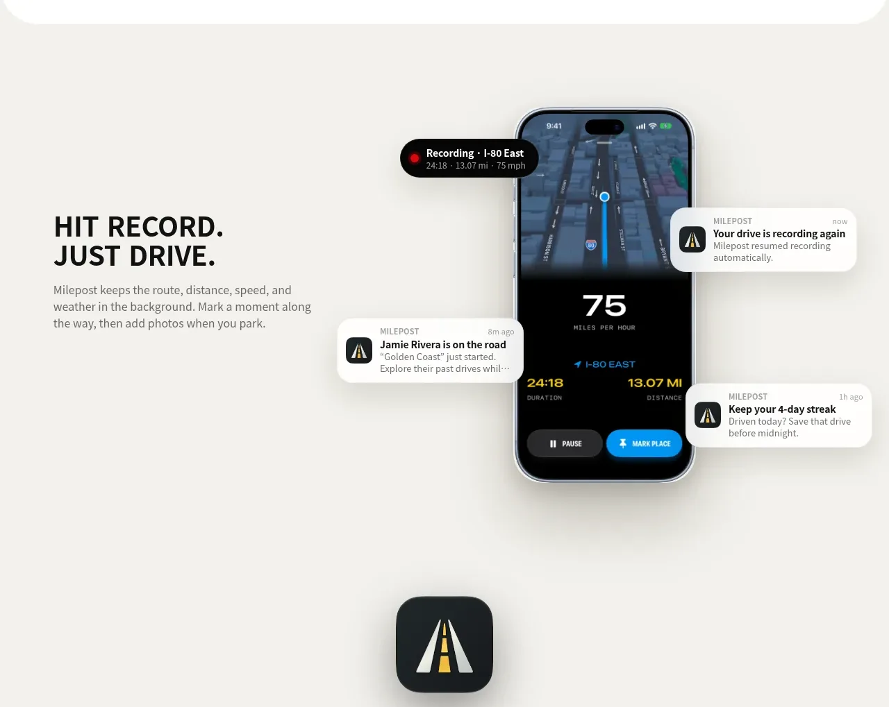 Automatic recording feature
Milepost · Feature grid
Automatic recording feature
Milepost · Feature grid

 Cross-functional collaboration accordion
Base Code · Feature grid
Cross-functional collaboration accordion
Base Code · Feature grid
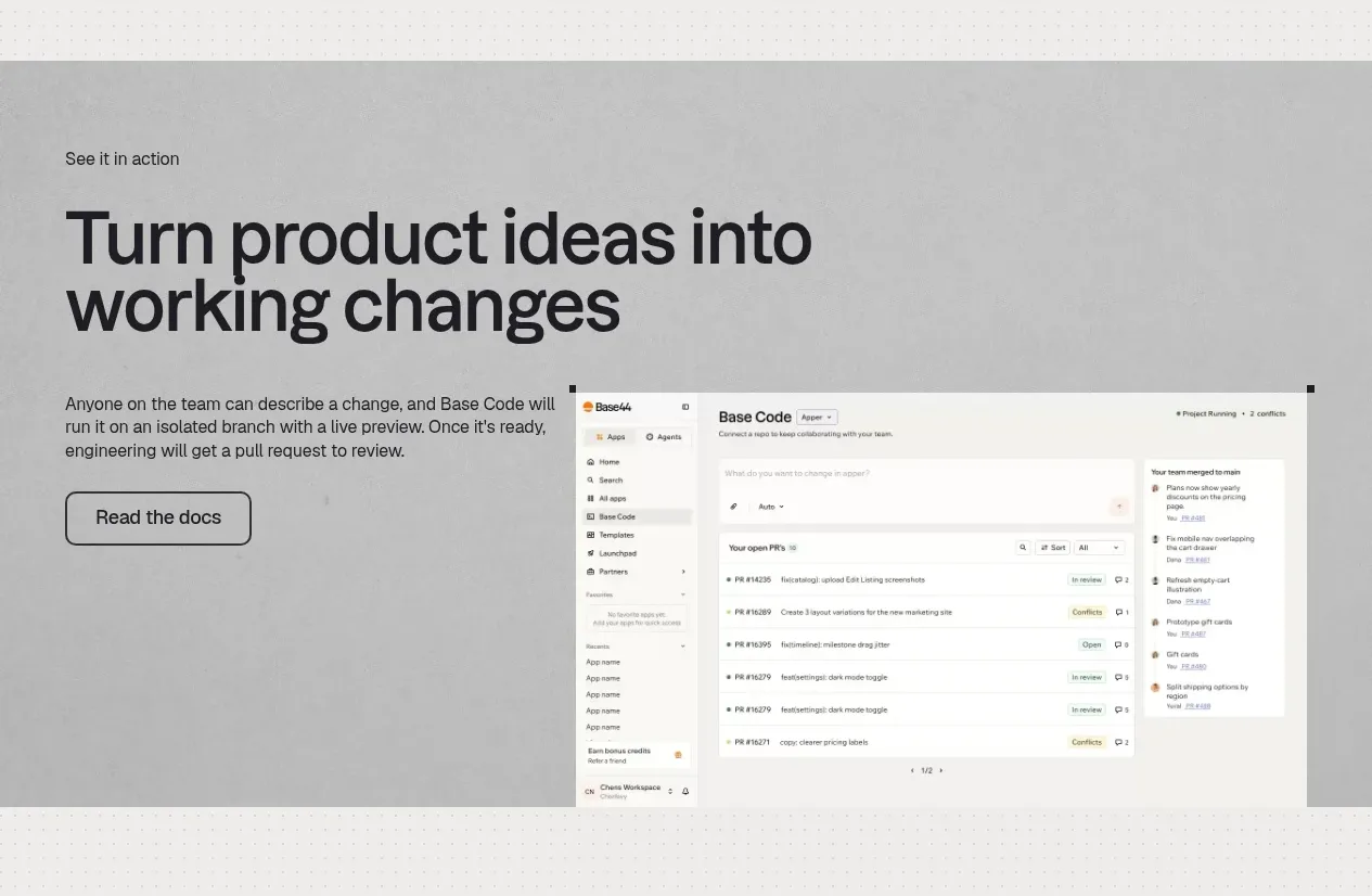 Product workflow demonstration
Base Code · Feature grid
Product workflow demonstration
Base Code · Feature grid