 kage
kage
milepost.club
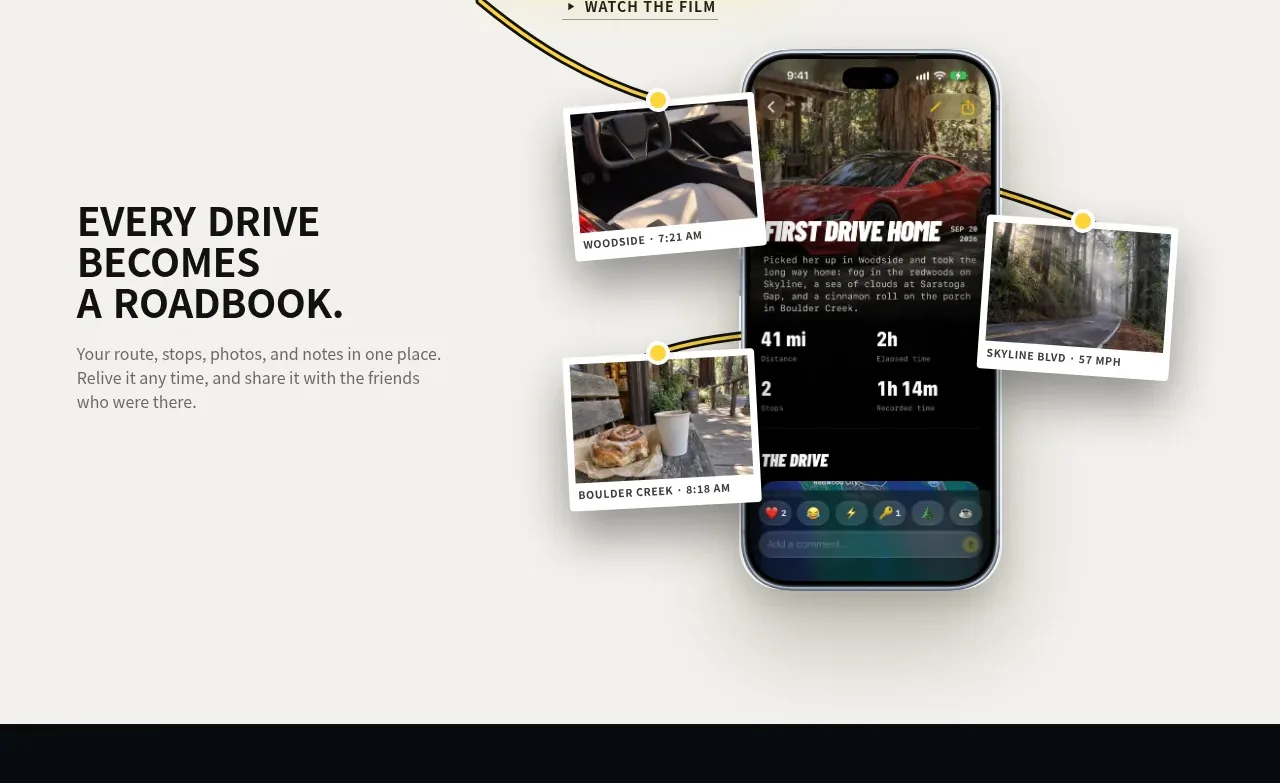
Design analysis
A left-aligned benefit statement is paired with a large phone-and-photo composition, making the abstract feature tangible through layered product evidence.
Prompt preview
## Reference images

Study these alongside the description below: hierarchy, rhythm, spacing, colour. Build for the product you are asked about, using this design language.

- Component: https://kage-design-assets.t3.tigrisfiles.io/components/milepost/daa1b44b-e646-4a0f-860e-b6d9c76440c8-1791871476-2.webp
- Full page it was cut from: https://kage-design-assets.t3.tigrisfiles.io/screenshots/milepost/daa1b44b-e646-4a0f-860e-b6d9c76440c8-1791871382204-full.webp
- Component on Kage: https://kage.design/component/milepost-feature-grid

## Before you start
Ask what feature should be understood first and what product screens or artifacts can prove its value. Adapt the composition to the user's product and visual identity.

Build a two-column feature band on #f4f3ef. Put a concise uppercase benefit headline and two short supporting lines in the left column, vertically aligned around the middle; reserve the right half for a large device mockup with several offset cards, photos, or content fragments orbiting it. Use a strong 30–42px sans-serif heading, muted 14–16px body text, and generous whitespace. Layer media with varied rotations of roughly -6° to 5°, soft shadows, thin light borders, and rounded corners around 4–14px. Use a restrained palette of off-white, black, and one accent yellow; keep the central product screen dominant. On mobile, stack the copy above the visual and reduce the offsets so no card clips.

Never: use logos, product names, copy, illustrations or imagery from the reference.
More components
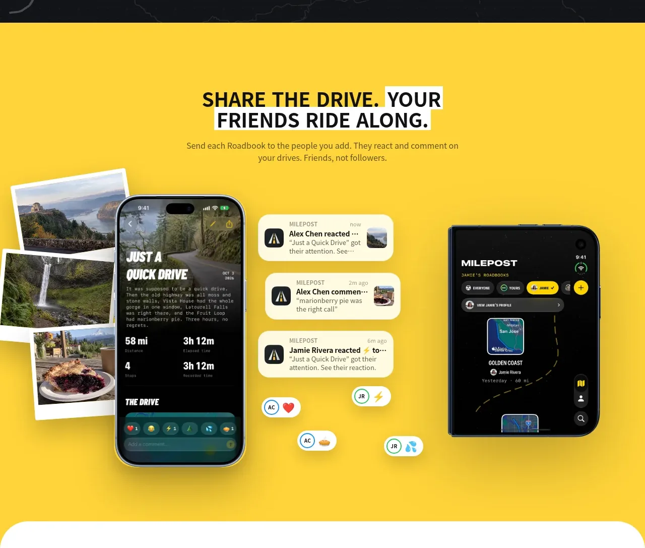
 Shared drive feature
Milepost · Feature grid
Shared drive feature
Milepost · Feature grid
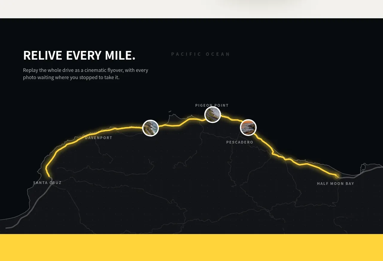 Route replay map feature
Milepost · Feature grid
Route replay map feature
Milepost · Feature grid
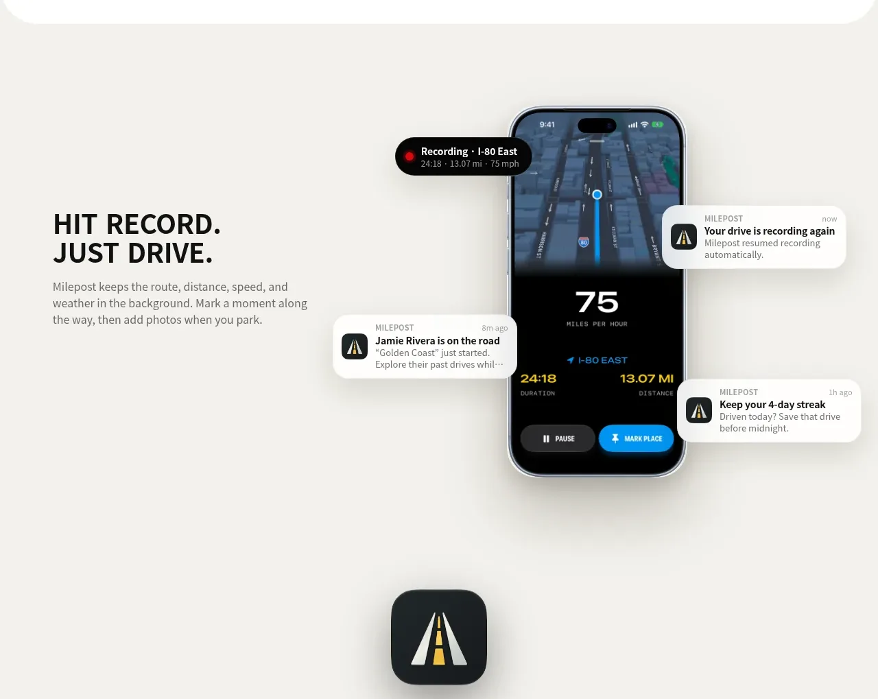 Automatic recording feature
Milepost · Feature grid
Automatic recording feature
Milepost · Feature grid
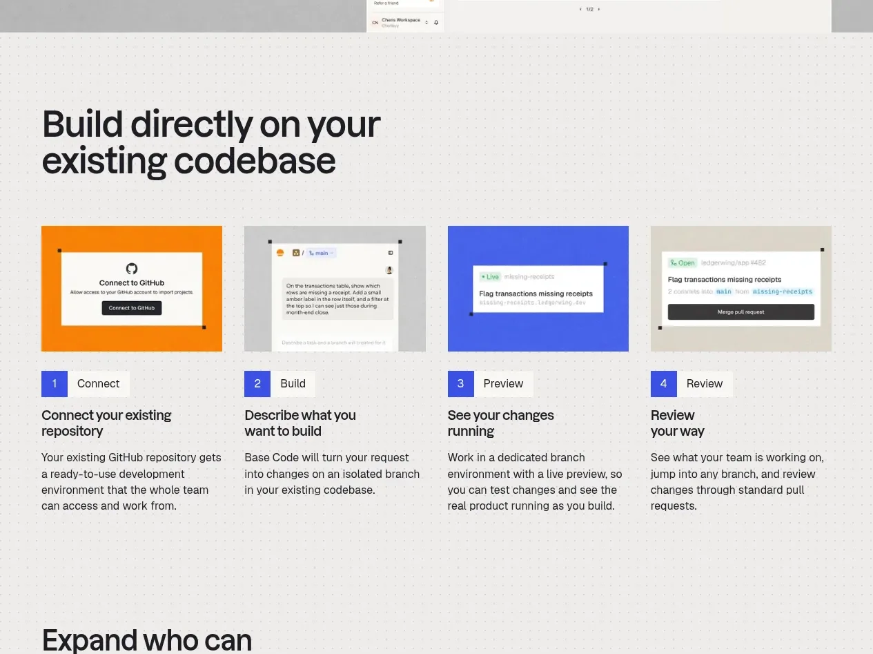
 Four-step build workflow
Base Code · Feature grid
Four-step build workflow
Base Code · Feature grid
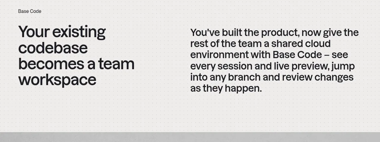 From codebase to team workspace
Base Code · Feature grid
From codebase to team workspace
Base Code · Feature grid
 Cross-functional collaboration accordion
Base Code · Feature grid
Cross-functional collaboration accordion
Base Code · Feature grid