 kage
kage
base44.com
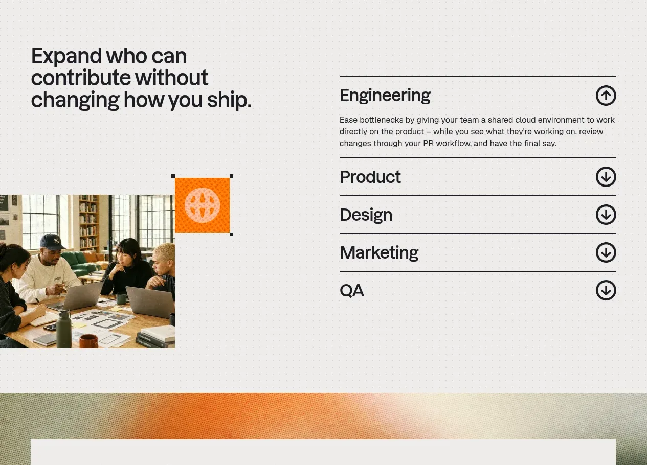
Design analysis
A split layout combines a bold statement and team image on the left with an accordion on the right, showing one expanded role and several collapsed roles.
Prompt preview
## Reference images

Study these alongside the description below: hierarchy, rhythm, spacing, colour. Build for the product you are asked about, using this design language.

- Component: https://kage-design-assets.t3.tigrisfiles.io/components/base-code/bec5af88-964e-4f0a-90b9-76aa2444b6f5-1791871471-5.webp
- Full page it was cut from: https://kage-design-assets.t3.tigrisfiles.io/screenshots/base-code/bec5af88-964e-4f0a-90b9-76aa2444b6f5-1791871315791-full.webp
- Component on Kage: https://kage.design/component/base-code-feature-grid-4

## Before you start
Ask which audiences or departments the user's product serves and what visual language its brand uses. Build a role-based section that reflects those answers.

Create a two-column collaboration section. Use the left side for a strong headline, a short supporting visual or photo placeholder, and a small accent tile; use the right side for a vertically stacked accordion of audience or department benefits. Give every row a strong horizontal rule, clear title, and circular expand/collapse icon. Show one item expanded by default with a short paragraph, while the remaining items stay collapsed. Use black rules and type on an airy warm-white background, with one saturated accent colour for the visual tile. Ensure the accordion is keyboard navigable, has visible focus styles, and animates height subtly without layout jumps. Stack the columns on mobile.

Never use logos, product names, copy, illustrations, or imagery from the reference.
More components
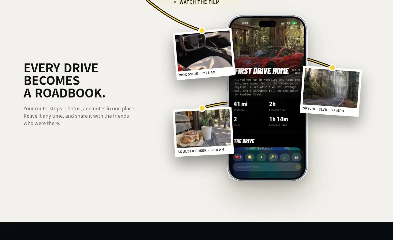
 Roadbook feature story
Milepost · Feature grid
Roadbook feature story
Milepost · Feature grid
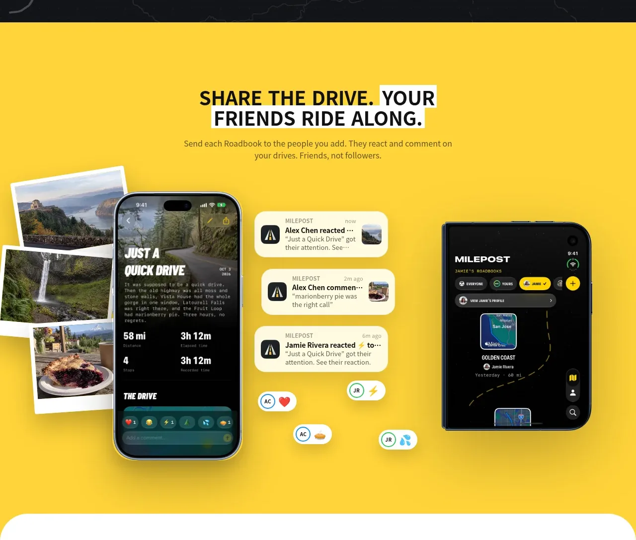 Shared drive feature
Milepost · Feature grid
Shared drive feature
Milepost · Feature grid
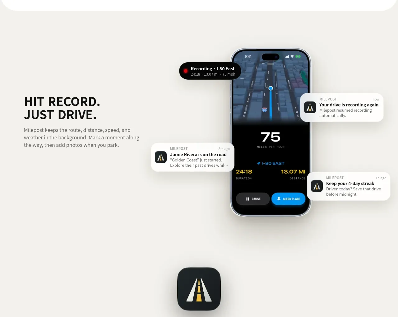 Automatic recording feature
Milepost · Feature grid
Automatic recording feature
Milepost · Feature grid
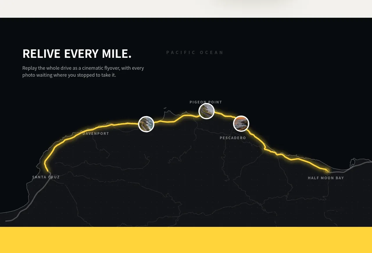 Route replay map feature
Milepost · Feature grid
Route replay map feature
Milepost · Feature grid
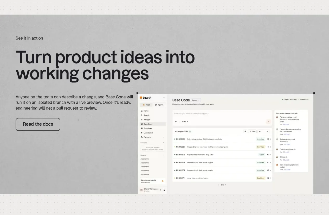
 Product workflow demonstration
Base Code · Feature grid
Product workflow demonstration
Base Code · Feature grid
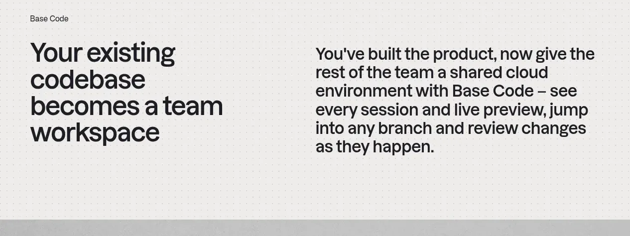 From codebase to team workspace
Base Code · Feature grid
From codebase to team workspace
Base Code · Feature grid