 kage
kage
milepost.club
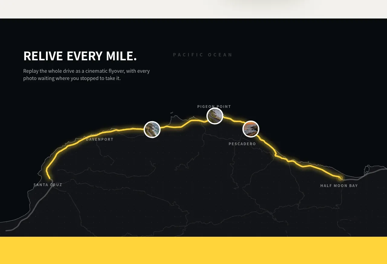
Design analysis
A dark cinematic section introduces replay as an emotional benefit, using a glowing route map and small location markers as the visual anchor.
Prompt preview
## Reference images

Study these alongside the description below: hierarchy, rhythm, spacing, colour. Build for the product you are asked about, using this design language.

- Component: https://kage-design-assets.t3.tigrisfiles.io/components/milepost/daa1b44b-e646-4a0f-860e-b6d9c76440c8-1791871476-3.webp
- Full page it was cut from: https://kage-design-assets.t3.tigrisfiles.io/screenshots/milepost/daa1b44b-e646-4a0f-860e-b6d9c76440c8-1791871382204-full.webp
- Component on Kage: https://kage.design/component/milepost-feature-grid-2

## Before you start
Ask what emotional or narrative feature the user's product needs to communicate and what visual data can make it feel real. Apply the style rules without reproducing the source imagery.

Create a full-width dark feature section using near-black #070a0e with a faint charcoal map/grid texture. Start with a left-aligned uppercase heading and compact explanatory copy in white and cool gray. Below and behind the copy, create a large route visualization: a thin luminous accent path in the brand accent color, subtle low-contrast geography or data contours, and three to five circular image/data markers with fine borders. Use a cinematic hierarchy, low-opacity background details, and ample vertical breathing room. Let the route occupy most of the lower half and remain legible at smaller sizes. Add gentle hover emphasis to markers if interactive, with tooltips rather than clutter.

Never: use logos, product names, copy, illustrations or imagery from the reference.
More components
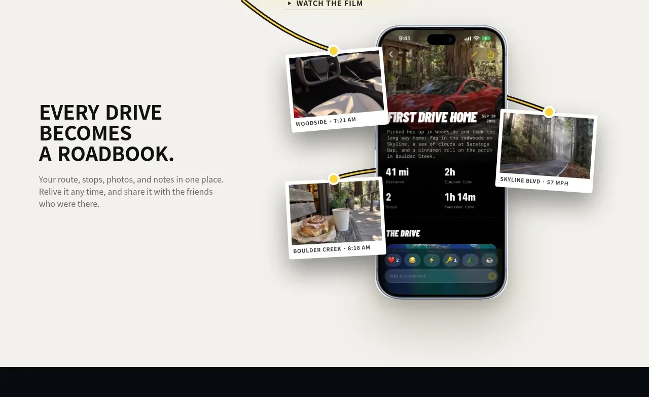
 Roadbook feature story
Milepost · Feature grid
Roadbook feature story
Milepost · Feature grid
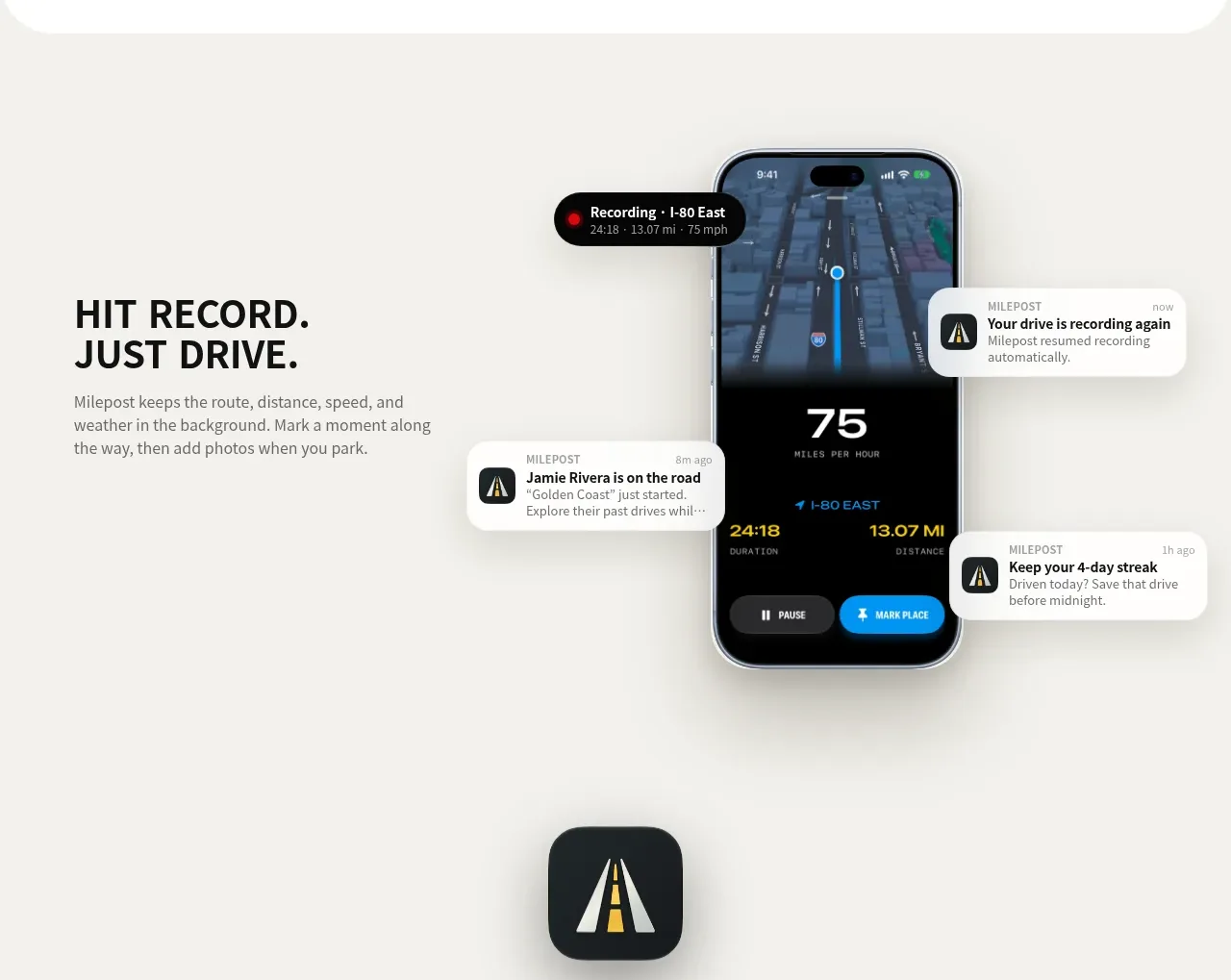 Automatic recording feature
Milepost · Feature grid
Automatic recording feature
Milepost · Feature grid
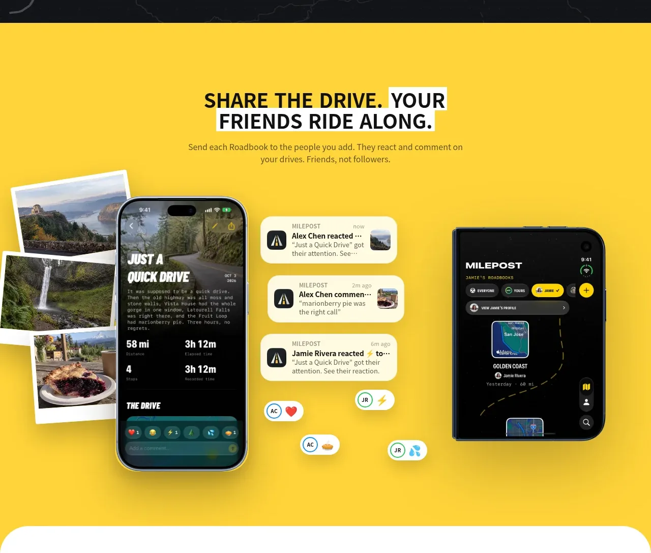 Shared drive feature
Milepost · Feature grid
Shared drive feature
Milepost · Feature grid
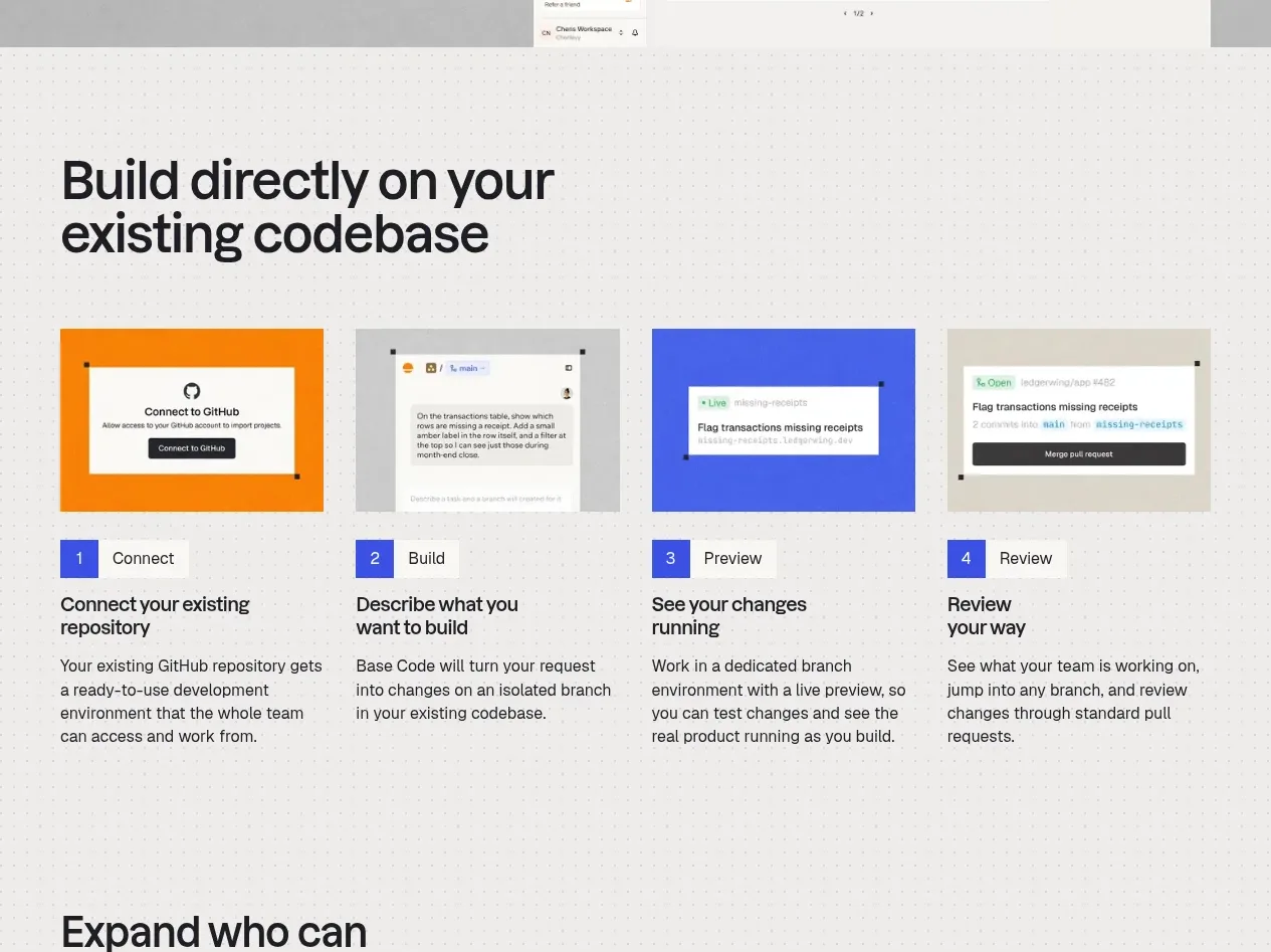
 Four-step build workflow
Base Code · Feature grid
Four-step build workflow
Base Code · Feature grid
 From codebase to team workspace
Base Code · Feature grid
From codebase to team workspace
Base Code · Feature grid
 Cross-functional collaboration accordion
Base Code · Feature grid
Cross-functional collaboration accordion
Base Code · Feature grid