 kage
kage
milepost.club
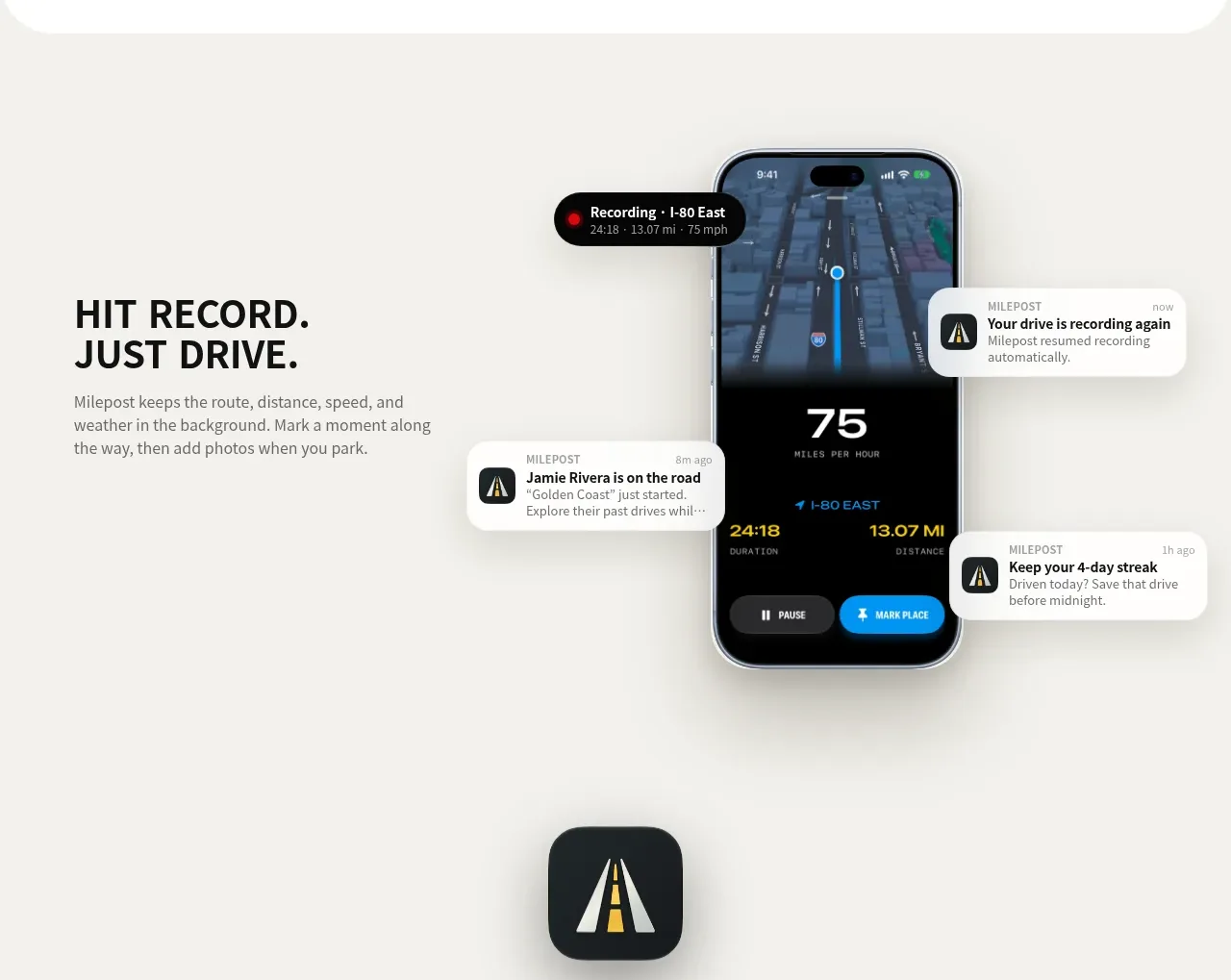
Design analysis
A spacious light section pairs a concise functional promise with a dominant phone showing live activity and floating status notifications.
Prompt preview
## Reference images

Study these alongside the description below: hierarchy, rhythm, spacing, colour. Build for the product you are asked about, using this design language.

- Component: https://kage-design-assets.t3.tigrisfiles.io/components/milepost/daa1b44b-e646-4a0f-860e-b6d9c76440c8-1791871477-6.webp
- Full page it was cut from: https://kage-design-assets.t3.tigrisfiles.io/screenshots/milepost/daa1b44b-e646-4a0f-860e-b6d9c76440c8-1791871382204-full.webp
- Component on Kage: https://kage.design/component/milepost-feature-grid-4

## Before you start
Ask what should happen automatically in the user's product and which live state best communicates that value. Apply the layout and visual principles to the user's own interface.

Build a split feature section on #f4f3ef. Place an uppercase, two-line heading and a short paragraph in the left third, aligned around the visual center. Place a large upright device mockup in the right half, showing a clear live-status screen with a bold metric and a few lightweight notification bubbles around it. Use near-black #111315 for headings, gray #777873 for body copy, white notification surfaces, 16–22px radii, and soft diffuse shadows. Use one yellow accent for active states and key data. Let the phone extend vertically enough to feel substantial, but keep all supporting bubbles inside the section bounds. Stack copy above device on narrow screens.

Never: use logos, product names, copy, illustrations or imagery from the reference.
More components
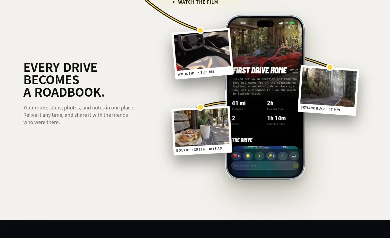
 Roadbook feature story
Milepost · Feature grid
Roadbook feature story
Milepost · Feature grid
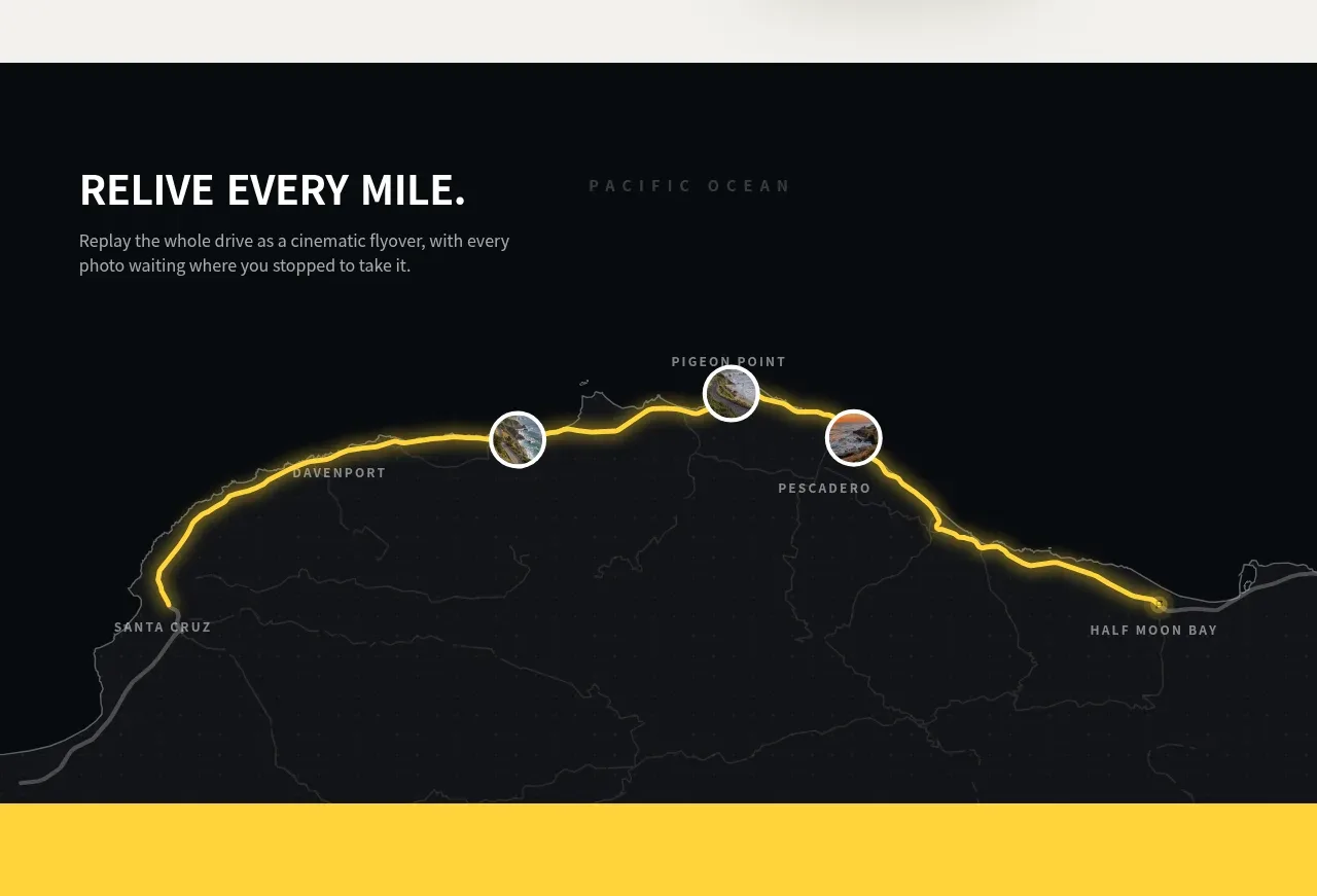 Route replay map feature
Milepost · Feature grid
Route replay map feature
Milepost · Feature grid
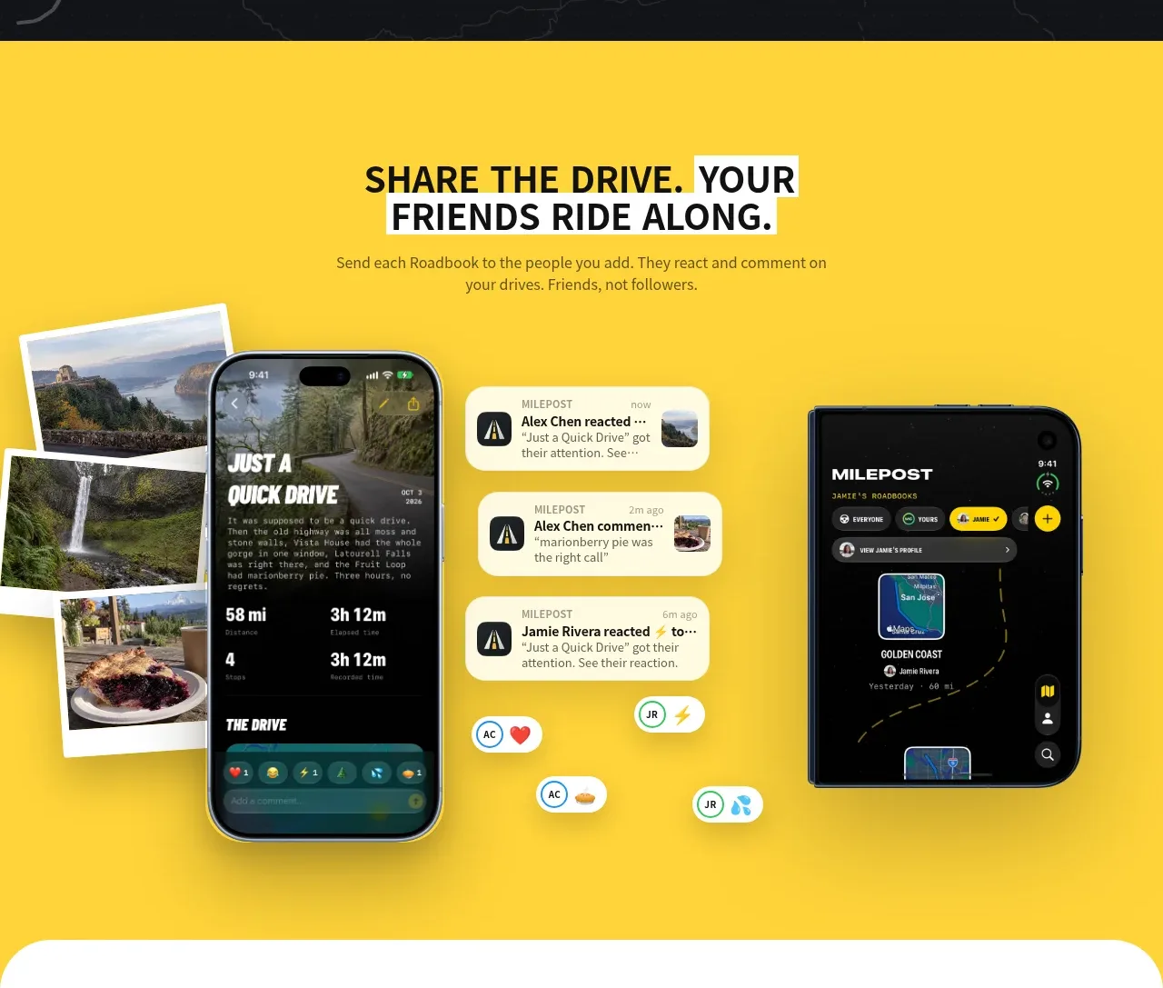 Shared drive feature
Milepost · Feature grid
Shared drive feature
Milepost · Feature grid
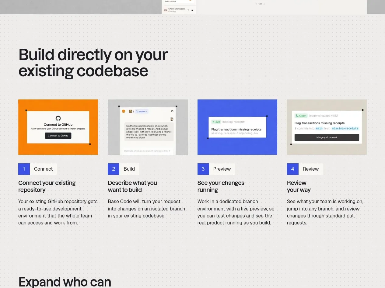
 Four-step build workflow
Base Code · Feature grid
Four-step build workflow
Base Code · Feature grid
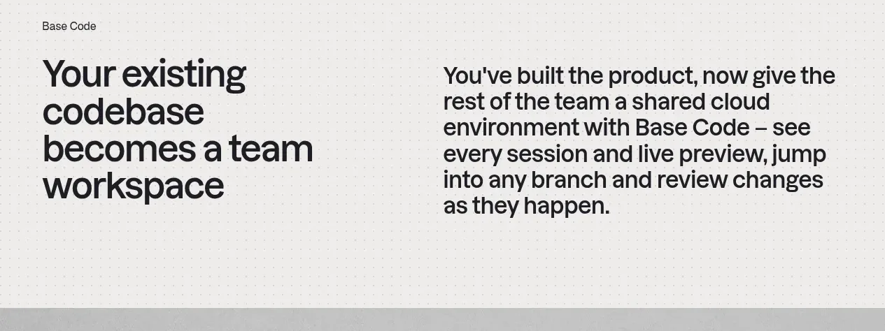 From codebase to team workspace
Base Code · Feature grid
From codebase to team workspace
Base Code · Feature grid
 Cross-functional collaboration accordion
Base Code · Feature grid
Cross-functional collaboration accordion
Base Code · Feature grid